If you’ve already read my first post, Understanding the Elements of Design, you’ll know that those building blocks, line, shape, colour, texture, and so on, give us the raw materials we use to create images. This second instalment looks at what comes next: the principles of design, the ideas that show us how those elements work together to create meaning in our illustrations.
When I first started out as an illustrator, no one ever sat me down and explained the elements and principles of design. I wish they had. These concepts aren’t just academic theory, they’re practical tools that help you see images more clearly, create with intention, and talk about visual work in a way that feels informed and confident.
For new illustrators, the principles become the scaffolding that supports every drawing, layout, and character you create. For teachers, they offer a shared language that makes classroom discussions richer, more accessible, and far less mysterious. Once students understand how ideas like balance, rhythm, contrast, and emphasis shape a composition, they can analyse images with clarity and build their own with purpose.
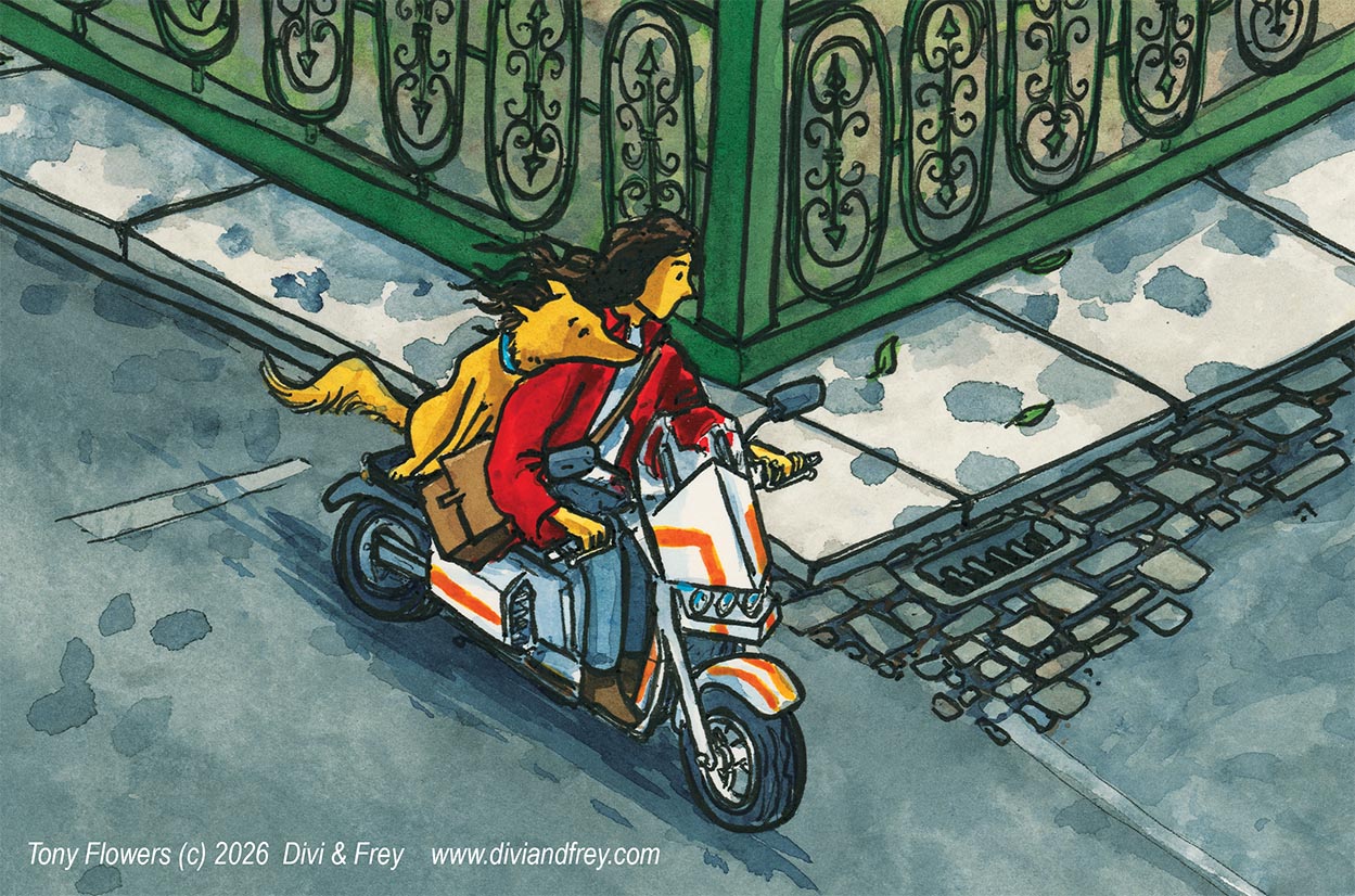
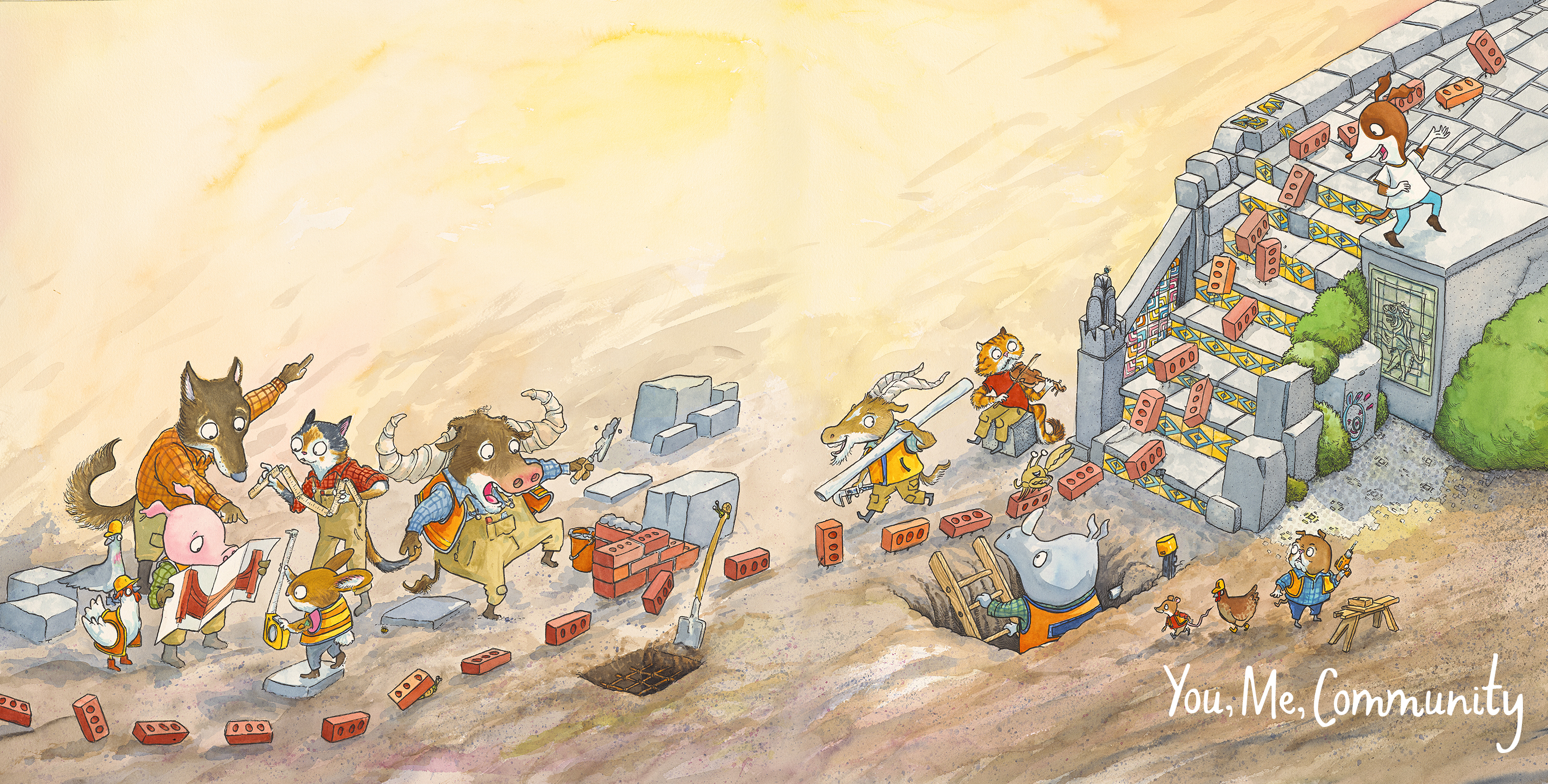
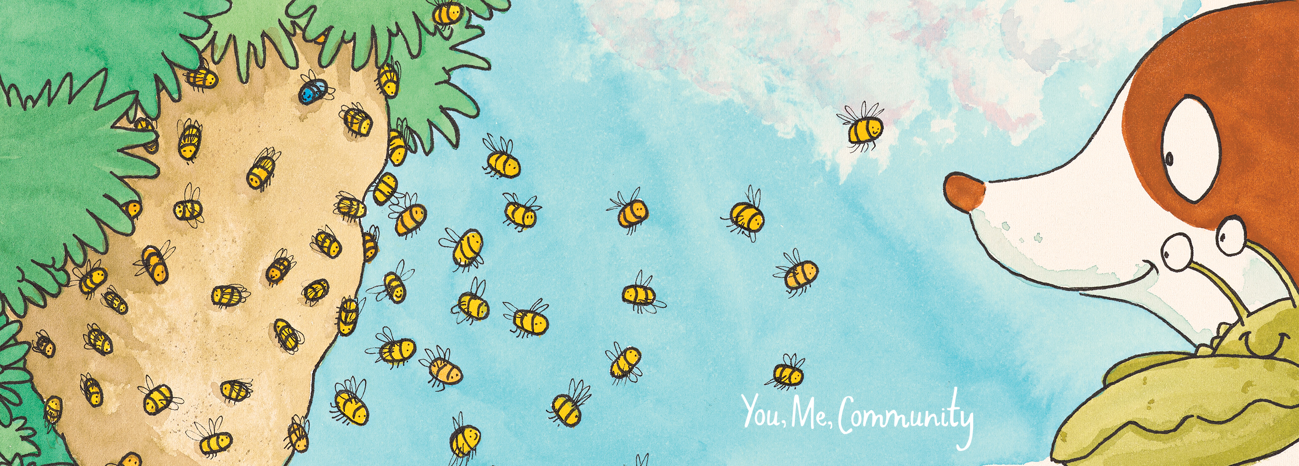
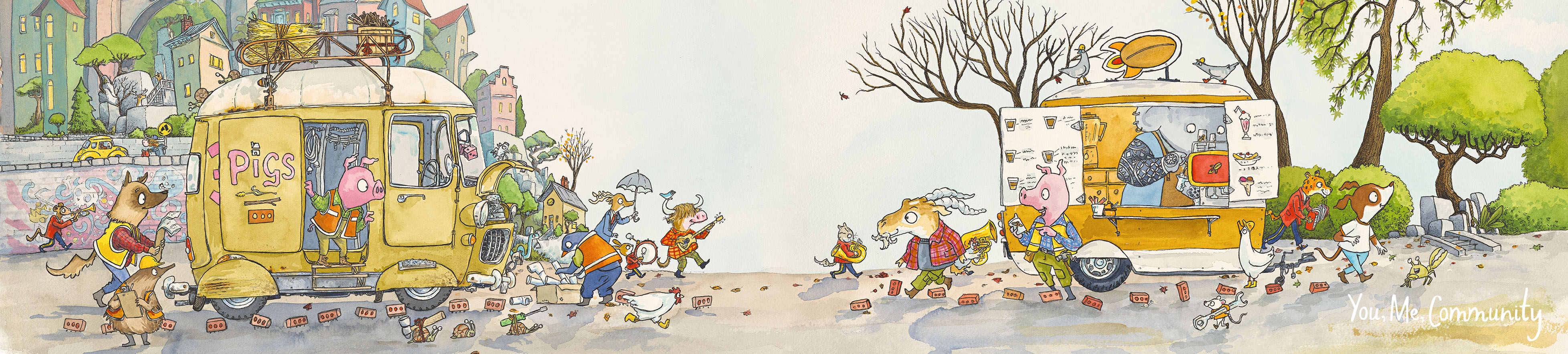
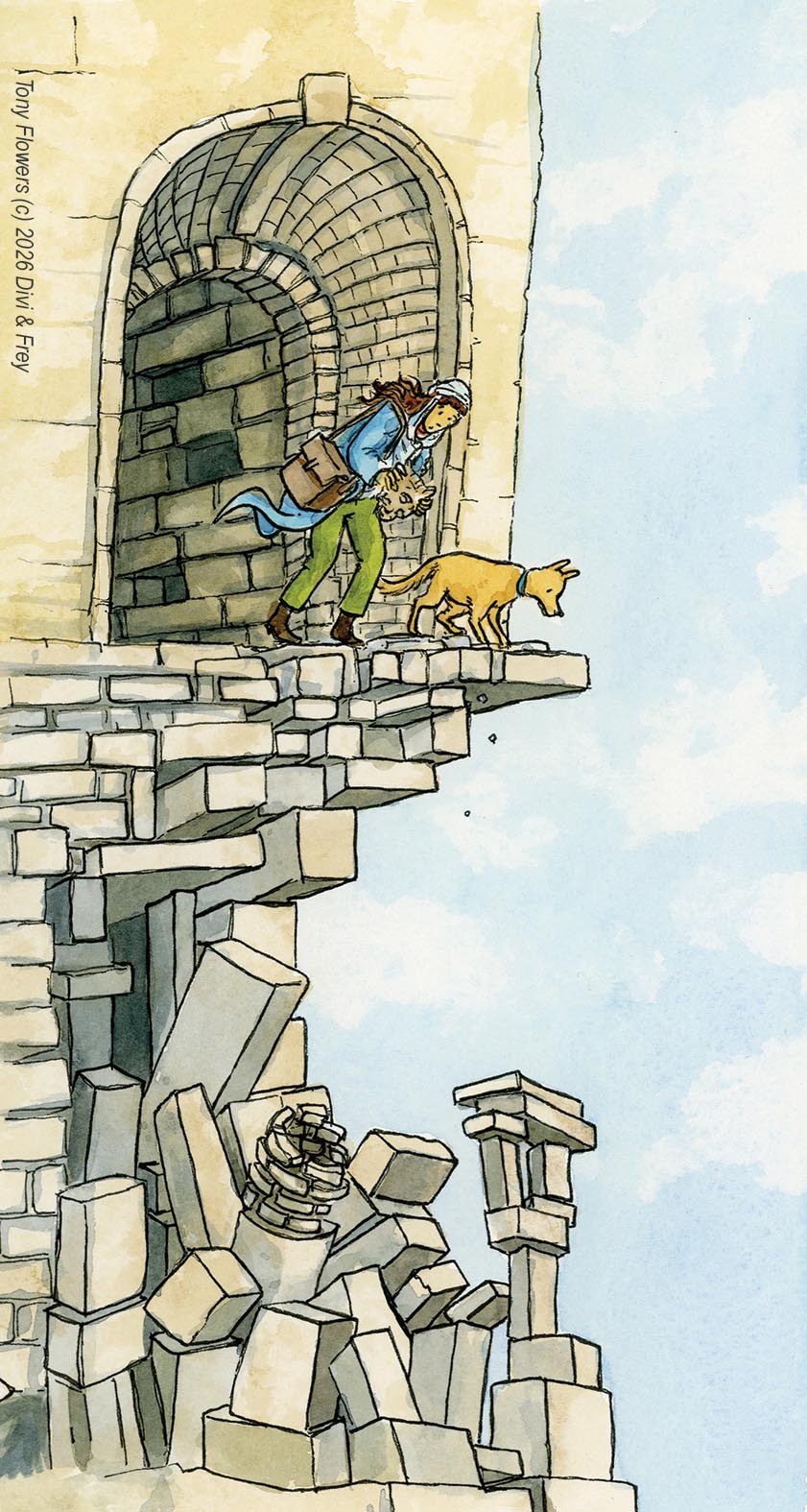
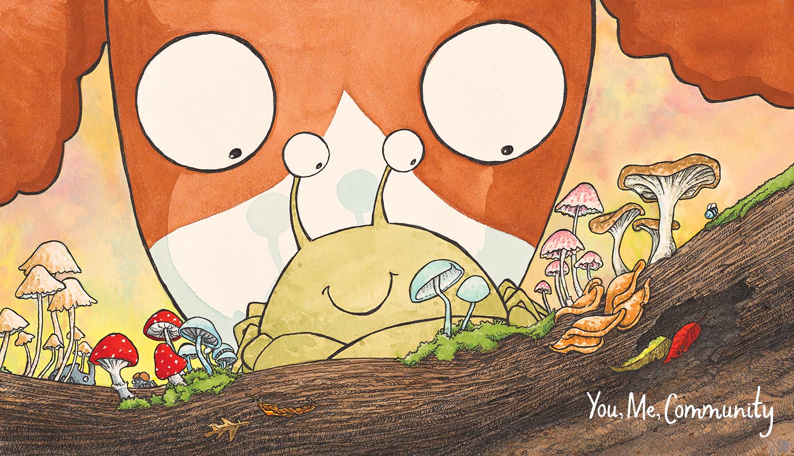
These principles transformed the way I approached my own books, like Divi & Frey and You, Me, Community and they continue to shape how I teach. My hope is that they’ll do the same for you and your students.
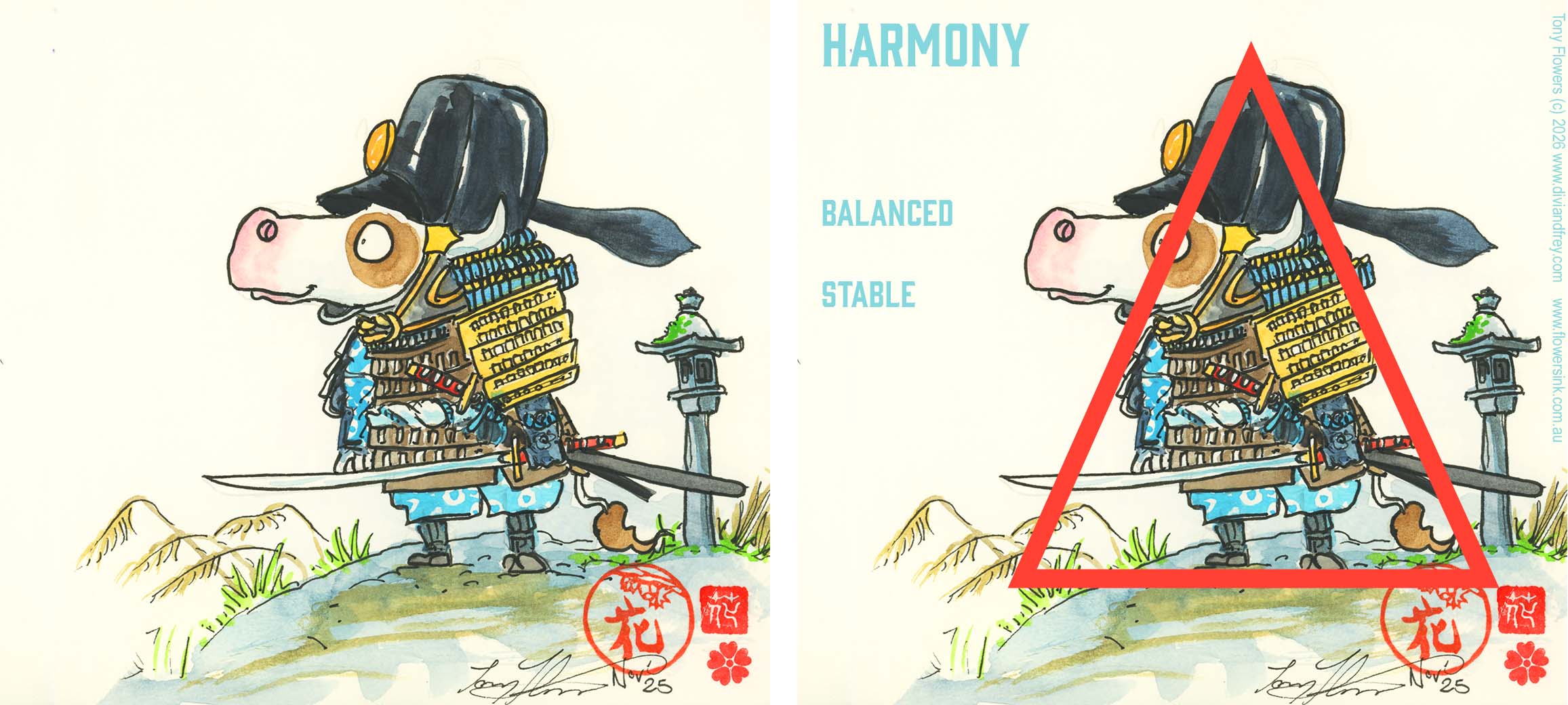
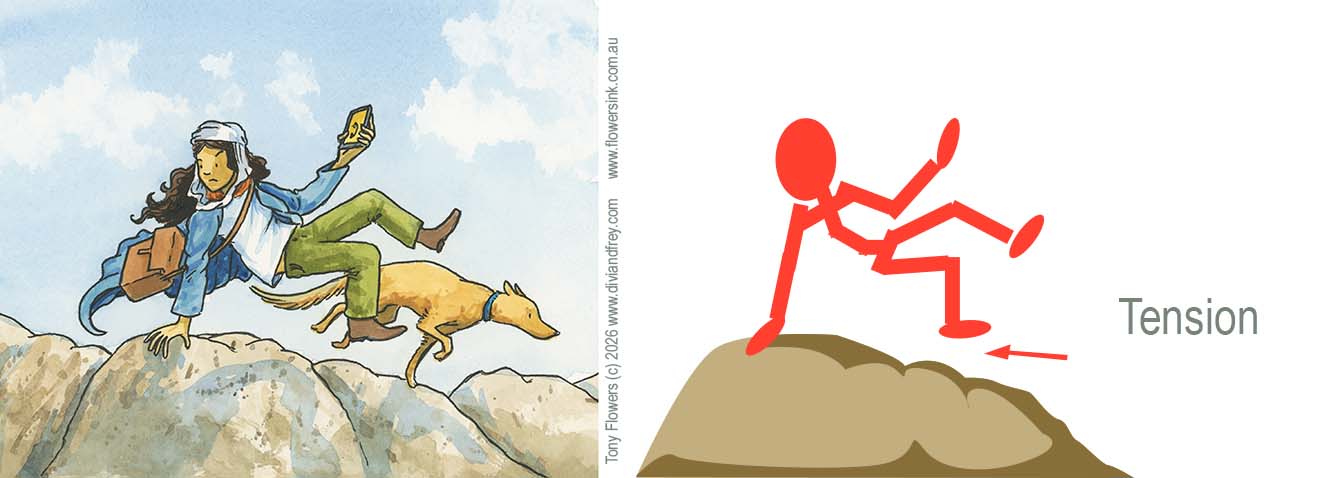
Balance How visual weight is distributed across a composition.
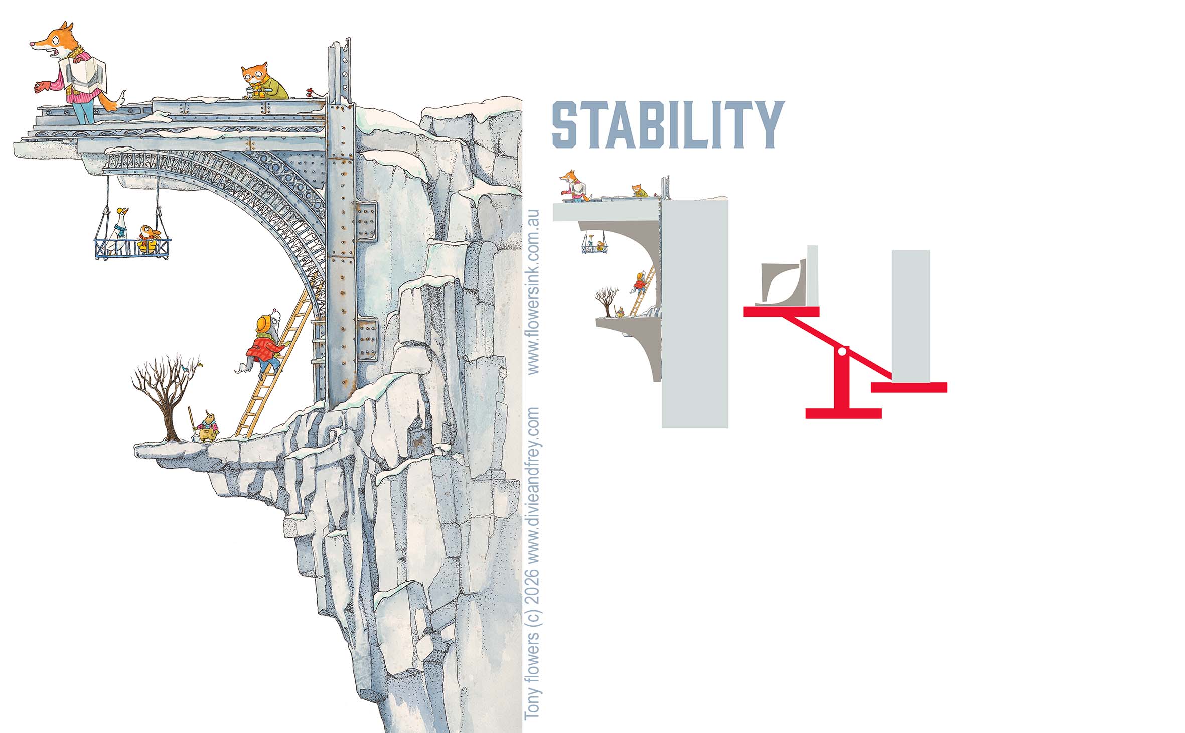
Creates a sense of stability, harmony, or intentional tension.
Contrast The difference between elements (light/dark, big/small, smooth/rough).
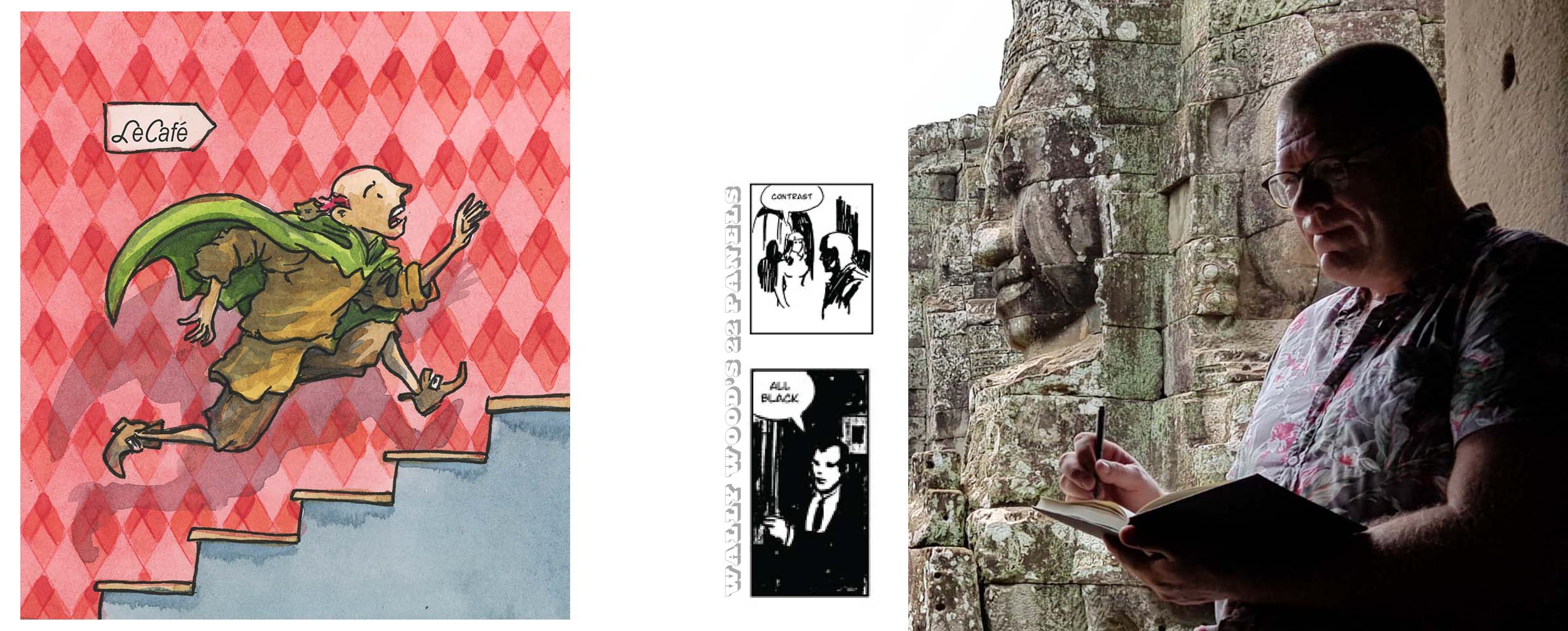
Helps important parts stand out and adds visual interest.
Emphasis Directs the viewer’s attention to the most important part of the image. Achieved through contrast, placement, or scale.
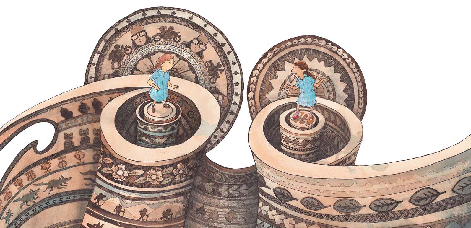
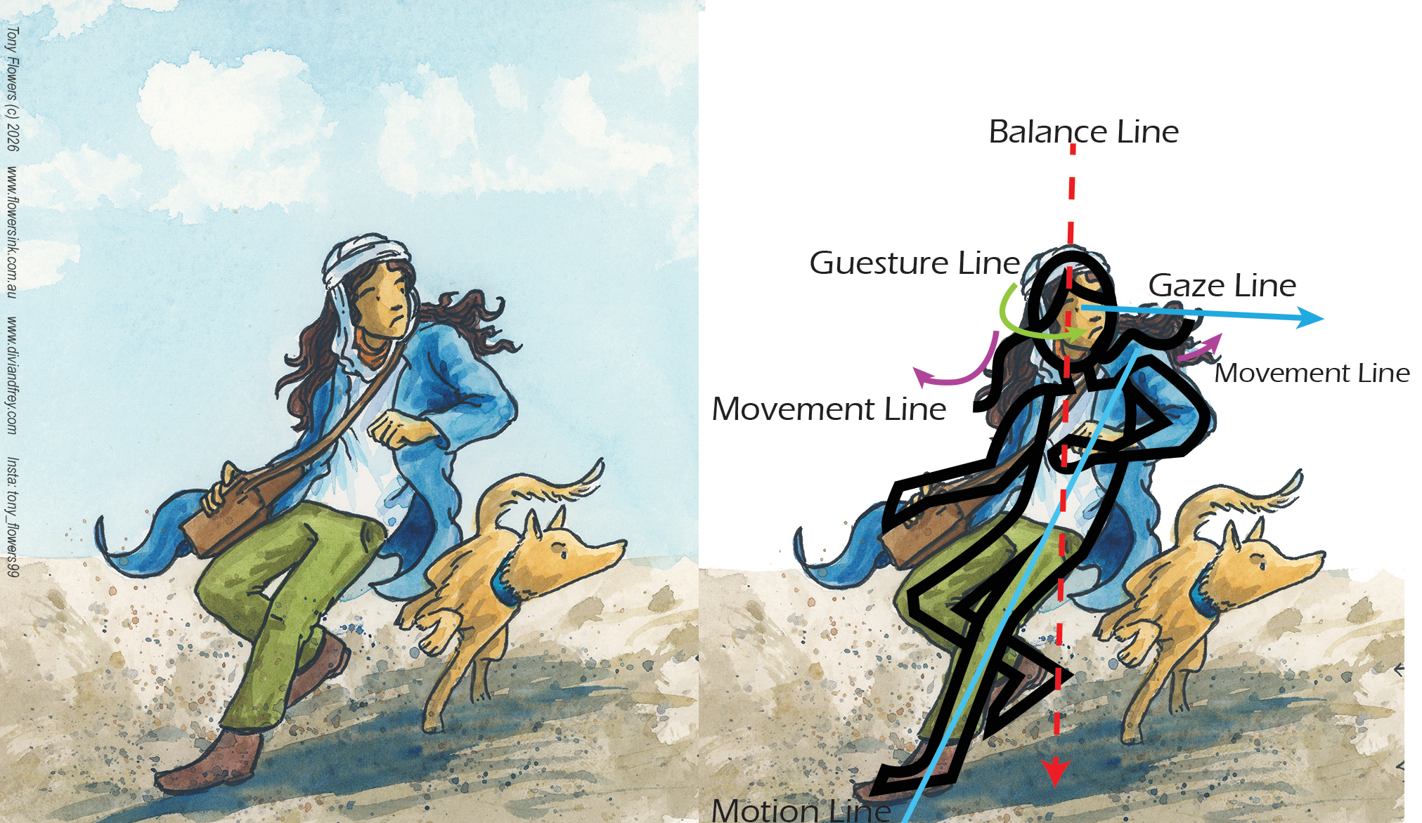
Movement Guides the viewer’s eye through the artwork. Uses lines, shapes, and rhythm to create a sense of flow or action.
Rhythm A visual beat created by repeating elements. Can feel calm, chaotic, playful, or structured depending on the pattern.
Pattern A repeated decorative design. Adds texture, structure, or visual energy to an illustration.
Unity How well all parts of a design feel like they belong together. Achieved through consistent style, colour, or repeated elements.
Variety Using differences in shape, colour, texture, or scale to keep a design interesting. Prevents the artwork from feeling flat or repetitive.
Proportion The size relationship between elements. Can create realism, exaggeration, or humour depending on how it’s used.
Scale How large or small something appears in relation to the viewer or other elements. Helps create mood, drama, or focus.
I hope this post has given you a useful introduction to the principles of design and shown how the elements of design can work together to create images that tell meaningful, engaging stories. Thanks for reading along as we explored these ideas.
If you’re a teacher and would like me to visit your school to run workshops on visual storytelling, illustration, or writing process, you’re very welcome to get in touch through my speaking agents. I’d love to work with your students and staff.
In Australia:
Lamont Authors
https://www.lamontauthors.com.au/lamont_author/tony-flowers/
Speakers Ink
https://www.speakers-ink.com.au/speakers/tony-flowers
For International enquiries, contact me directly.
Melbourne Book Tour 24th to 28th August 2026
SOME THING EXTRA FOR THE TEACHERS OUT THERE
Principles of Design Student Check
Reading images and Illustration
Name: ___________________________ Artwork/Task: ____________________
Balance
- ☐ I can identify where the visual weight sits in the image.
- ☐ The artwork feels balanced, unbalanced, or intentionally uneven — and I can explain why.
Contrast
- ☐ I can spot strong differences (light/dark, big/small, smooth/rough).
- ☐ I can explain how contrast helps important parts stand out.
Emphasis
- ☐ I can identify the focal point of the image.
- ☐ I can explain how the artist drew my eye to that area.
Movement
- ☐ I can see how my eye travels through the artwork.
- ☐ I can describe what creates that sense of flow or action.
Rhythm & Pattern
- ☐ I can find repeated shapes, lines, or colours.
- ☐ I can explain how the repetition creates a mood or feeling.
Unity & Variety
- ☐ I can see how the parts of the artwork feel like they belong together.
- ☐ I can identify where variety keeps the image interesting.
Space
- ☐ I can identify positive and negative space.
- ☐ I can explain how space helps make the image clearer or more dramatic.
Creating Your Own Artwork
Principles of Design Student Check
Name: ___________________________ Project: _________________________
Balance
- ☐ I arranged shapes and objects so the composition feels stable or intentionally uneven.
- ☐ I checked that nothing feels accidentally “heavy” on one side.
Contrast
- ☐ I used contrast to make important parts stand out.
- ☐ I checked that my contrasts are clear and not confusing.
Emphasis
- ☐ I chose a clear focal point for my artwork.
- ☐ I used size, colour, or placement to highlight it.
Movement
- ☐ I used lines, shapes, or direction to guide the viewer’s eye.
- ☐ My composition has a sense of flow or action.
Rhythm & Pattern
- ☐ I repeated elements to create a visual beat or structure.
- ☐ My rhythm supports the mood I want (calm, energetic, playful, etc.).
Unity & Variety
- ☐ My artwork feels consistent in style and colour.
- ☐ I added enough variety to keep it interesting.
Space
- ☐ I used positive and negative space intentionally.
- ☐ My design feels clear, not cluttered.

Leave a comment