How Single‑Point Perspective Illusions Work
Single‑point perspective illusions use one vanishing point to trick the eye into seeing depth on a flat surface. When all the lines in a drawing angle toward the same point, your brain automatically interprets the image as 3D, even though it’s completely flat. This is the foundation (used below) behind that ladder that seem to rise out of one page on to the next the page; And the doorway that appear to sink inward, and characters that look like they’re floating in front of the paper.
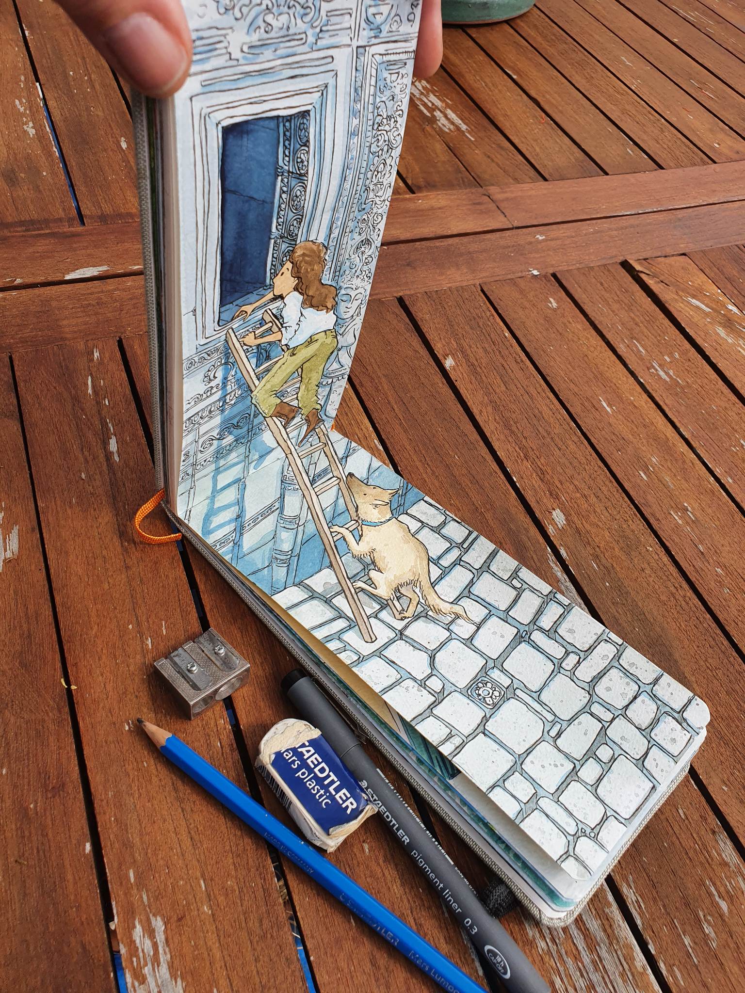
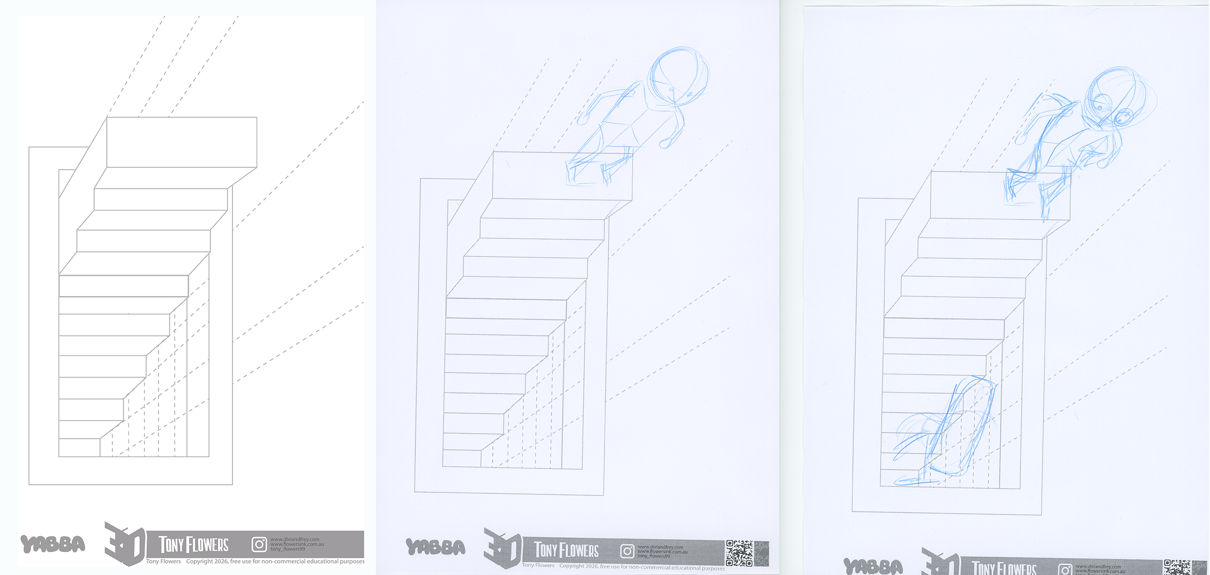
This is one of my sketchbook example that uses two pages form one image.
How to see the illusion
A camera lens makes this illusion even easier to see. Because the lens acts as a fixed focal point, it removes the tiny differences between your two eyes. When you get the camera in the right position when you are looking at the drawing through a phone or tablet camera, the illusion often “locks in” instantly. Everything lines up from a single viewpoint, so the depth becomes stronger and more convincing.
You can achieve the same effect without a camera by closing or covering one eye. With only one eye open, your depth perception flattens, and the perspective lines become more dominant. This helps your brain read the drawing as a single, unified space, perfect for making the illusion pop.
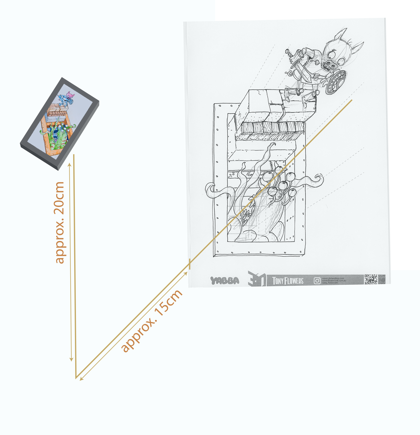
Above is the approx. position for a camera or viewing point for the exercise material below.
*** it should be noted that some people can not see the illusion in these exercises ***
How I Use This Technique in Divi and Frey
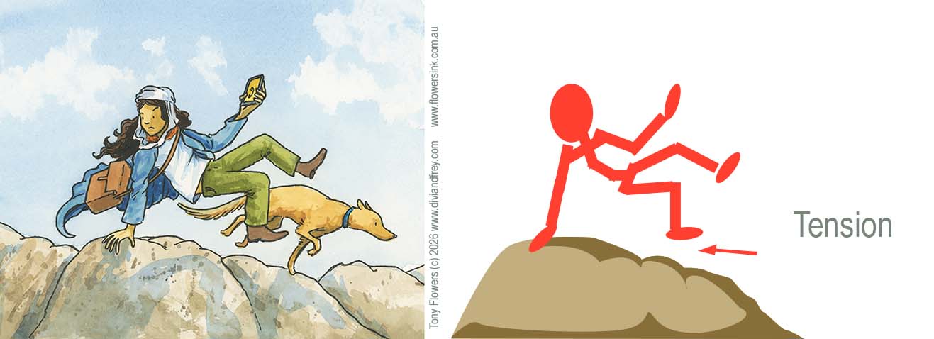
In my upcoming graphic novel Divi and Frey, I use single‑point perspective illusions to create scenes that feel dynamic, dramatic, and immersive. Whether it’s a staircase rising toward danger, a cavern dropping away beneath the characters, or an object bursting toward the reader, these illusions help guide the eye and build tension. They allows the reader experiences the story world in a unique way.
The exercises that follow are simplified versions of the same techniques I use when planning pages for the book. They give students a chance to experiment with depth, contrast, texture, and perspective in a hands‑on, playful way.
This is a single page activity that was originally developed for a YABBA talk in April 2026 and has been adapted here as a classroom‑ready set of drawing challenges you can use with your students.
This is the starting example used in the Yabber demonstration to show how shadow helps build the illusion.
Learning Outcomes
Students will use single‑point perspective to create a 3D staircase illusion that appears to rise out of a hole in the page, applying visual‑literacy skills, design principles, and creative problem‑solving.
Success Criteria
Students can:
- Enhance the illusion using contrast, texture, colour, and light/shade.
- Experiment with characters, objects, and materials to personalise the illusion.
- Explain how design choices affect depth, realism, and viewer perception.
Resource:
Download and print this PDF template
Activity 1: Building the Illusion (Core Drawing Task)
Time: 20–30 minutes Focus: Single‑point perspective, depth, spatial illusion
- Provide students with the 3D Stair Grid template (from the attached PDF).
- Demonstrate how the grid uses a single focus point to create depth (refer to the ‘How to see the illusion‘ section above).
- Students should draw over the template to create the staircase rising out of the “hole,” following the grid lines to keep angles accurate.
- Encourage them to exaggerate the height or depth by adjusting stair width or spacing.
- Quick check‑in: students tilt their page and view from different angles to see how their changes have affected the illusion.
Teacher prompts:
- “Which angle gives you the best 3D illusions?”
- “How does changing the stair height affect the illusion?”
- Remember to close one eye or cover one eye to view the illusion.
Activity 2: Texture, Material & Lighting Experiments
Time: 20 minutes Focus: Contrast, texture, light & shade, material representation
Students choose a material for their staircase:
- Stone (rough, uneven shading, cracks)
- Wood (grain lines, knots, warm tones)
- Concrete (smooth, cool tones, speckled texture)
- Metal (high contrast, reflective highlights or rusted and weathered)
Then they:
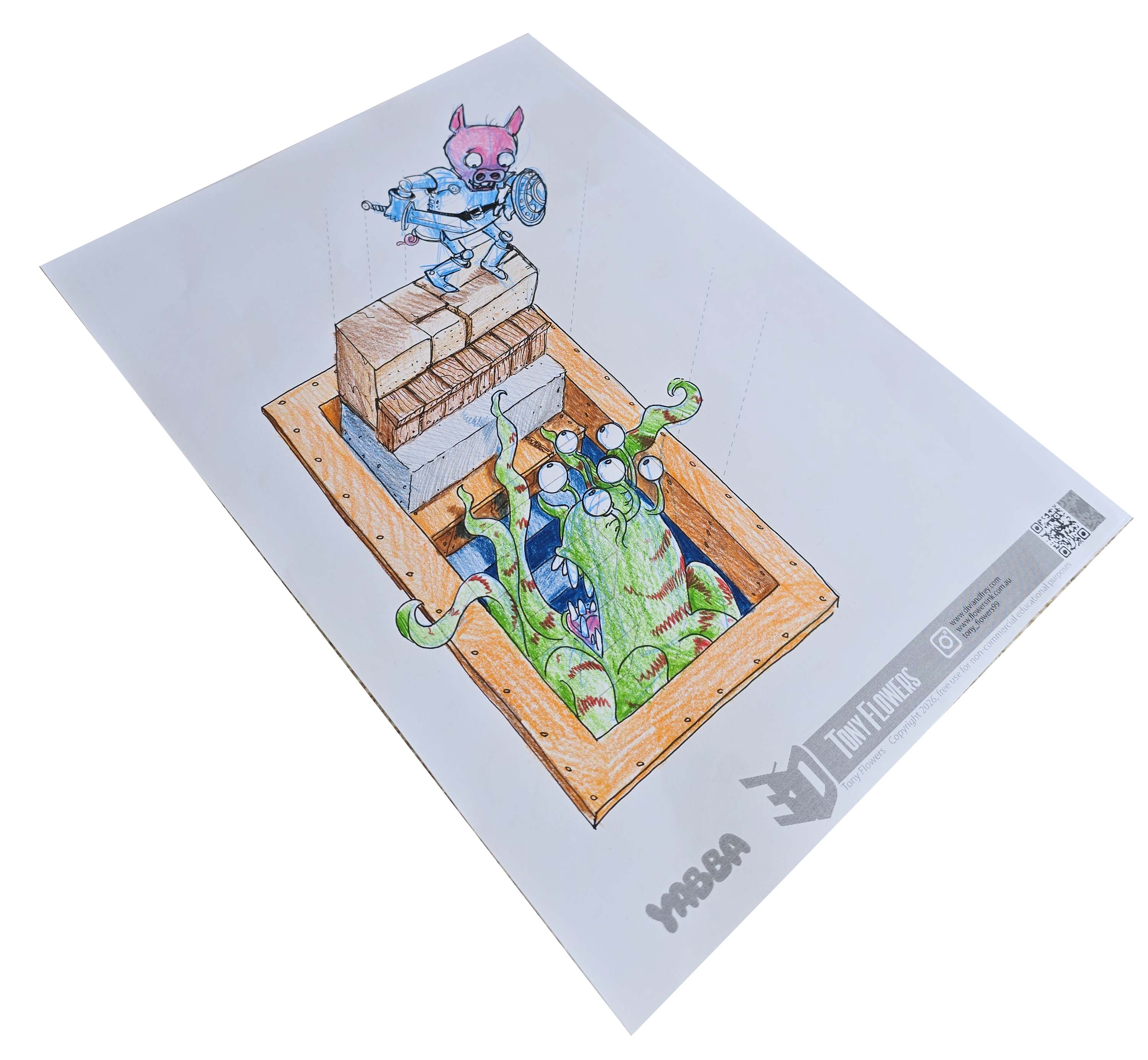
- Add shadows under each step to strengthen the illusion.
- Use contrast to separate the stairs from the “hole.”
- Add colour sparingly to enhance depth (cool colours recede, warm colours advance).
Drawing Tip
Before you start shading, take a moment to imagine where the light is coming from and what kind of light it is, direct sunlight, a single light bulb, or an overcast sky. Each type of light creates different shadow strengths. Stronger, more focused light sources produce darker, sharper shadows, and all shadows will fall away from the light in the same direction. Thinking this through first will make your illusion much more convincing.
Activity 3 : Characters & Objects Emerging From the Page
Time: 20–30 minutes Focus: Creative storytelling, perspective extension, visual literacy
Students add characters or objects interacting with the stairs:
- A character climbing or sitting on a step
- A creature peeking out of the hole
- A backpack, lantern, or treasure chest placed on a step
- A rope, vine, or ladder extending out of the page
Skill focus: Students use guide lines to determine the correct angle for objects so they appear to sit naturally in the 3D space.
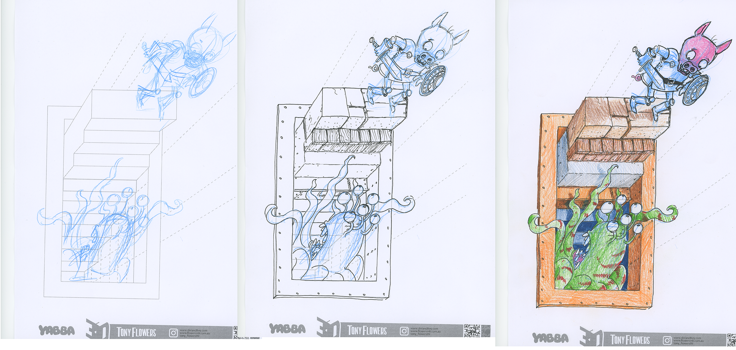
Challenge option: Extend additional objects beyond the staircase, e.g., a hand reaching out, a signpost leaning toward the viewer.
Ways to Enhance the Illusion
Students can strengthen the 3D effect by applying:
- Contrast: Darken the interior of the hole; lighten the top surfaces of steps.
- Colour: Warm colours for surfaces closest to the viewer; cool colours for deeper areas.
- Texture: Use material‑specific marks to add realism.
- Light & Shade: Decide on a light source and shade consistently.
- Edges: Sharper edges appear closer; softer edges appear further away.
Linking to Previous Posts
This activity naturally extends your earlier posts on:
- Elements of Design: line, shape, colour, texture, value
- Principles of Design: contrast, emphasis, movement, space, unity & variety
Alignment with the Australian Curriculum
English – Multimodal Literacy (Years 5–8)
Analyse how visual features contribute to meaning in multimodal texts.
Create texts that integrate visual, spatial and linguistic features for effect.
Visual Arts (1–10)
Explore and apply visual conventions (line, shape, space, texture, value) to communicate meaning.
Experiment with materials, techniques and processes to develop skills in 2D and 3D artmaking.
Create artworks that communicate ideas using visual conventions and design principles.
Reflect on how visual conventions and compositional choices influence audience interpretation.
Design & Technologies (Years 5–8)
Investigate how design elements and principles influence the functionality and aesthetics of designed solutions.
Generate and communicate design ideas using technical drawings and visual representations.
SCHOOL VISITS and TALKS
If you’re a teacher and would like me to visit your school to run workshops on visual storytelling, illustration, or writing process, you’re very welcome to get in touch through my speaking agents. I’d love to work with your students and staff.
In Australia:
Lamont Authors
https://www.lamontauthors.com.au/lamont_author/tony-flowers/
For International enquiries, contact me directly.

BOOK WEEK 2026 TOUR MELBOURNE

Leave a comment