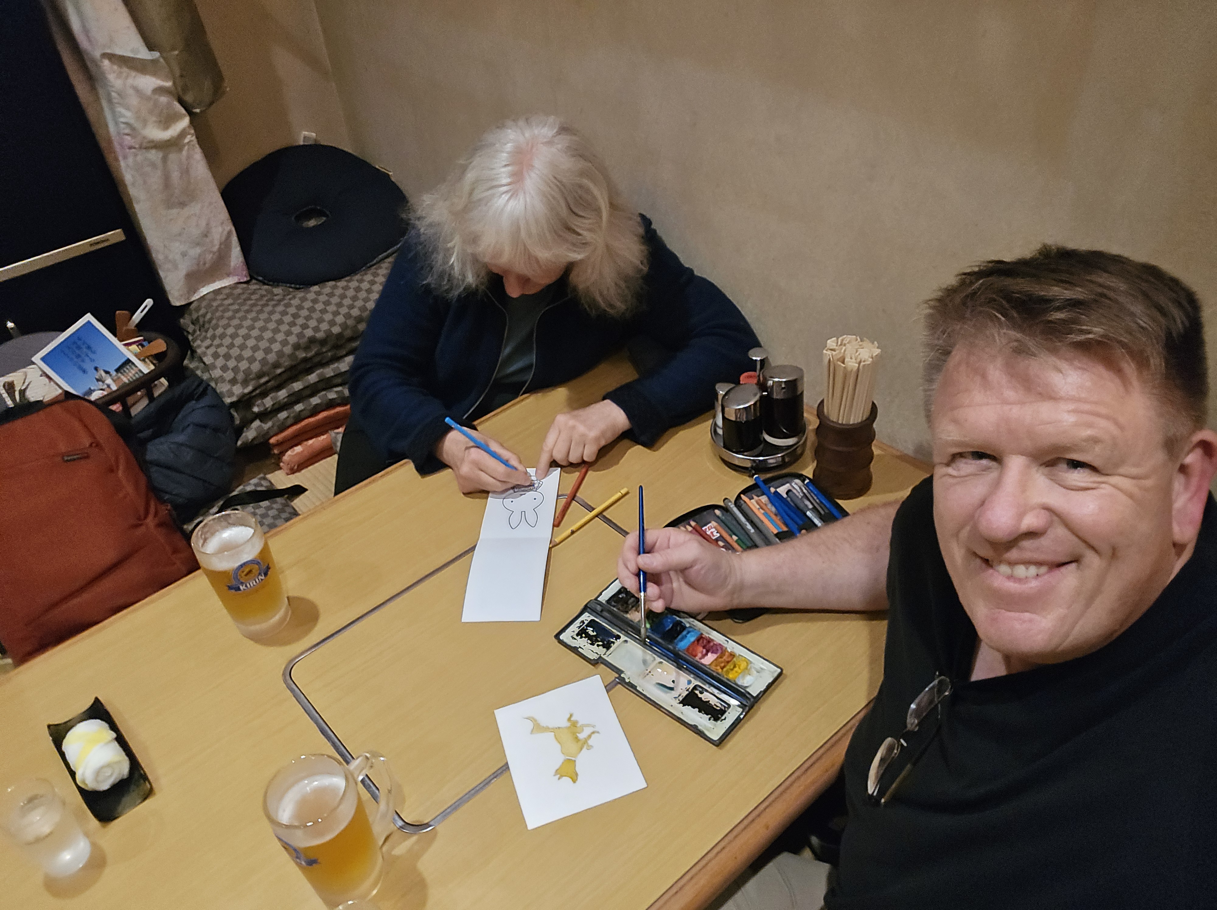
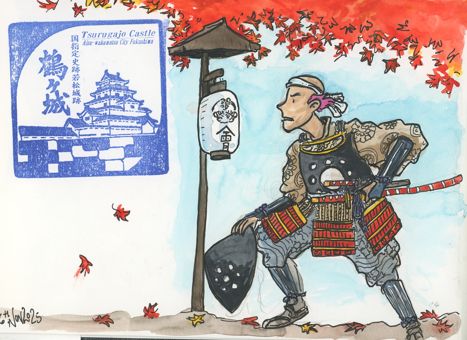
Japan has become one of my favourite places to explore, and this year I was lucky enough to return for my sixth trip. Each visit feels fresh, whether I’m wandering through ancient temples, weaving through neon‑lit laneways, or simply soaking up the rhythm of everyday life. This time, though, I travelled with a special creative focus: shaping the next adventure for my characters Divi and Frey.
Carrying a sketchbook changes the way you notice things. I found myself stopping at small details—a lantern outside a Hakone teahouse, the curve of a bridge in Nikko, or the steep steps of the old Takaido road. These everyday sights became sparks for story ideas. Divi and Frey thrive on adventure, and Japan’s mix of history, myth, and modern energy gave me plenty of material to weave into their next journey.
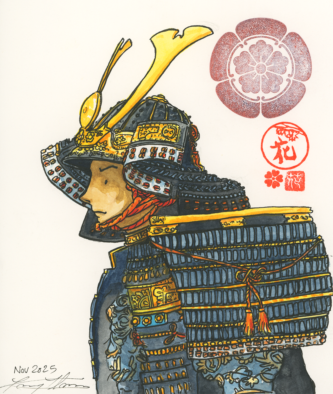
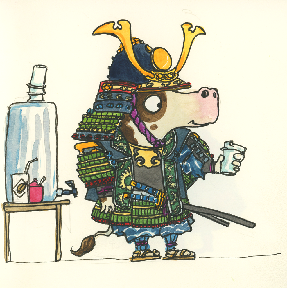
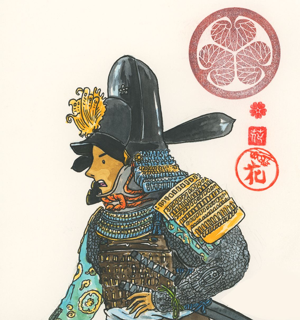
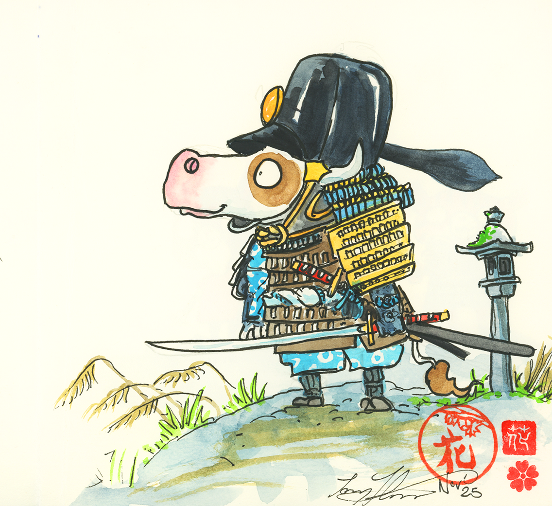
At the same time, another idea began to grow: a picture book series for younger readers. While Divi and Frey’s stories are full of twists and global escapades, the picture book concept is gentler, designed to capture curiosity and wonder in ways that younger children can connect with. I sketched objects and experiences from my travels—samurai armour, chefs flipping okonomiyaki, and lanterns (so many lanterns!)—and began reimagining them as part of a playful illustrated world for children to explore.
Looking back through my drawings, I can see how Japan’s textures and traditions have filtered into both projects.
A castle keep, mountain‑top temples, and samurai armour all find their way into Divi and Frey’s adventures, while simplified versions of these elements shape the picture book concept.
It’s a reminder that travel isn’t just about sightseeing; it’s about absorbing the atmosphere and letting it reshape your creative work.
Japan continues to inspire me with its contrasts: quiet gardens beside busy train stations, centuries‑old shrines next to futuristic towers. That balance between old and new mirrors the kind of stories I love to tell—ones that mix adventure with reflection, humour with heart.
As I refine these ideas, I’m grateful for the way travel feeds creativity. Whether it’s a grand adventure for Divi and Frey or a gentle picture book for younger readers, Japan has once again given me the spark I needed. And with six trips behind me, I’m sure there are many more stories waiting on the seventh.
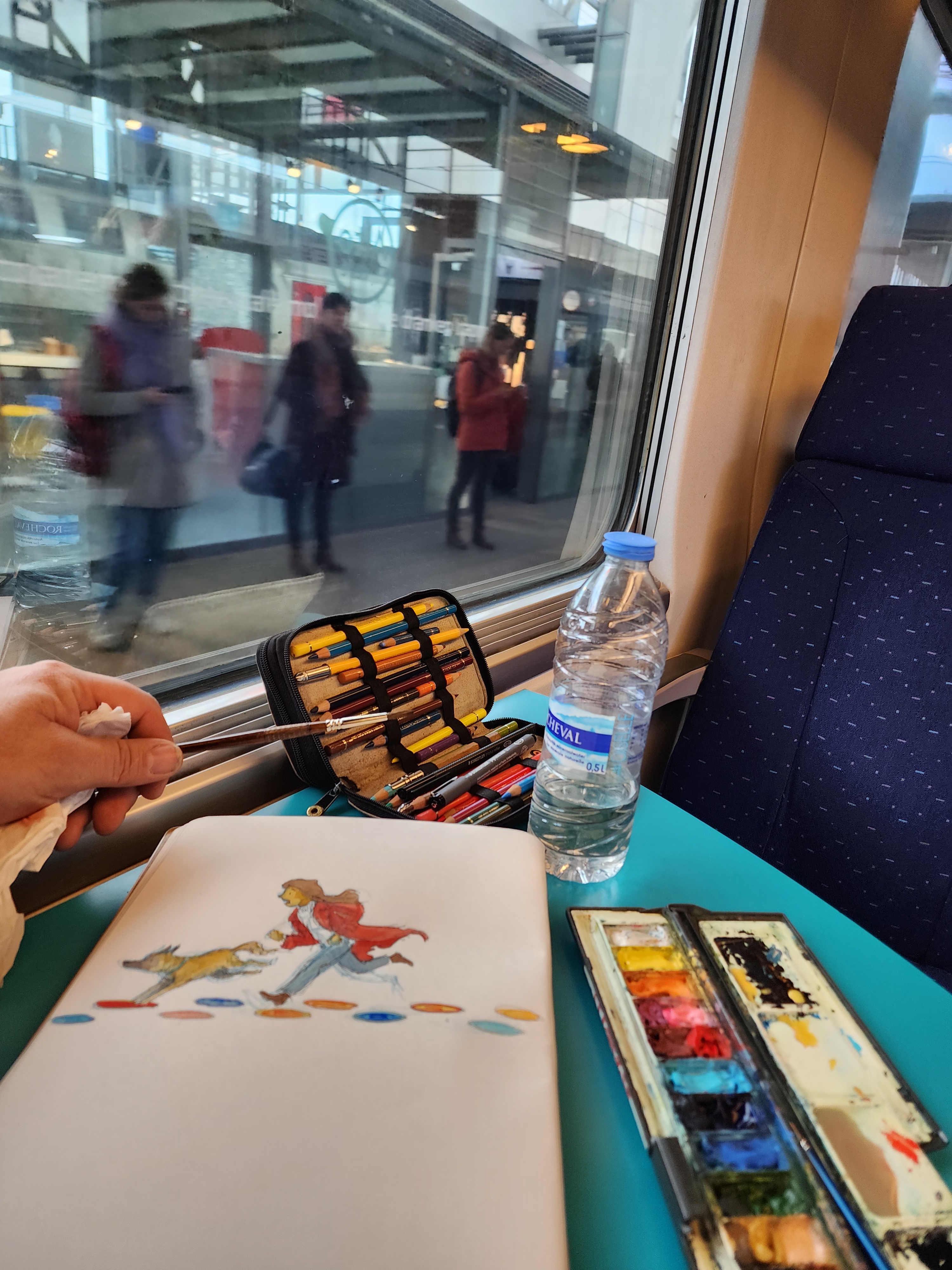
As someone who often works on my illustrations in public spaces—whether it’s my local café, an airport lounge, or mid-journey on a train—I’ve come to expect a certain kind of conversation. People spot the sketchbook, the watercolours, the characters taking shape, and inevitably ask:
“Are you working on a book?”
Sketching on a train (2024) while travelling in England
When I say yes—usually a graphic novel or picture book—the next line is almost always:
“I have an idea for a book!”
What follows is often an enthusiastic elevator pitch. Sometimes it’s a heartfelt personal story, sometimes a quirky concept with a twist ending. Occasionally, it’s accompanied by a generous offer: “If you like the idea, maybe you could illustrate it?” or “Could you take it to your publisher?”
I always appreciate the passion and creativity behind these moments. But I often have to explain that this isn’t how the publishing industry works. Generally, publishers prefer to pair a manuscript with an illustrator they believe can bring the text to life visually. They’re usually hesitant to take on projects from first-time authors and illustrators working together, as it can reduce the chances of the story being accepted.
So here’s the advice I always offer:
As interesting as a story idea may be, it’s not a story for publishing until you write it down.
Ideas are wonderful. They’re the spark. But they’re not the fire. A story doesn’t leap from your imagination to a printed book without that essential step: writing.
Tip 1: Start Writing
After talking with many authors and illustrators, it’s clear there’s no single “right” way to write. We’re all wired differently, and what works for one person might not work for another. But if you’re staring down a blank page and wondering how to begin, here are a few things I’ve found genuinely helpful:
Just start. Don’t wait for the perfect sentence or a fully formed plot. Begin with whatever’s in your head and let the words flow.
Forget the rules. Grammar, spelling, structure—none of that matters in the first draft. Your only job is to get ideas down.
Write without judgement. Don’t worry about whether it’s “good.” Just write. The more you do, the more you’ll discover what your story wants to be.
It’s okay to be messy. This is writing for your eyes only.
Back at uni, the HDR team used to run a session for master’s and PhD candidates called “Shut Up and Write.” And honestly, it’s great advice. Here’s how it works:
Set aside one hour of your day
Turn off distractions—no emails, no social media
Set a stopwatch for 15 minutes
Write like mad for those 15 minutes
Take a 5-minute break
Repeat the cycle three times
At the end of the hour, you’ll have a bunch of ideas written down. Some might go nowhere. Others might be the seed of something brilliant. Either way, you’ve started—and that’s the most important part.
Tip 2: Find Time and Build a Routine
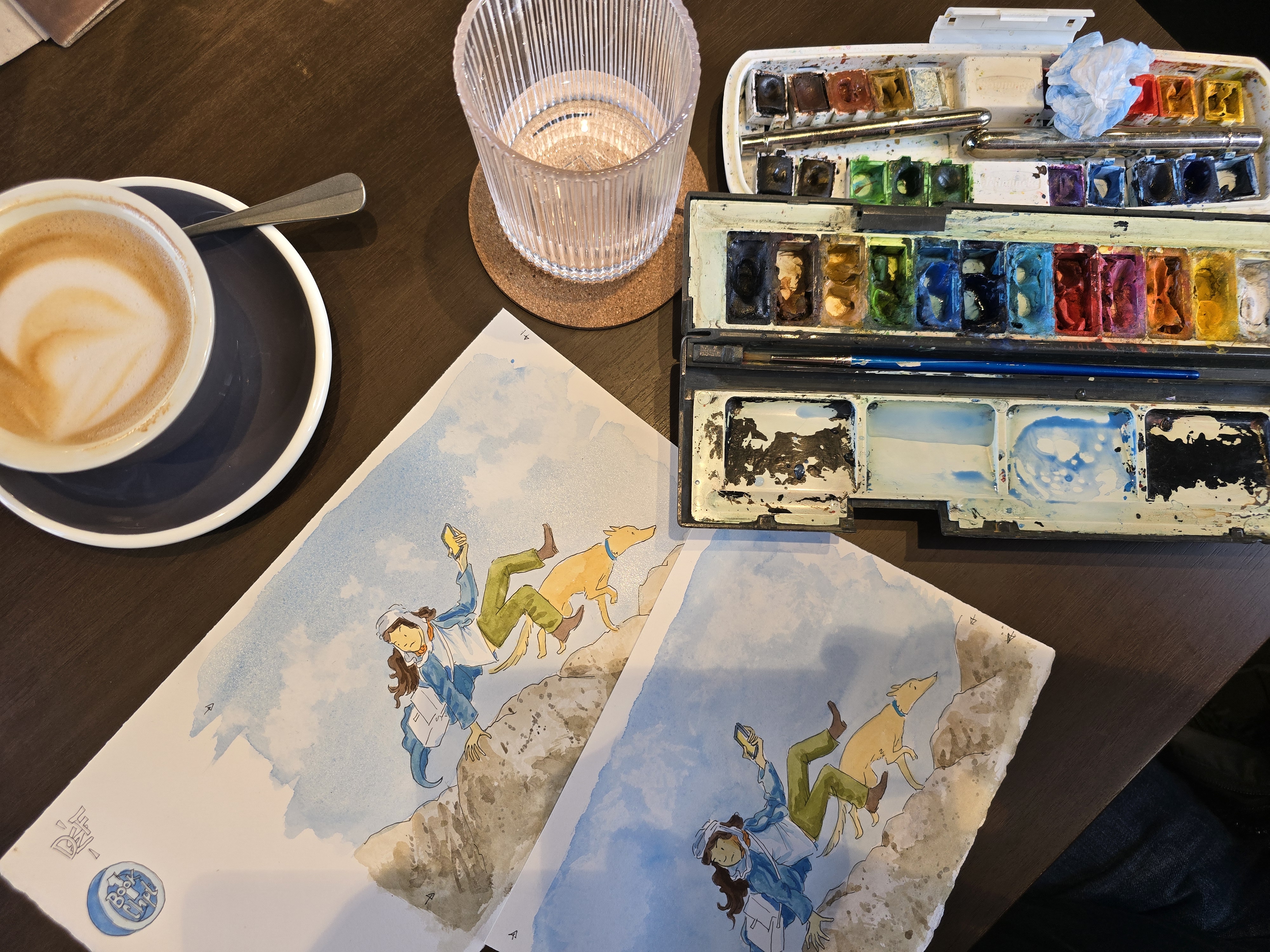
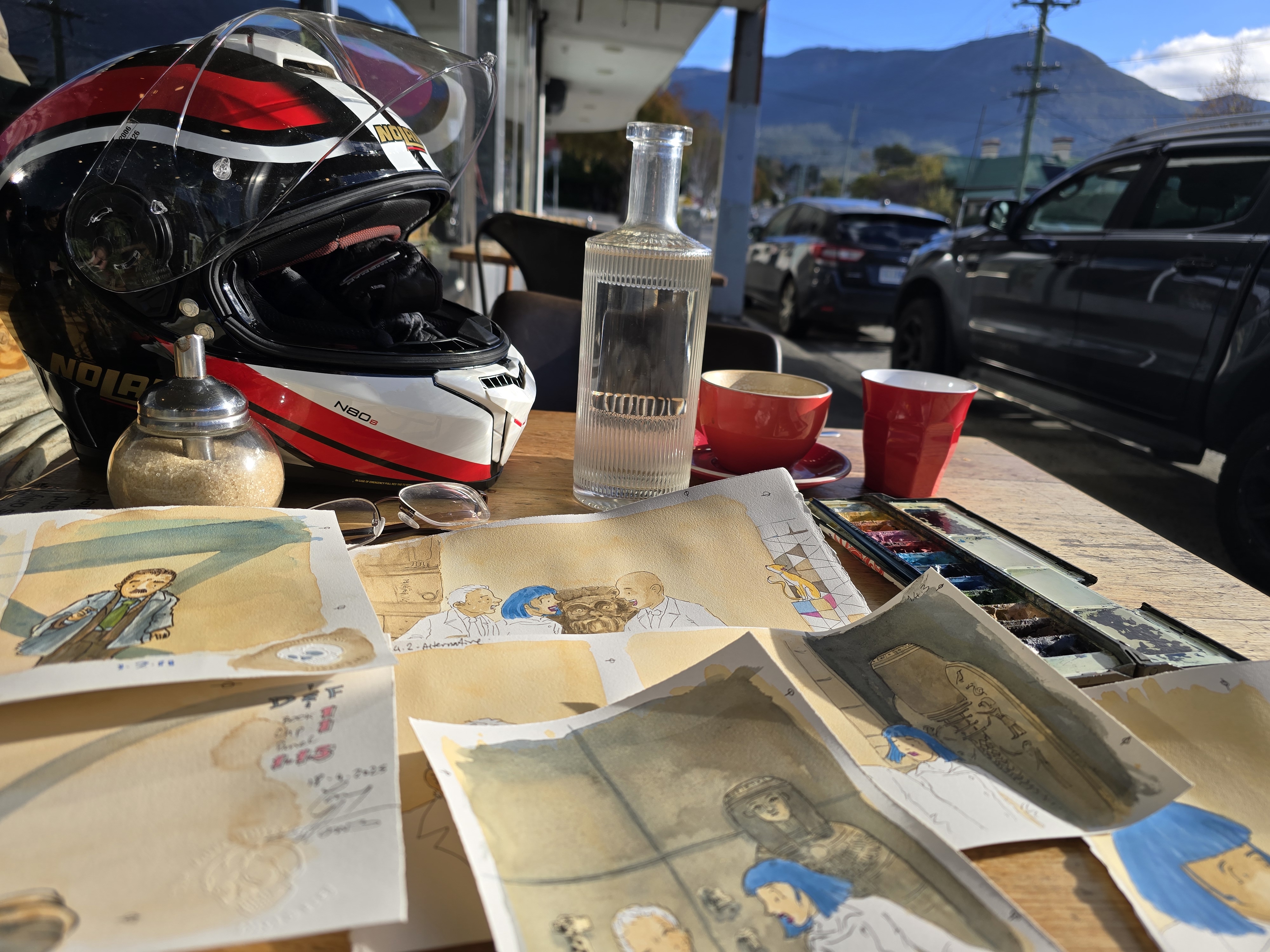
I start every day with a coffee (or two) in one of my local cafés and draw for at least an hour. Throughout the day, I look for pockets of time that would otherwise be wasted—sitting in a waiting room, waiting for a bus. These are perfect moments to pull out a notebook or sketchbook and scribble for five minutes.
The simplest way to do this? Swap your phone scrolling time for scribbling time—or at least cut the phone time in half. You’ll be surprised how much you get done.
Tip 3: Match the Space to the Task
Not all writing time is about crafting perfect words. Different parts of the process need different environments.
I can work on rough sketches and notes anywhere. I always carry a sketchbook and plan travel sketchbooks to keep ideas from each trip in one place. But when I’m working through a manuscript and need to concentrate, I often wear noise-cancelling headphones at the café or work from home when it’s quiet.
Once the planning is done, I can work on final illustrations anywhere with enough space. I choose cafés where I’m less likely to be bumped or where the tables are large enough—especially when working on large-format illustrations.
Tip 4: Shaping a Story Is a Process
You don’t sit down and write a finished novel or picture book from the start. You’re beginning a process. Everyone writes differently, so it’s important to find what works for you.
Here’s What Works for Me
Personally, I use a mix of sketches, rough story maps, character designs, and text to generate a story. It’s not a neat, linear process. I jump between these tools as needed, letting the story evolve organically. Sometimes a character sketch sparks a plot twist. Other times, a rough map of the story arc helps me refine a visual moment.
Eventually, I need to bring it all together—especially when it’s time to present the idea to a publisher or plan it out for a book format. That’s when I shift into layout mode. I create storyboards and rough page designs to explore how the images and text will interact. I ask myself:
How do the images work together to form a visual narrative?
How do they flow across a page and through the structure of a book?
Where does the reader pause, turn, or feel something shift?
This is where the story starts to take shape—not just as a collection of ideas, but as a cohesive experience for the reader. It’s a dance between words and pictures, rhythm and pacing, emotion and clarity.
Stories Are Everywhere—But They Need You to Write Them
I love these spontaneous conversations with strangers. They remind me that storytelling is alive and well, bubbling just beneath the surface in everyday life. But if you want your story to grow beyond an idea—if you want it to live in the hands of readers—it starts with writing it down.
So next time inspiration strikes, don’t just tell someone about it. Grab a notebook, open a document, or sketch out your thoughts. That’s where the real journey begins.
As an illustrator and storyteller, I’ve always been drawn to the wisdom handed down by creative legends—those rare individuals who manage to distil complex ideas into deceptively simple truths. Whether it’s Wally Wood’s iconic “22 Panels That Always Work”, the foundational Elements and Principles of Design, or Pixar’s 22 Rules of Storytelling, these are the tools I come back to time and time again. They’re not rigid rules—they’re creative compasses.
I love detail. I live for it. The texture of a cobblestone street, the folds in a costume, the way light falls across a scene—these are the things that make a world feel real. But I’ve learnt (sometimes the hard way) that detail without purpose can muddy the story. It’s a balancing act: knowing when to go wild with intricacy and when to pull back for clarity.
Rule 5 reminds me that storytelling is about intentional choices. Every character, subplot, and visual flourish should serve the narrative. If it doesn’t, it’s a detour—and while detours can be fun, they can also lead readers away from the heart of the story.
Wally Wood’s Panels and Visual Economy
Wally Wood’s “22 Panels That Always Work” is a masterclass in visual storytelling. It’s not about drawing more—it’s about drawing smart. His panels show how composition, contrast, and framing can convey drama and emotion without cluttering the page.
When I’m sketching panels for Divi and Frey, I often think of Wood’s work during the self-editing phase. I ask myself:
Can I say more with less? It’s not about stripping everything away—it’s about identifying what’s essential in the frame.
Is this detail enhancing the mood, or is it just me having fun? I don’t cut out the details I love to draw—I refine how I use them. Detail should support the story, not distract from it.
My old ceramics lecturer, Rynne Tanton, once challenged us with the question: “What is a cat?” The idea was to distil the essence of a feline form into as few lines as possible. Once you’ve nailed that, you can build back up to the version you want. That same thinking applies to illustration.
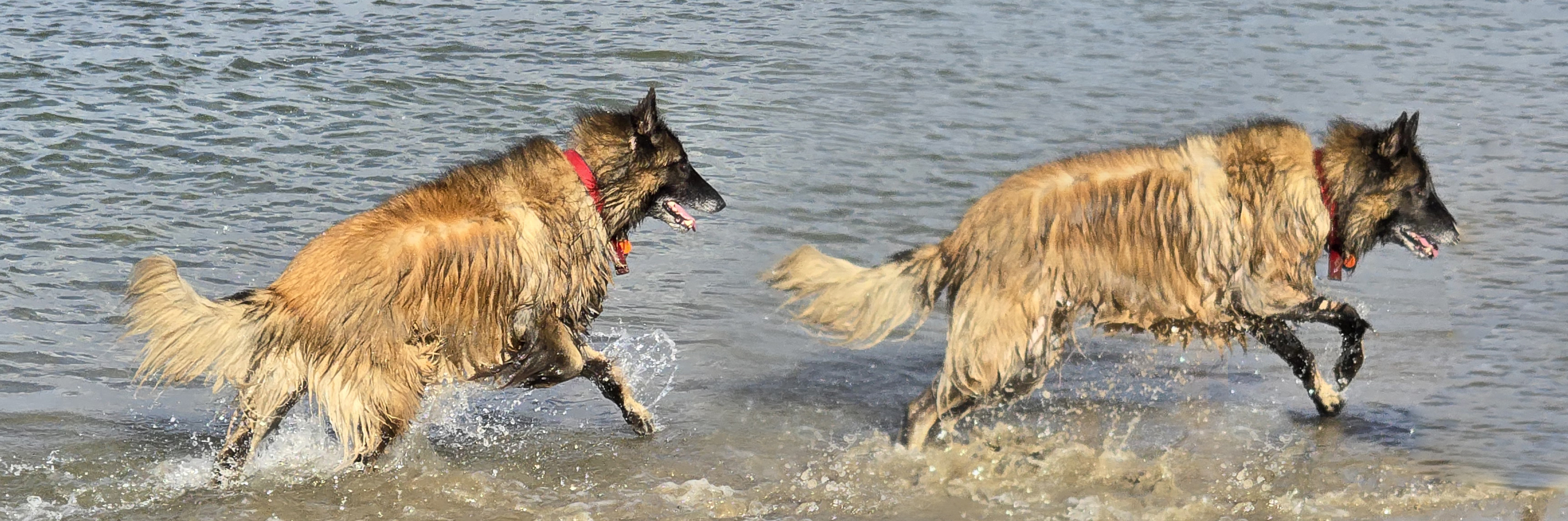
I used this approach in Designing the character image for Frey.
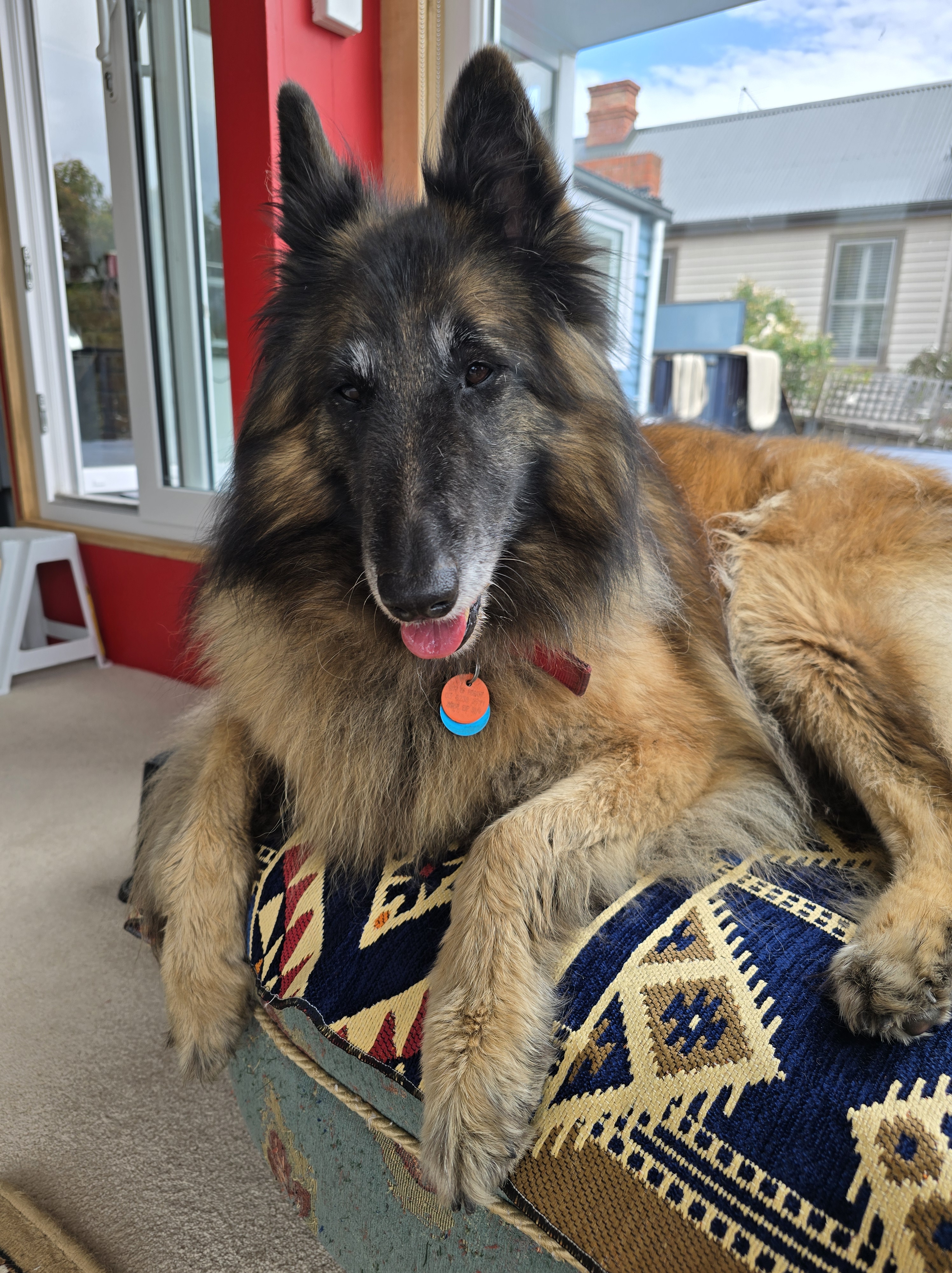
The real Freya is a shaggy, Multicoloured bundy of joy (pictured above on the beach in Tasmania). When I looked at first looked at drawing her, I was trying to capture her long hair.
Then I realised the the essence of Frey was not her long fur. It was her movement and attitude.
Applying Rule 5 to Illustration
In my own work—especially in Divi and Frey—I’ve found Rule 5 applies just as much to drawing as it does to writing. When designing a scene, I ask:
What’s the emotional beat here?
What are the characters trying to do or say?
What visual elements support that?
What can I strip away to make the moment land?
Sometimes I go full tilt with detail—a cluttered room might reveal a character’s personality, or a dense jungle might heighten mystery. But I’ve learnt to be ruthless in editing. If it doesn’t serve the story, it’s out.
Principles Meet Storytelling
The Principles of Design—balance, contrast, emphasis, rhythm—are storytelling tools too. They guide the eye, shape emotion, and create narrative flow. When paired with Pixar’s storytelling rules, they become a powerful framework for crafting immersive, emotionally resonant experiences.
Final Thoughts
Rule 5 is a personal challenge, but also a creative liberation. It forces me to ask: What’s essential? What’s noise?
And in that tension, I find clarity.
So if you’re just starting out in illustration or looking to sharpen your storytelling, my advice is this: simplify, focus, and tell stories that work—whether through words, panels, a well-placed shadow, or a glorious explosion of detail that serves your story.
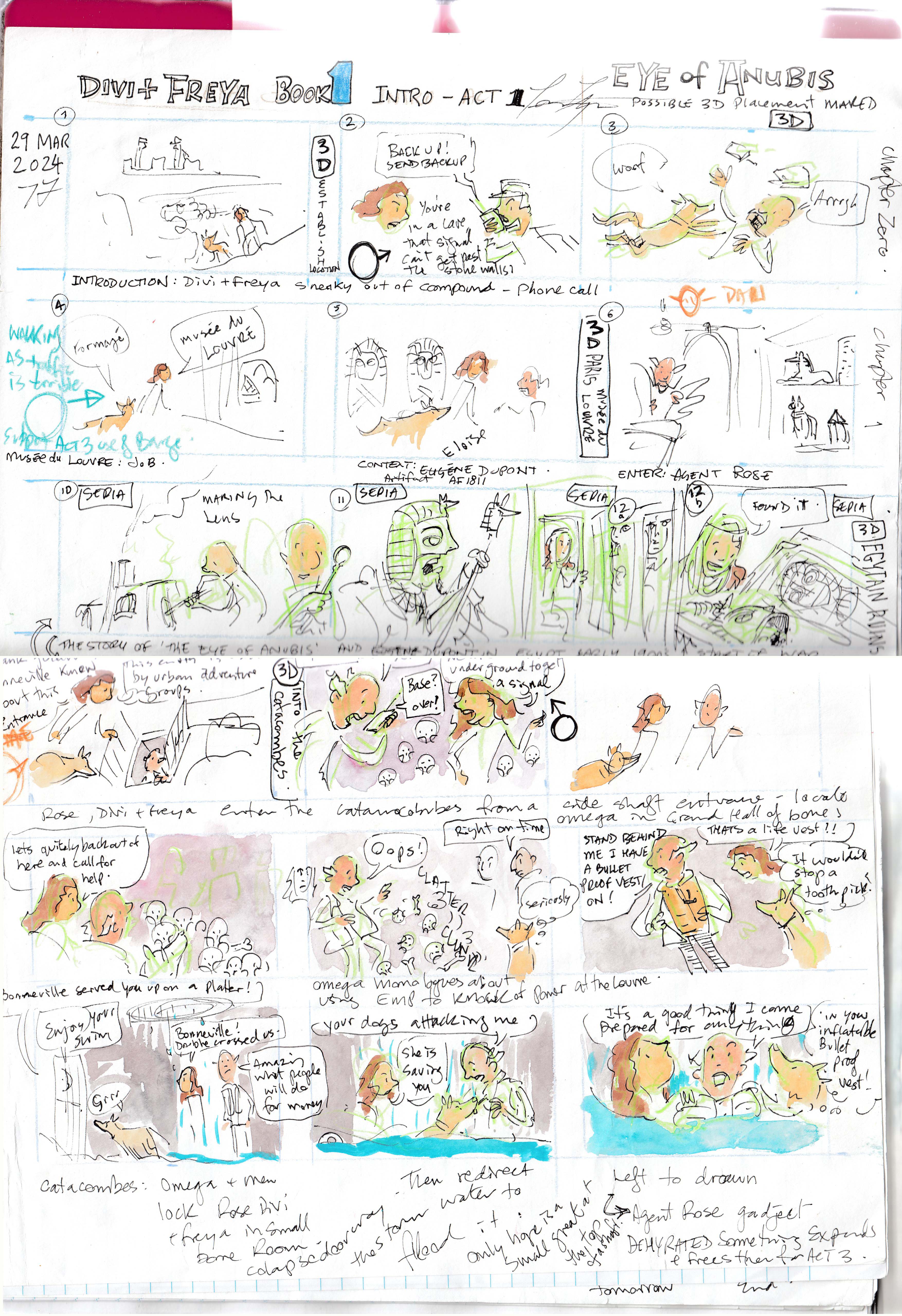
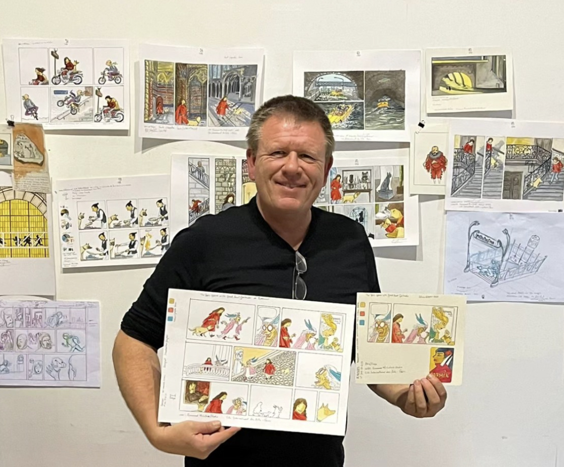
One of the most common questions I get asked is, “Where do your ideas come from?” Like many illustrators, I stay open to inspiration in everyday life. But for my graphic novel series Divi & Frey, I had to take that to a whole new level—turning daily moments into full-blown adventures.
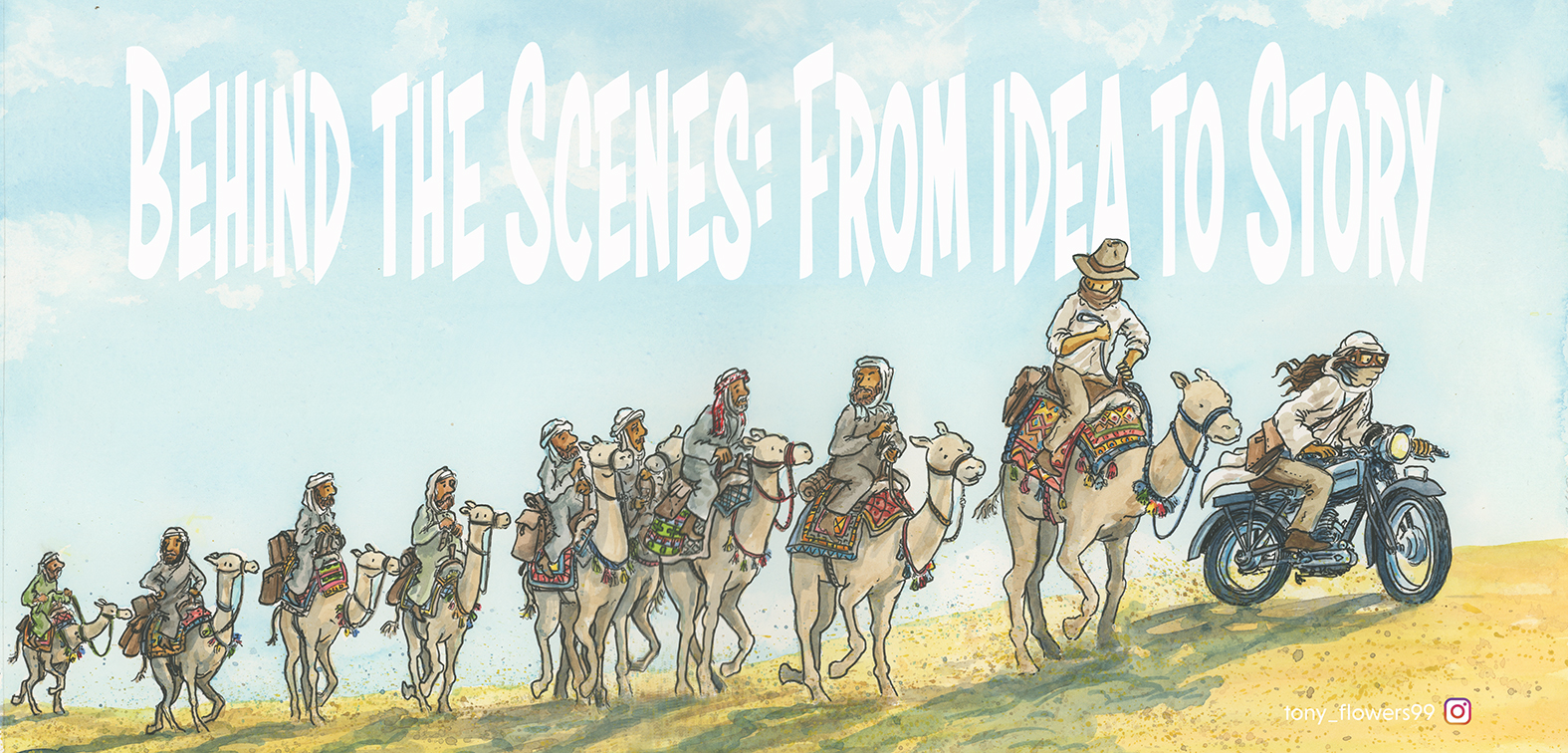
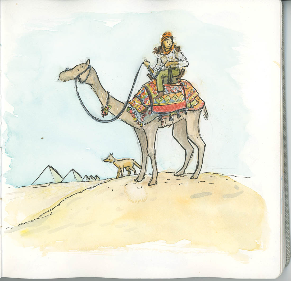
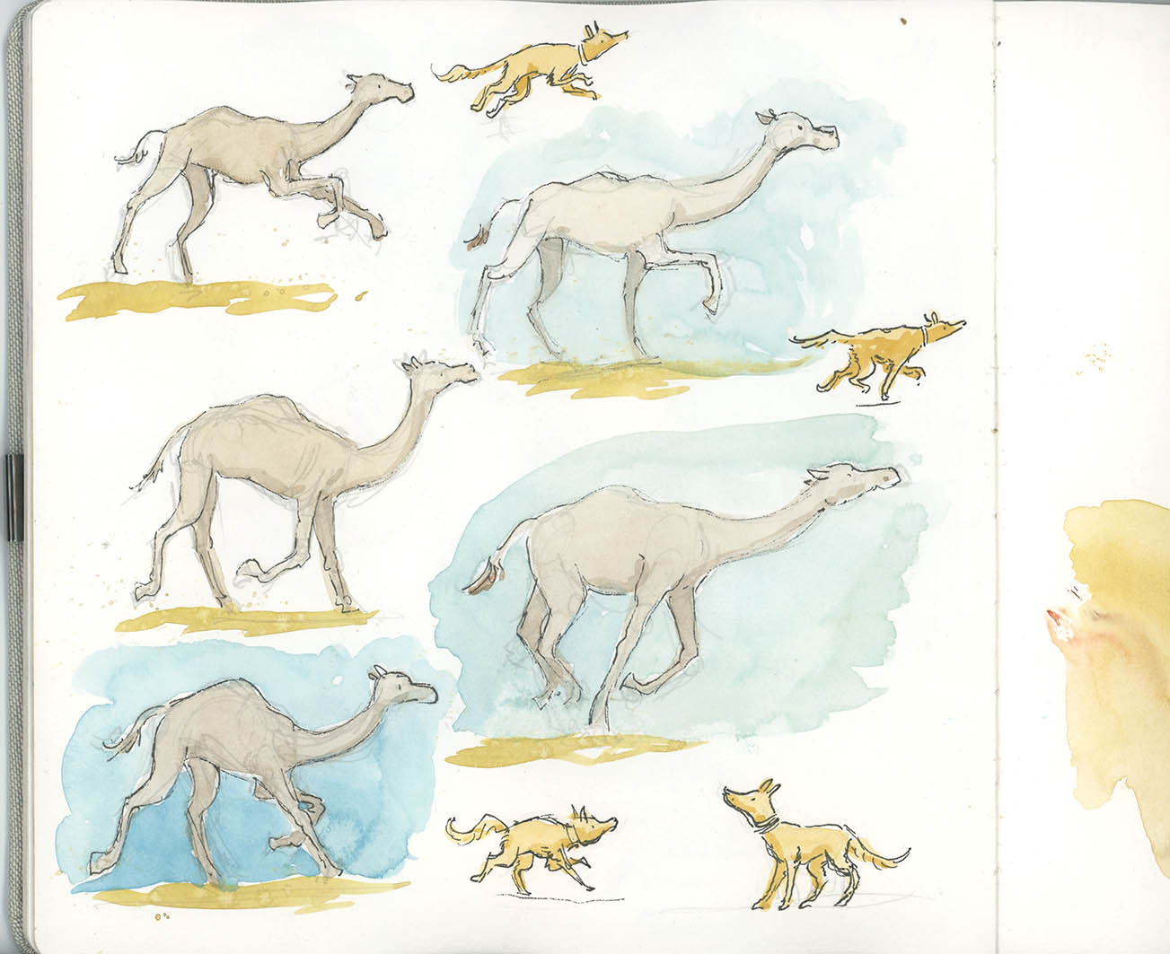
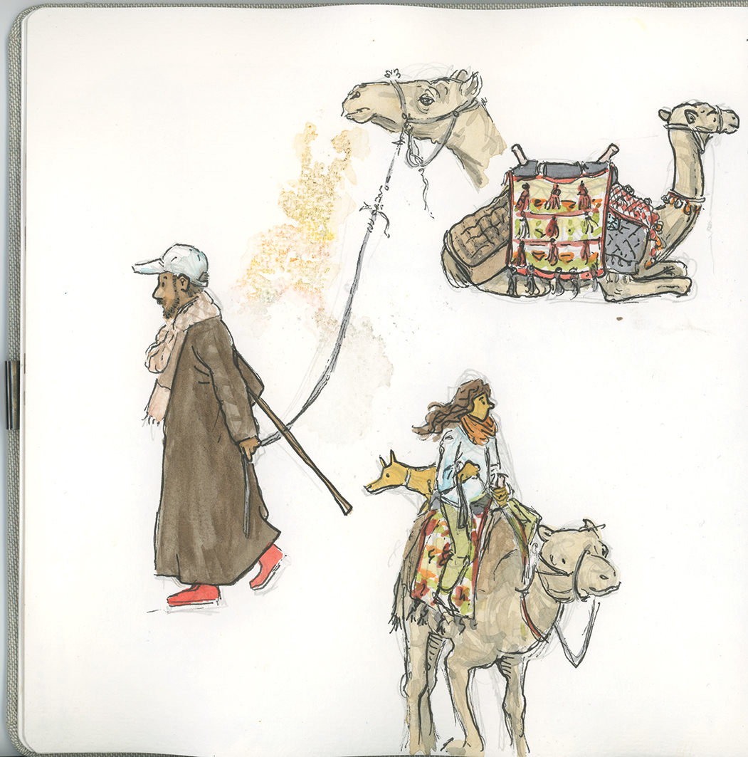
To create the Paris-based story with Egyptian sections for Book 1, I spent time as an artist-in-residence at the Cité des Arts in Paris and travelled for three weeks through Egypt. These experiences filled my sketchbooks with moments that would later shape the story.
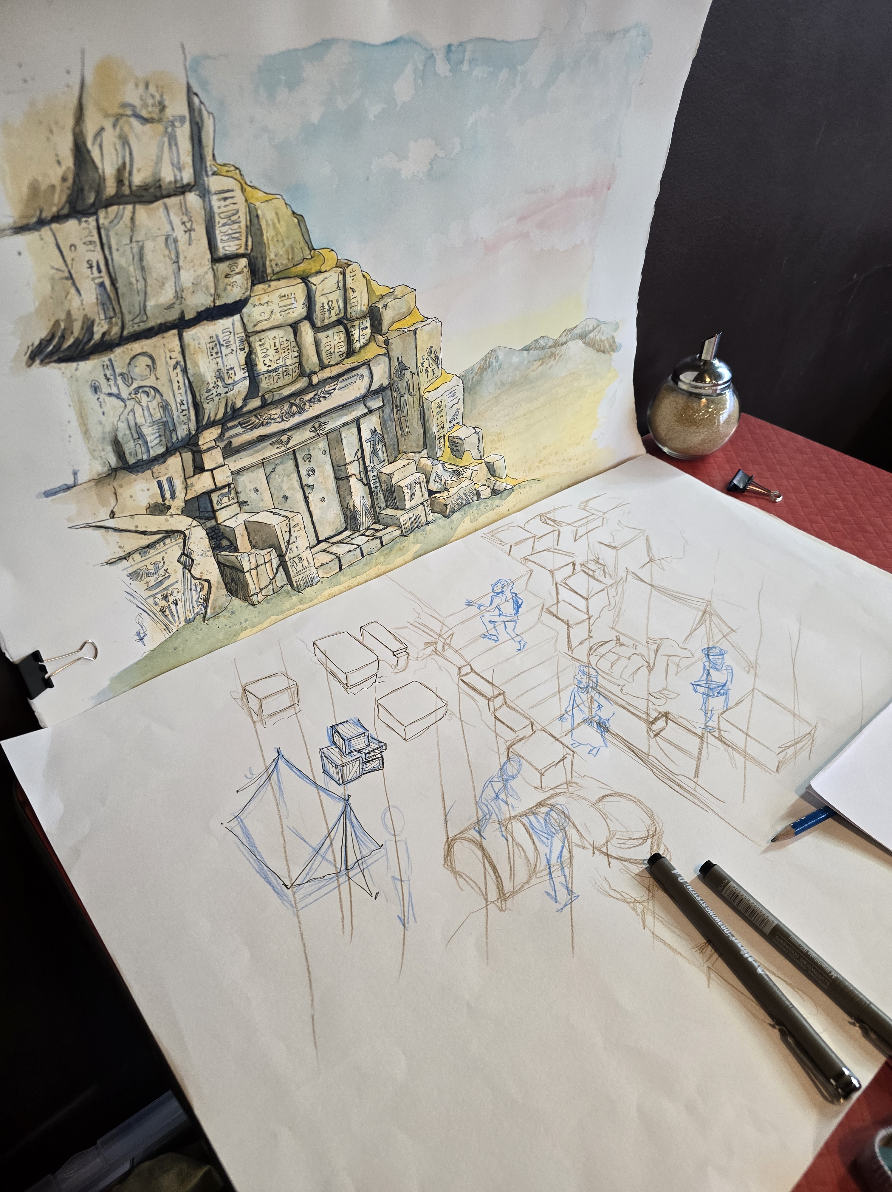
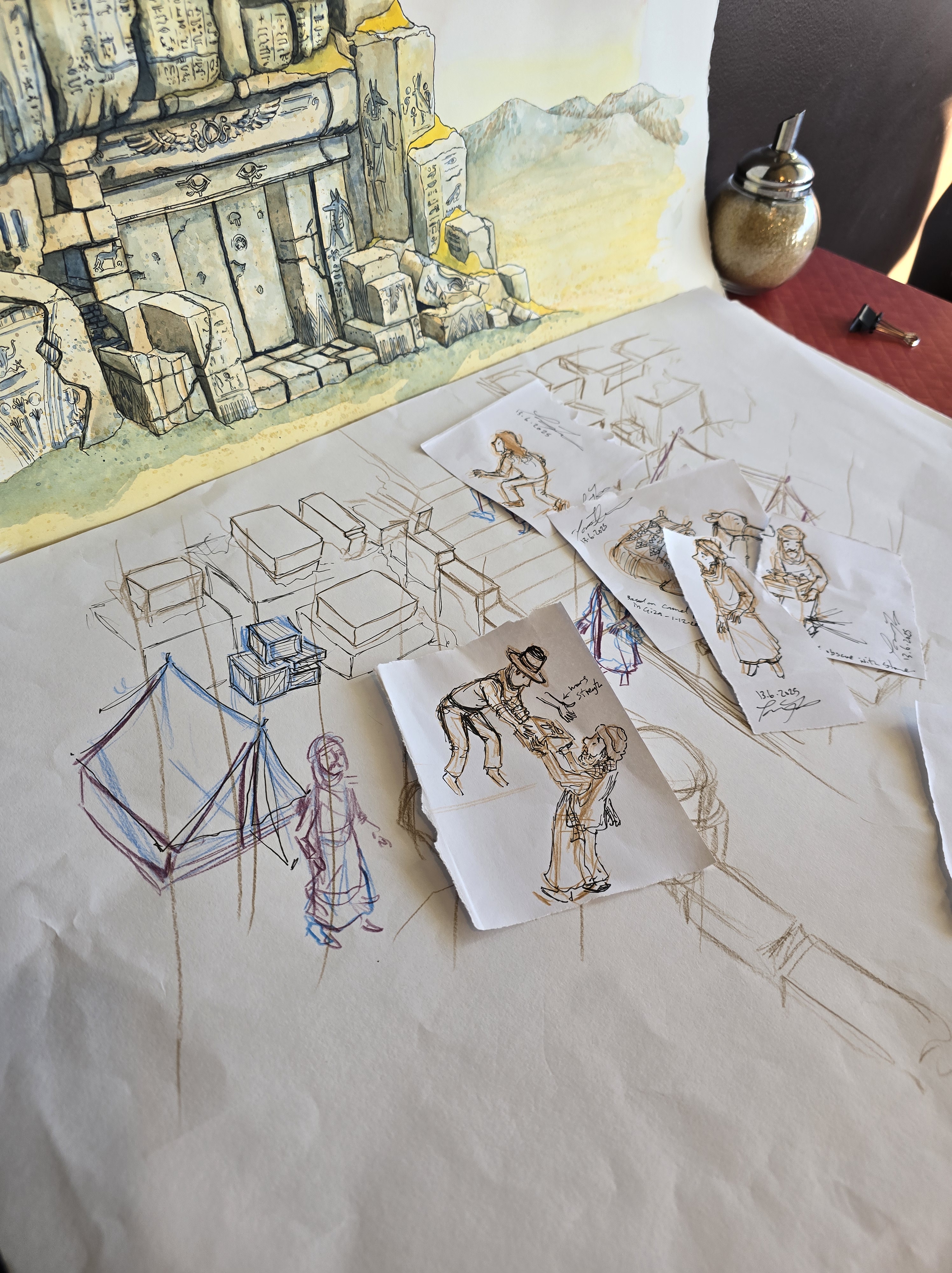
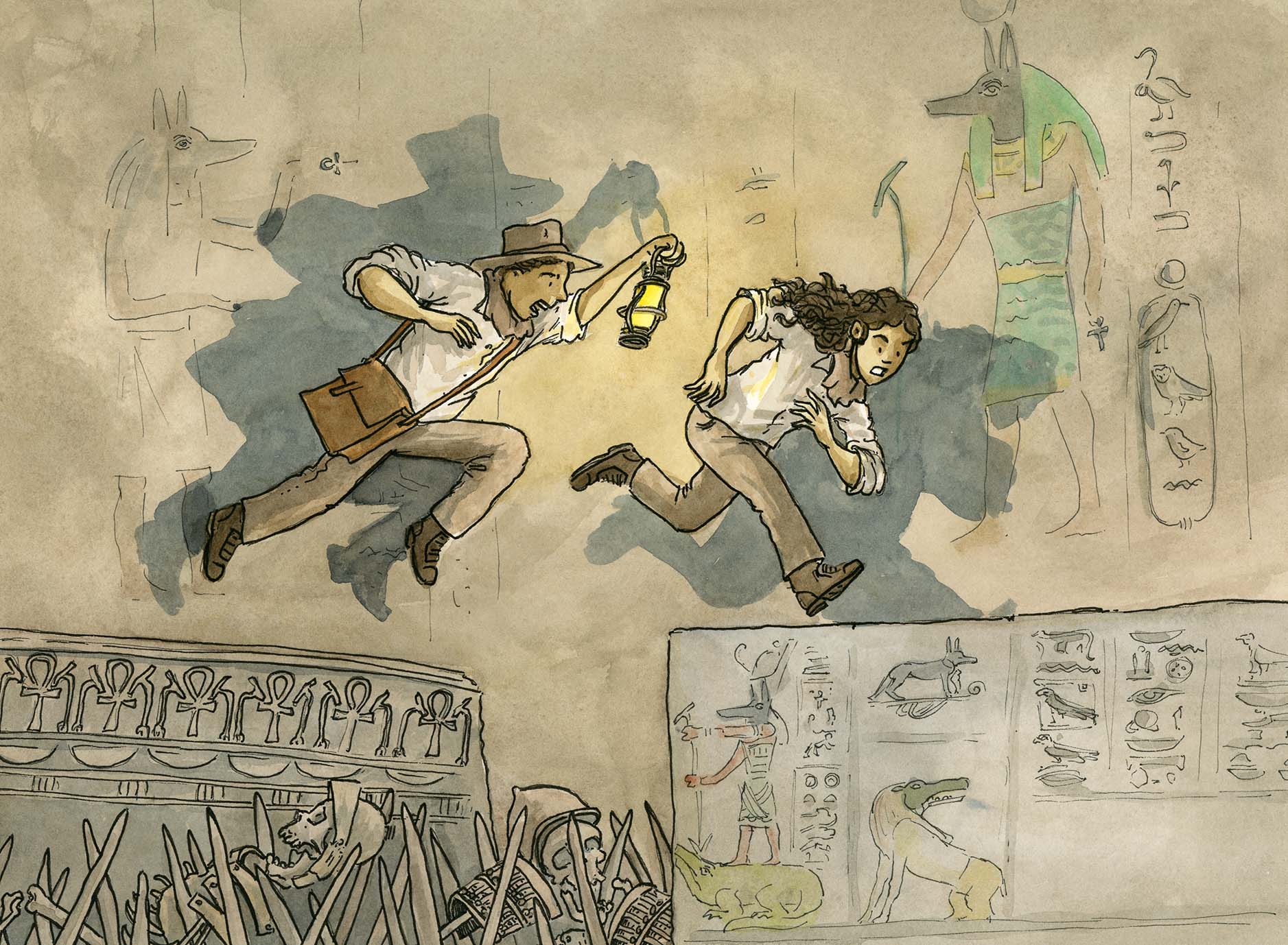
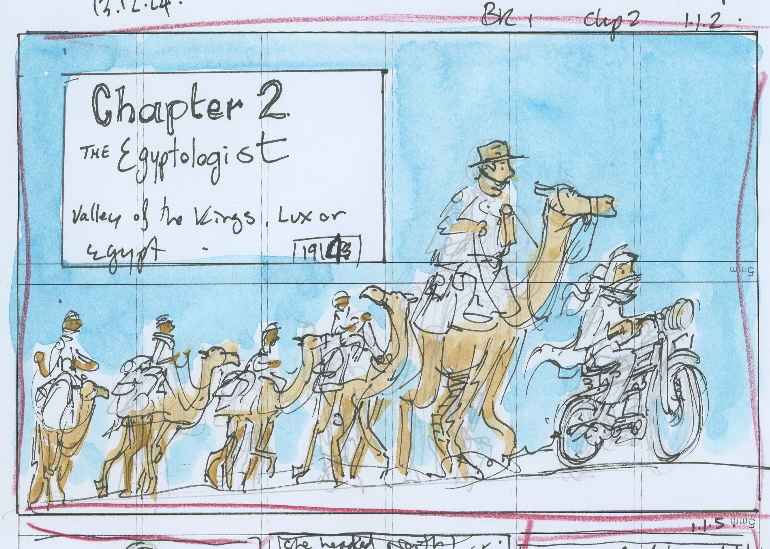
For this first ‘Behind the Scenes’ post, I thought the Chapter 2 banner (image above) would be a great example of how a moment and a sketch evolve into a finished illustration.
Step 1: The Idea Spark
Inspiration often begins with a fleeting moment—a place, a smell, a story, or a feeling. I jot down notes or sketch in my A5 landscape sketchbook to capture the mood and explore the subject. I also take reference photos to help fill in the details later.
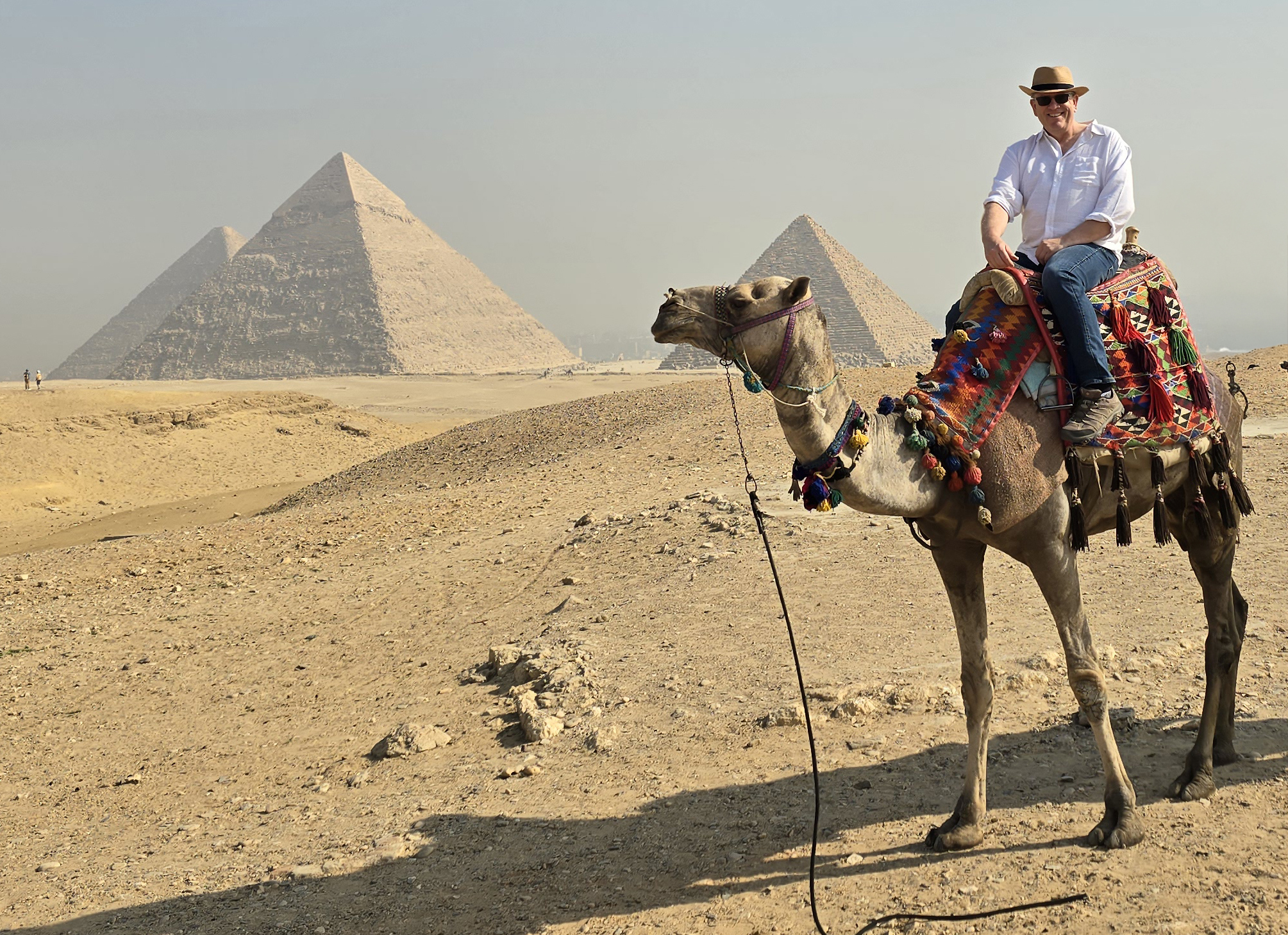
The Pyramids of Giza (December 2024)
Step 2: Rough Sketches
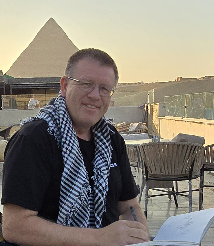
Sketching by the Pyramids (December 2024)
This is one of my favourite stages. I sketch fast and loose—sometimes dozens of versions of a character or scene. It’s messy, experimental, and often only makes sense to me. I treat it like casting actors, testing wardrobe, and scouting locations for a visual story.
Step 3: Refining the Composition
Once a rough sketch feels right, I refine the lines, adjust the layout, and add background elements. I think about how the illustration will work with the text. Then I storyboard the sequence—mapping how each scene connects and how the reader’s eye moves across the page. It’s like choreographing a silent dance.
Step 4: Final Sketch and Paper Prep
I prepare a final sketch at the scale I’ll be drawing. For Divi & Frey, I work at a 2:1 ratio for most illustrations and 1.5:1 for 3D illusion scenes. I sketch on photocopy paper, then use a light pad to trace the final outline onto watercolour paper.
Paper choice matters. I use cold-pressed 100% cotton for picture books and hot-pressed cotton for Divi & Frey to support finer linework. I stock up in bulk—30 to 40 sheets at a time—to ensure consistency across the project. Book 1 will include over 1,000 individual illustrations!
Step 5: Colour, Ink, and Final Washes
I begin with base watercolour washes, building layers gradually to create depth and texture. I focus on lighting, colour harmony, and character mood. Once the colour is about 95% done, I ink the final linework, then add shadow washes to ground the characters and unify the composition.
Step 6: Scan, Format, and Layout
Once the illustration is complete, I scan it at high resolution (usually 400 dpi or higher). Depending on your publisher, they may handle scanning and layout, so always check your contract for delivery requirements, file formats, and colour profiles.
For Divi & Frey, I place the scanned artwork into my rough layout using Adobe InDesign, positioning it alongside text and speech bubbles. This is when I truly see if the image works—cropping, framing, and flow all come together. It’s incredibly satisfying to watch a sketch come to life on the page.
Final Thoughts
Illustration isn’t just about drawing—it’s about thinking visually and chasing the story behind a moment. So next time you see a finished page in a graphic novel, remember it probably started as a scribble in the corner of a sketchbook.
Paris is often described as magical. For me, it was creatively catalytic.
Rosamond McCulloch studio building, Cité Internationale des Arts, Paris (Dec 2023)
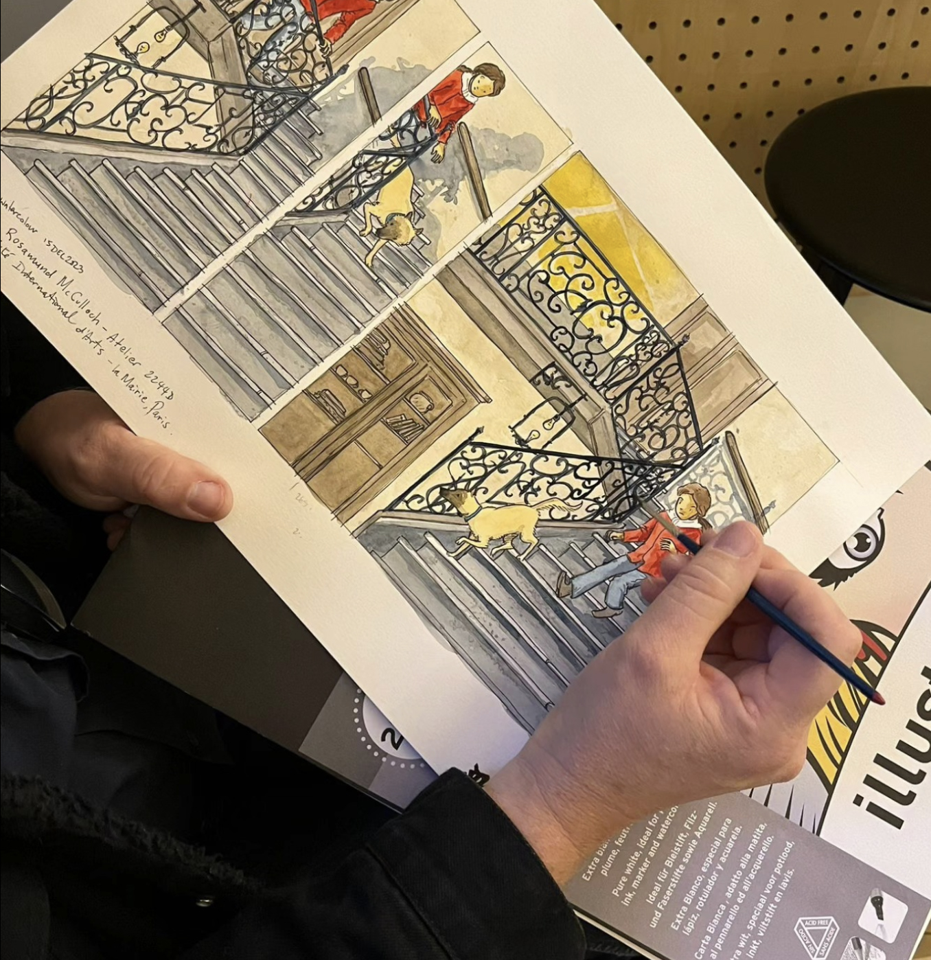
In early development for Divi and Frey and the Curse of Anubis, Book One of the series, I lived and worked at the Cité Internationale des Arts as part of the University of Tasmania’s Rosamond McCulloch studio artist-in-residence program. Unlike the whirlwind of a tourist sprinting between monuments, I had the rare luxury to be still—to absorb the place fully and let Paris slowly sketch itself into my imagination.
The staircase in the Rosamond McCulloch studio building, Cité Internationale des Arts, Paris (Dec 2023)
Inspiration in the Bones and Canals
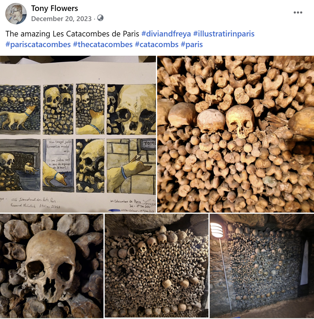
From wandering the halls of the Louvre to drifting beneath the Bastille through the canals of Saint-Martin, Paris unveiled layer upon layer of history and story. The catacombs—oh, the catacombs! I had expected to feel solemn reverence, maybe even quiet awe. What I got was that plus a moment of unexpected hilarity.
As we moved through tunnels adorned with carefully stacked bone and skulls arranged in pattern —a young family followed a few steps behind. The parents issued the standard warnings: “Be careful.” “Don’t touch.” And then… a clunk in the dark. A child’s voice echoed: “Whoopsy, Daddy!” Cue an avalanche of imagined disaster—bones tumbling, curses activating, Frey having to dodge a femur trap.
Les Catacombes de Paris (Dec2023)
Of course, it was only a loose stone kicked down the path. But the moment stuck—this humorous little spark inside such a haunting place. These are the small moments that became woven into the fabric of Divi and Frey. Moments of unexpected playfulness that bring characters to life in unexpected way..
Rosamond McCulloch studio, Cité Internationale des Arts, Paris (Dec 2023)
Living, Drawing, Discovering
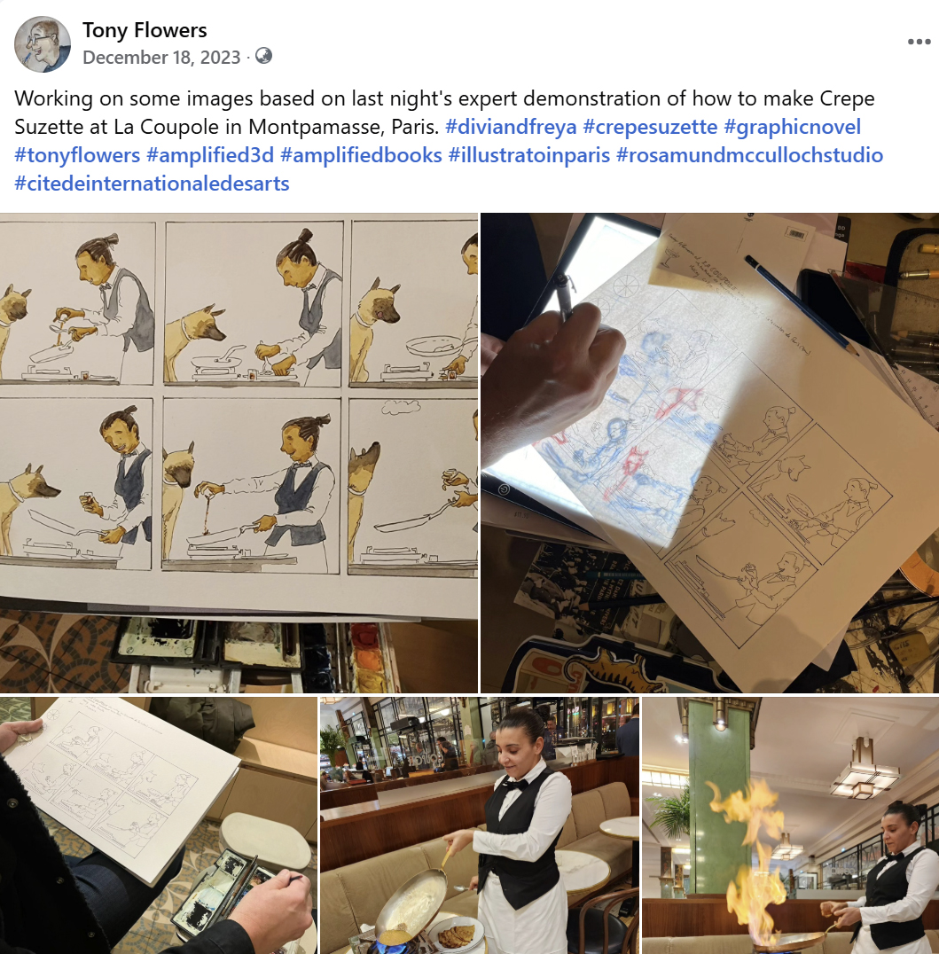
Paris wasn’t just the backdrop; it was like having a collaborator. Living as an artist in residence gave me something deeper than a checklist of sights. I sketched crepe preparation techniques at café Montpamasse, marveled at how effortlessly a waiter turned batter into golden spirals with a flick of the wrist.
La Coupole, how to make a Crepe Suzette, Montpamasse, Paris (Dec2023)
I wandered medieval alleyways imagining how Divi might get lost there… or escape something ancient and cursed. That immersive experience helped me breathe life into this graphic novel—a story that blends Egyptian mythology, Paris, and a cinematic adventure brough to life on the page.
The Hunt for Future Homes
Now that Book One is on its way, I am always on the lookout for other places that might shape future Divi and Frey adventures. If you run a creative residency and think your location would suit a bit of mythical mischief, please get in touch. There might be a chapter waiting to be set in your part of the world.
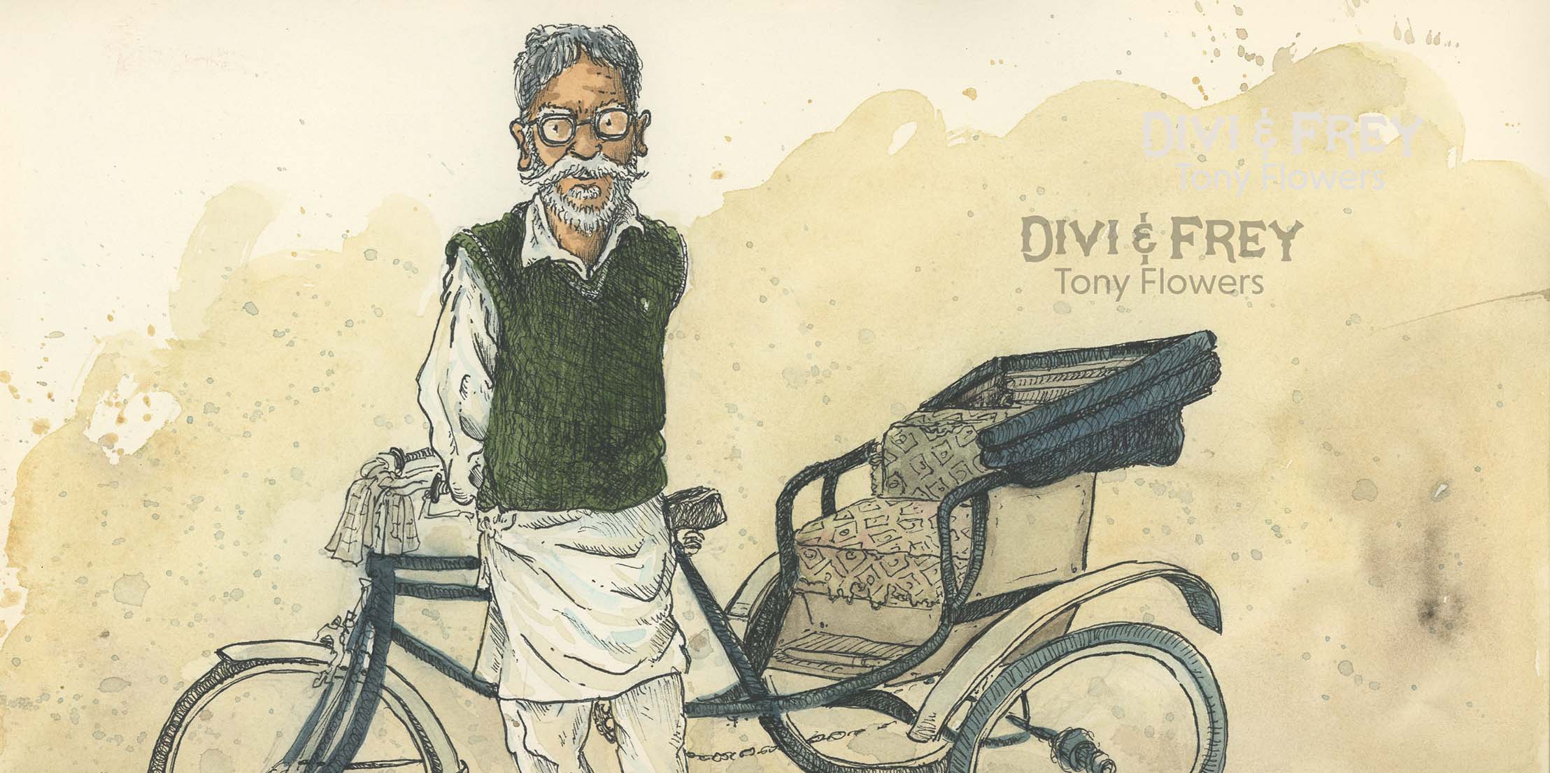
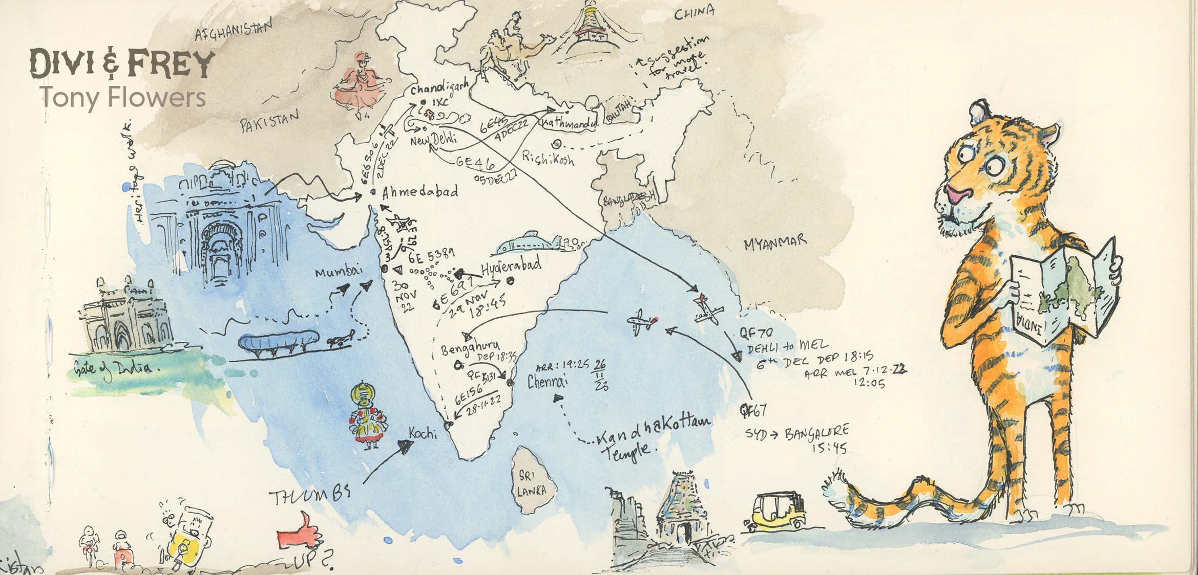
In November 2023, I took a journey through India that changed everything.
India and Nepal were more than just travel destinations—they became living sketchbooks that whispered stories into my hand as I drew. From the vibrant pulse of Chennai to the layered history of Kathmandu, every moment was a collision of colour, culture, and character. I wandered through Kochi’s coastal calm, Ahmedabad’s architectural rhythms, and Hyderabad’s fragrant street markets—each place leaving its mark not just in ink, but in imagination.
This trip wasn’t simply a travel log—it was a catalyst. The people, sights, sounds and tastes of India didn’t just inspire—they helped shape the core concept of Divi and Frey, my long-developed graphic novel series. I watched the adventure unfold in real time on the page. Ideas that had been dormant sparked to life as I sketched street scenes, temple interiors, and chance encounters with locals who shared stories as vibrant as the saris they wore.
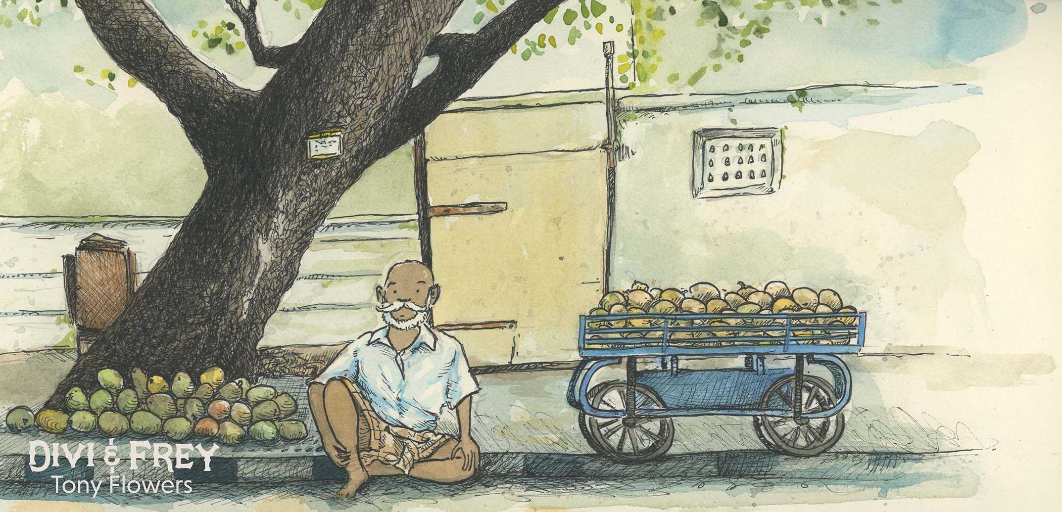
Mango Seller, New Dehli.
What started years ago as scattered thoughts in notebooks and storyboard sketches truly began to breathe during my travels through India and Nepal. This trip marked a pivotal shift—from loosely formed ideas to fully realised narrative threads. Immersing myself in the rhythm of daily life across cities like Ahmedabad, Kochi, and Hyderabad, I came to understand something fundamental: to authentically create, you must be immersed.
India didn’t just inspire me—it challenged and elevated my storytelling lens. The kaleidoscope of experiences, from temple rituals to conversations with chai vendors, offered a sensory depth that no textbook or screen could replicate. I realised that ideas grow richer when you give them roots in real places, with real people.
While the first Divi and Frey book is set in Paris and Egypt, and those locations have their own magic, the true starting point for the series—the emotional and creative ignition—was India. It was there, sketchbook in hand, that I saw how travel could transform intention into narrative.
This post features a selection of sketchbook pages that capture the spirit of my travels—snapshots of moments that helped guide Divi and Frey toward its future.
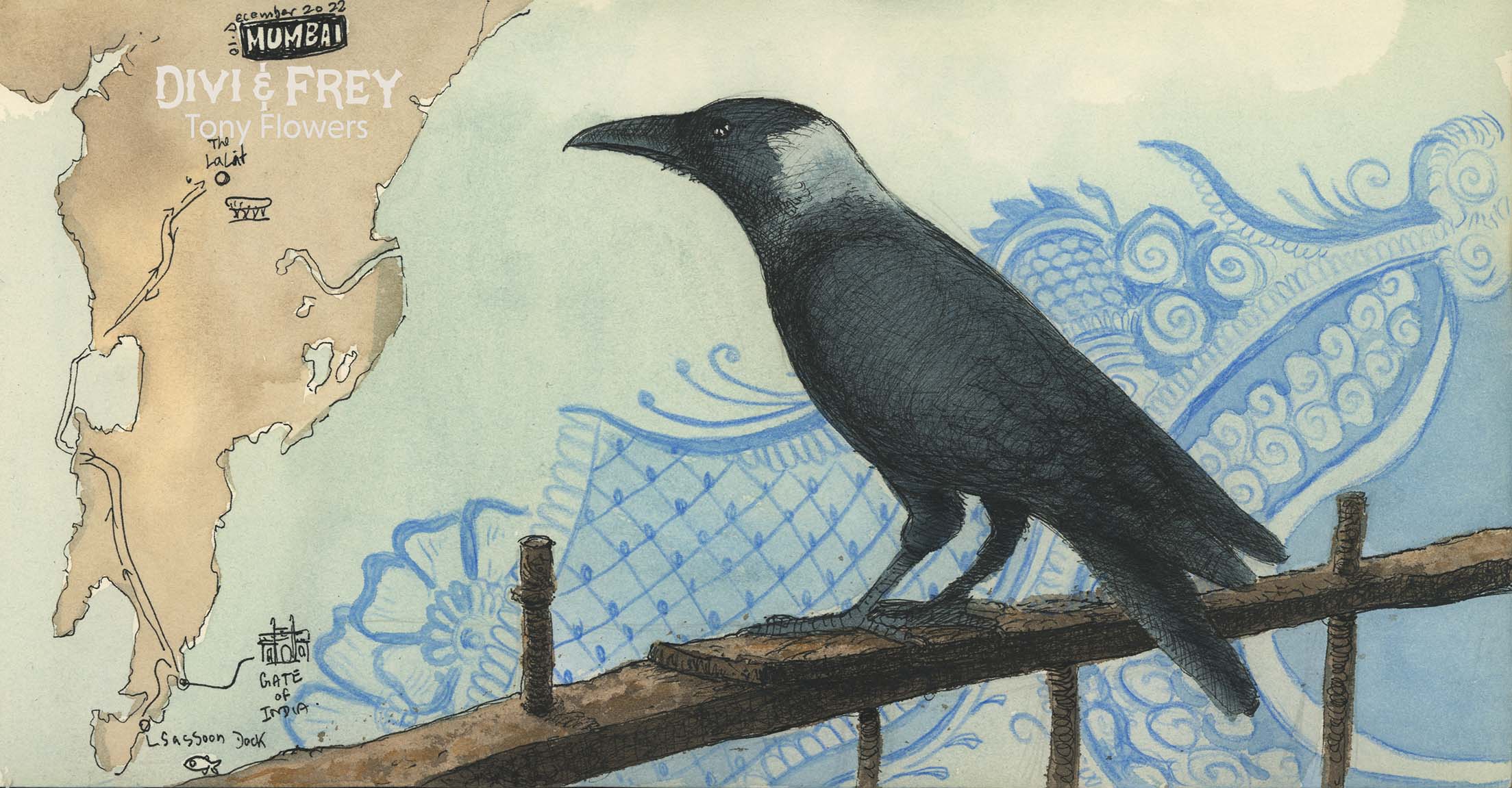
Raven on the fence of the Gate of Idina, Mumbai.
Though I managed to explore much—Bengaluru, Mumbai, Chandigarh, New Delhi—I barely scratched the surface. And so, I’ve planned a return to India in 2027, intent on uncovering the legendary sites I missed the first time around. There’s still so much to draw, to feel, and to learn and a whole new adventure to write.
Stay tuned for a fresh wave of adventure posts in 2026, as I gear up for my next expeditions. Divi and Frey continues to evolve, but the heart of it will always beat with the energy of the journeys that shaped it—starting with Japan, Borneo and India.
I lucky enough to stumble across an original ink drawing in an antique shop recently. The image was in a tatty old frame with no artist listed on the work(image below). On closer inspection, I could just make out the faint remains of the pencil sketch work in places and see the ink nib marks, it had all of the hall marks of an image in the created around the same time and a using similar techniques to that of Sir John Tenniel (19820 – 1914).
So $50 and some research later, I found out the artist was Frank Reyonlds, (1876 – 1953) and the etching created from this drawing appeared in the January 1920 edition of Punch magazine.
The slightly deaf footman (Reynolds, 1920)
I love this style of illustration and the work of Reynolds more famous contemporaries, such as E.H. Shepard (1879 – 1976)
Drawn from life (Shepard, 1962)
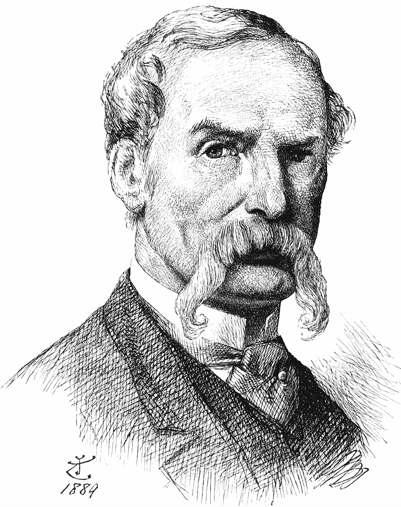
And Sir John Tenniel (1820 – 1914)
John Tenniel – self-portrait.
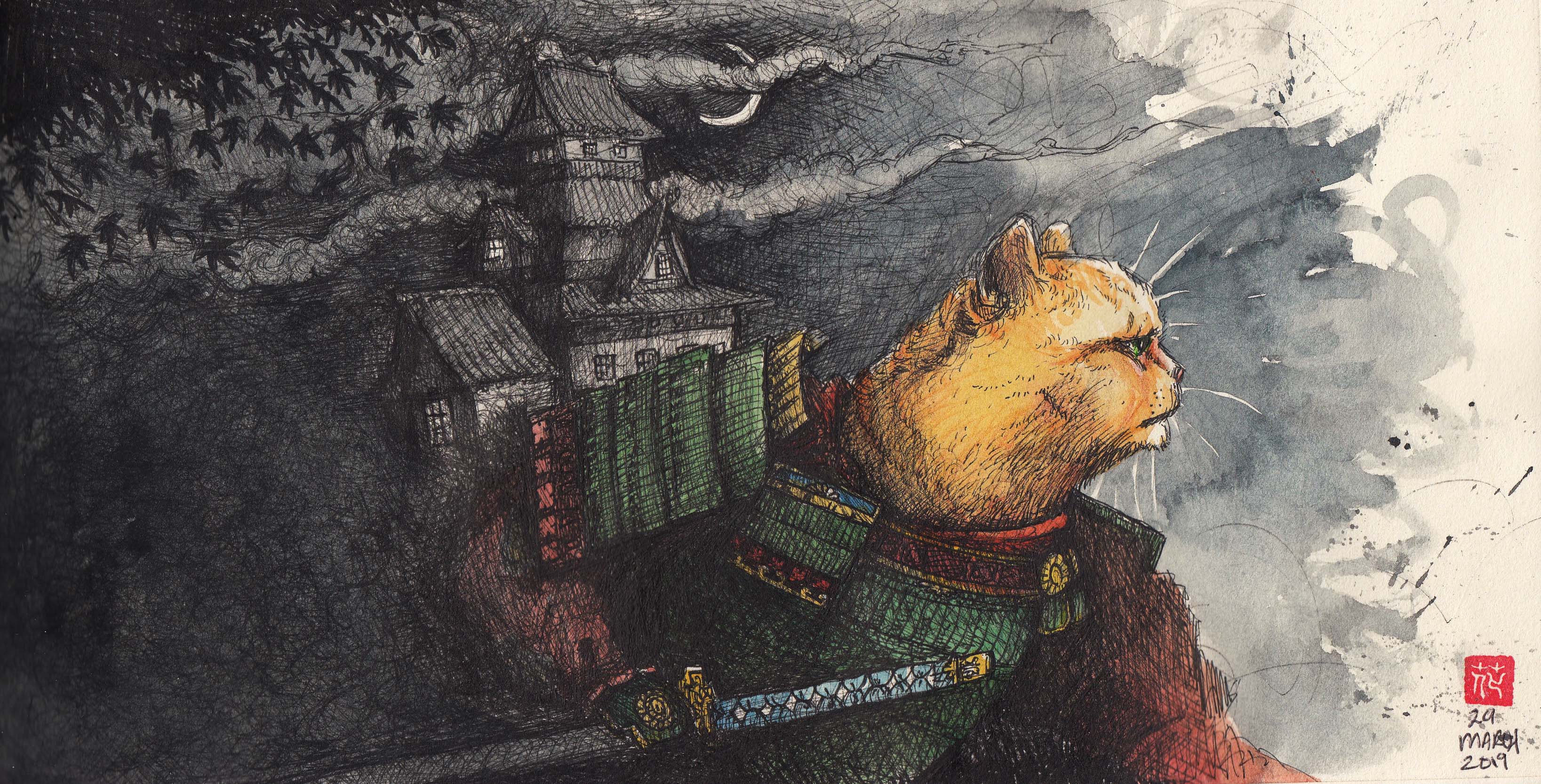
The discovery of Reynolds illustration reminded me of a number of images that I have created using a similar style of line work in recent years. Inspired I set about creating a range of new images both for the pure pleasure of using such a rich illustration style and also to understand the style more deeply.
Here are some of the results;
Miffy the Samurai (ink, watercolour and pencil on paper), 2019
Shinobi Pug (ink, watercolour and pencil on paper), 2019
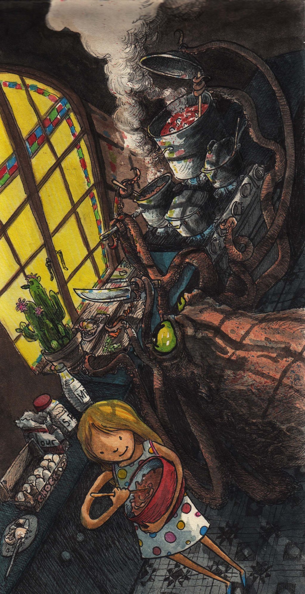
Cooking with an octopus (ink, watercolour and pencil on paper), 2019
Just in case your interested and have managed to read this far, here is the print version (as appeared in Punch, Jan 1920) of the illustration that I purchased.
See if you can spot the differences between the original drawing and the finished work.
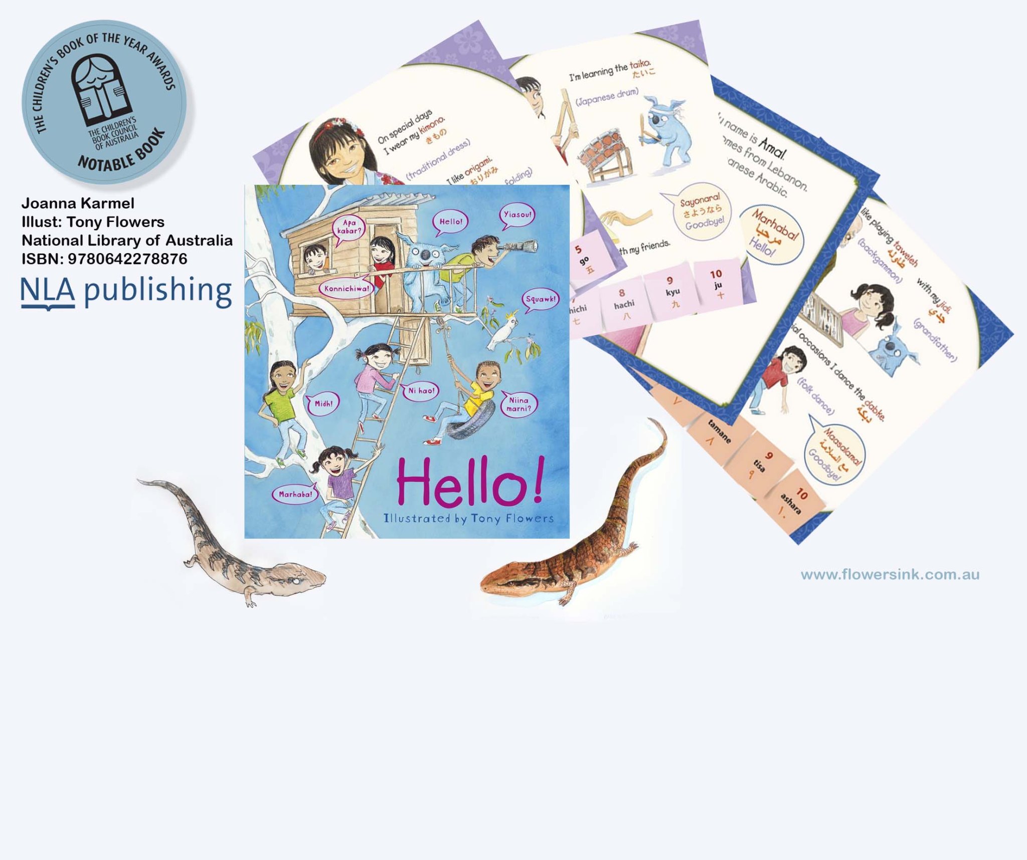
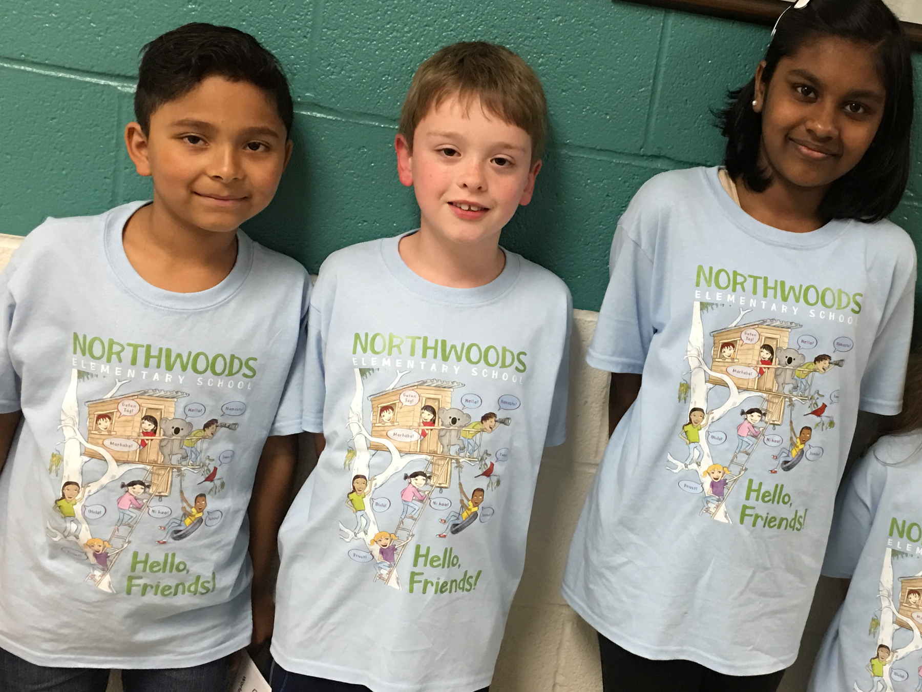
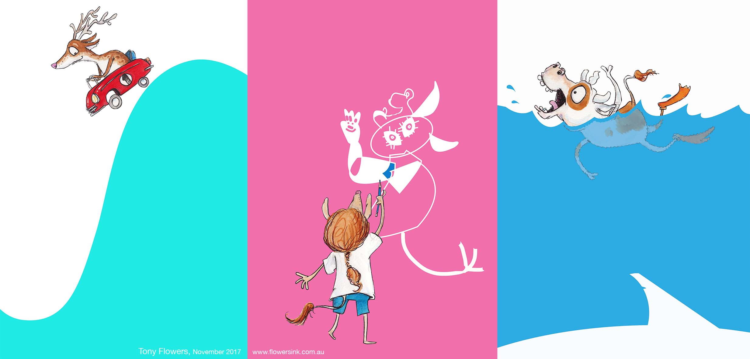
Some days you wake up to interesting requests from across the globe. Back in February I received a lovely request from a school in North Carolina to us the cover image for my ‘Hello!’ book on a fundraising tee-shirt for their International Festival. As a very culturally diverse school they identified with the concepts of the book and the cover design, It also helped that their school mascot was a koala.
After they made some modification to put in their mascot over the koala character on the book, they produced a wonderful tee shirt that sold 6 times the normal amount (based on previous years – sales).
What I really like is days like to today when I receive photos of the event and I can see the smiling faces and my drawing have been used in ways that I never expected when I first created them.
I thought that I might post some images from my current sketchbook. Some of these have been posted on Facebook in the past, but not as a collection with an explanation (albeit a rambling one). I have shown my sketchbook to a number of people, all of whom focus in on these images. This may be as they are a little different to my normal illustration style.
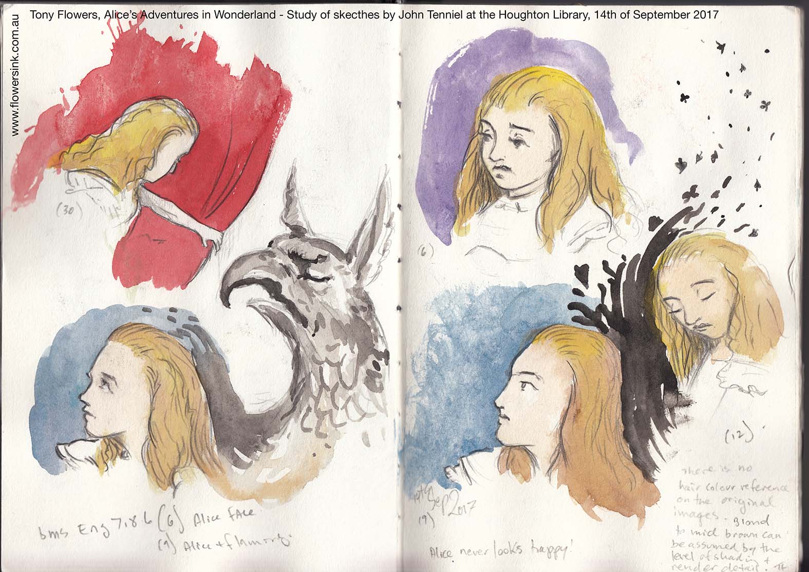
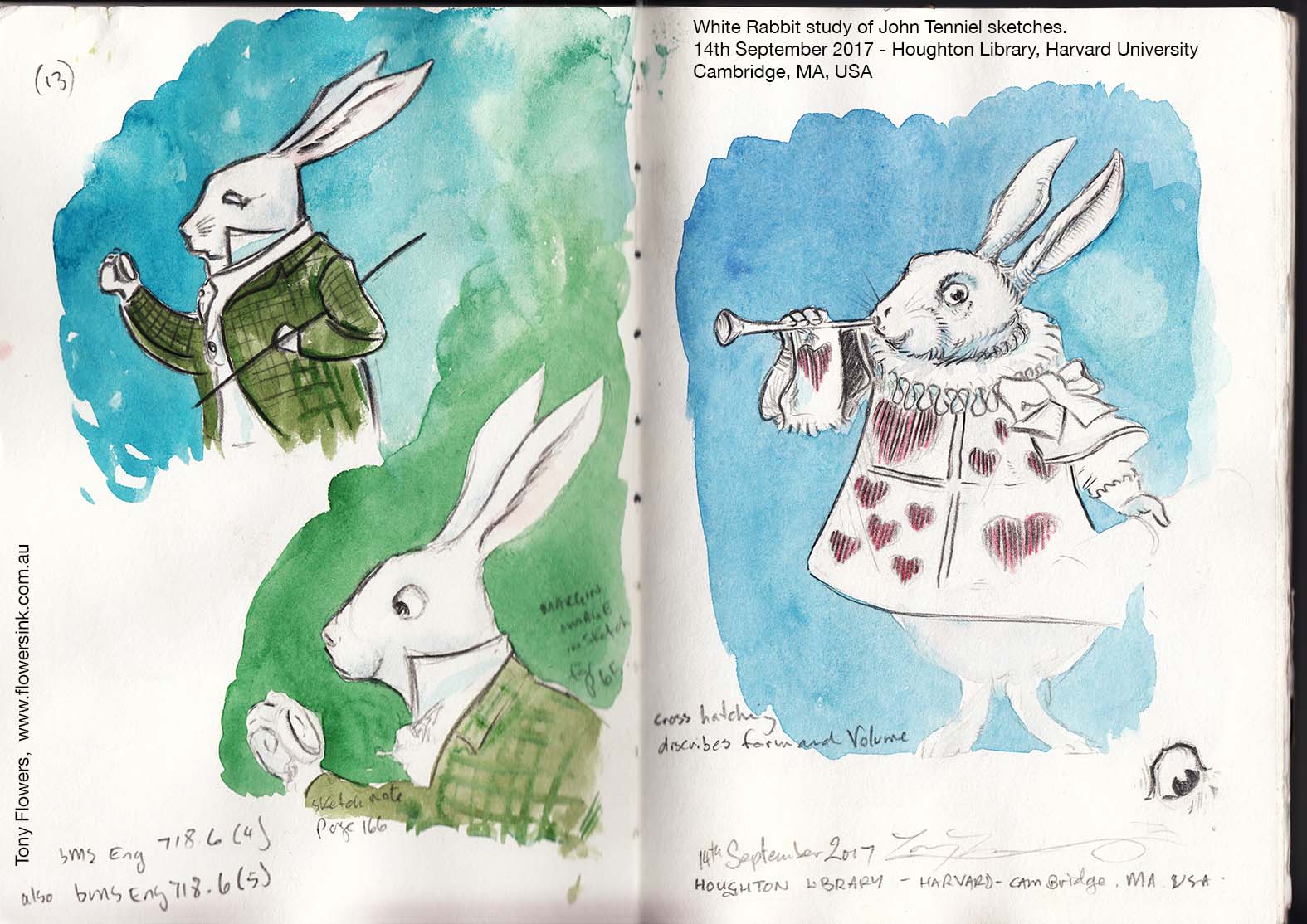
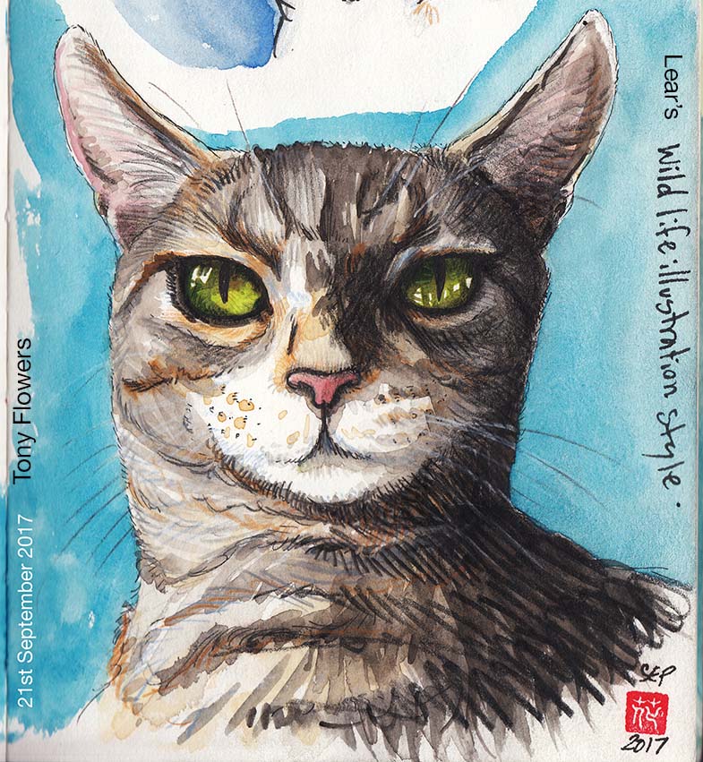
After my recent travels where I was able to visit the Harvard University’s rare books and manuscript collection at Houghton Library (see my older posts from September), I have been exploring the styles of Edward Lear and John Tenniel. This has been done initially through examining the original sketches of both artists and reproducing their line work, enabling me to get a feel for how each of them approached their drawings.
Tenniel for instance, has a very structured approach to his images, describing the form and volume through the use of cross hatch that will be later translated into the final printed image. Tenniel is best known for his illustrations for Alice’s Adventures in Wonderland.
These images were sketched in the Houghton Library’s reading room and the colour was watercolour washed in later emphasising the character’s silhouette.
Lear has two predominant styles, the first is the simplistic line work used in his books of nonsense poems, such as his most famous work “The Owl and the Pussycat”. The second style is more of a realistic study of natural history subjects, such as the bird that he painted for John Gould (http://www.foliosociety.com/book/ELB/edward-lear-s-birds). Lear was also a prolific landscape artist, but I left these works outside of my terms of reference for this exploration.
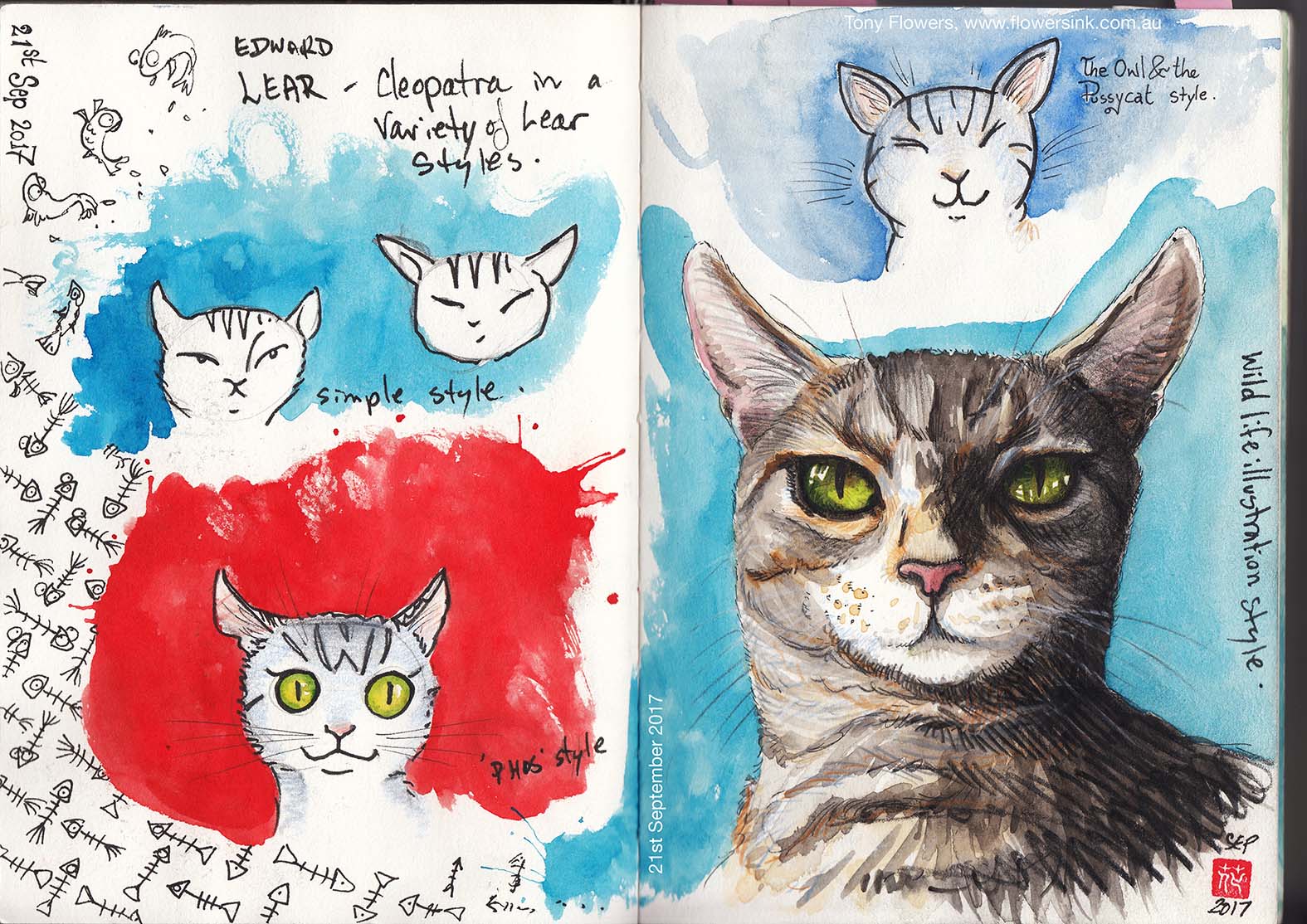
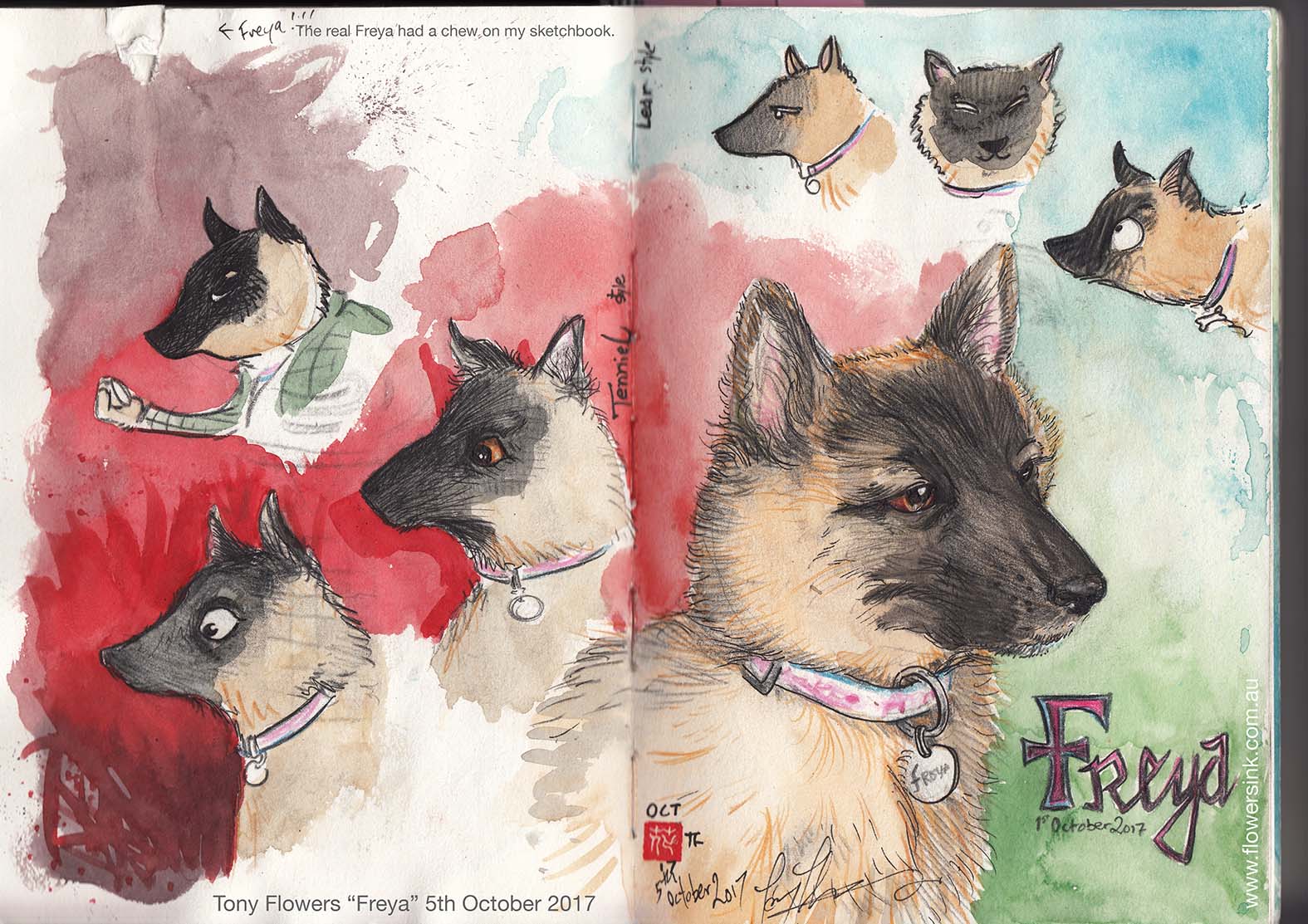
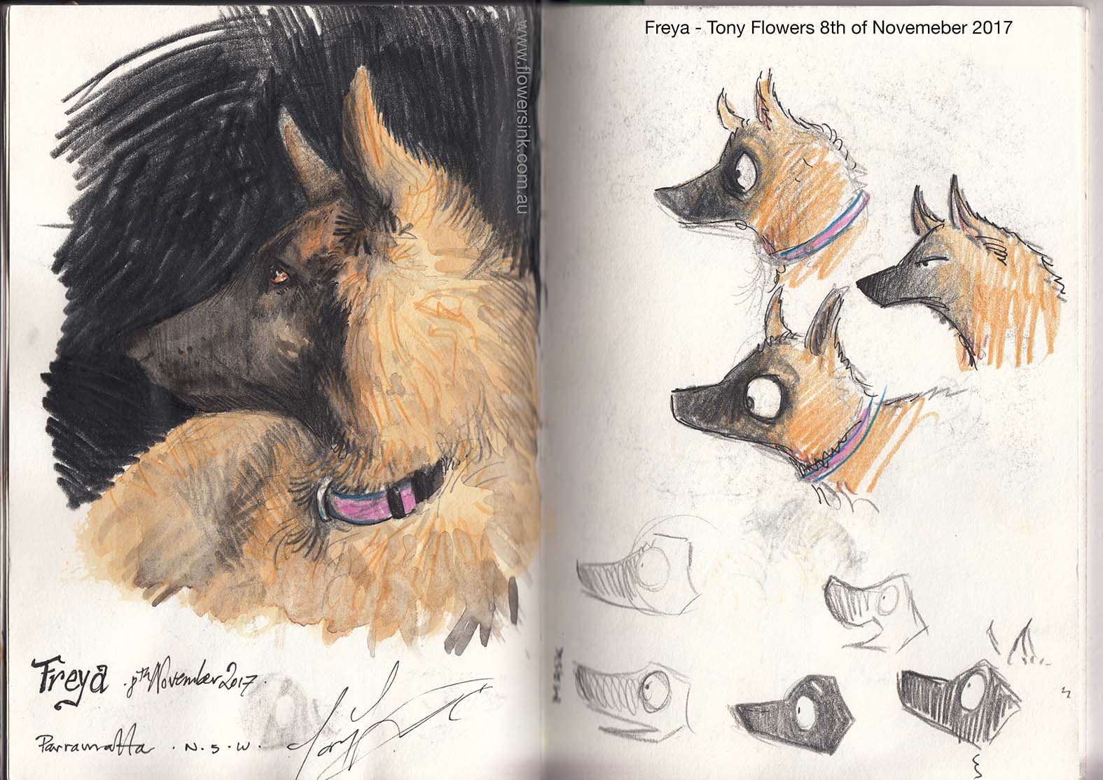
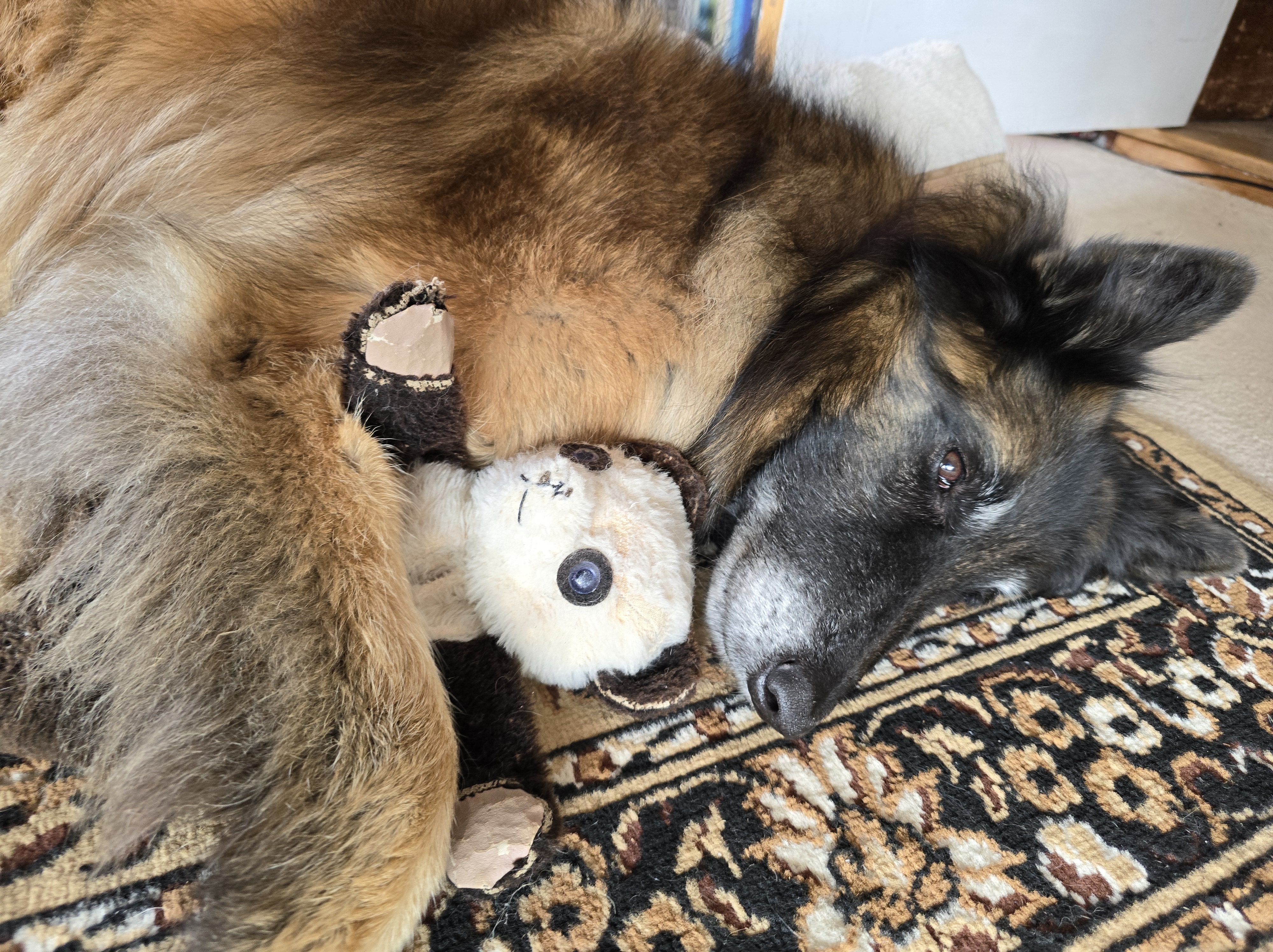
Once I had started to develop an appreciation for their approach to drawing I then produced some sketches as an exercise to apply these approaches to my own work. I decided to create studies of my cats (Miffy and Cleopatra) and puppy (Freya). My beautiful German Shepherd (Thor) has so far missed out on this visual treatment.
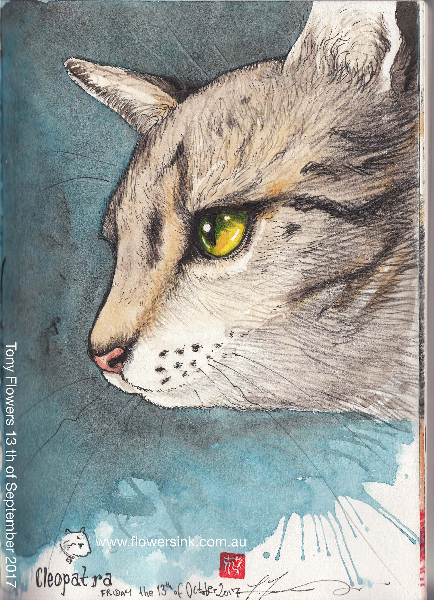
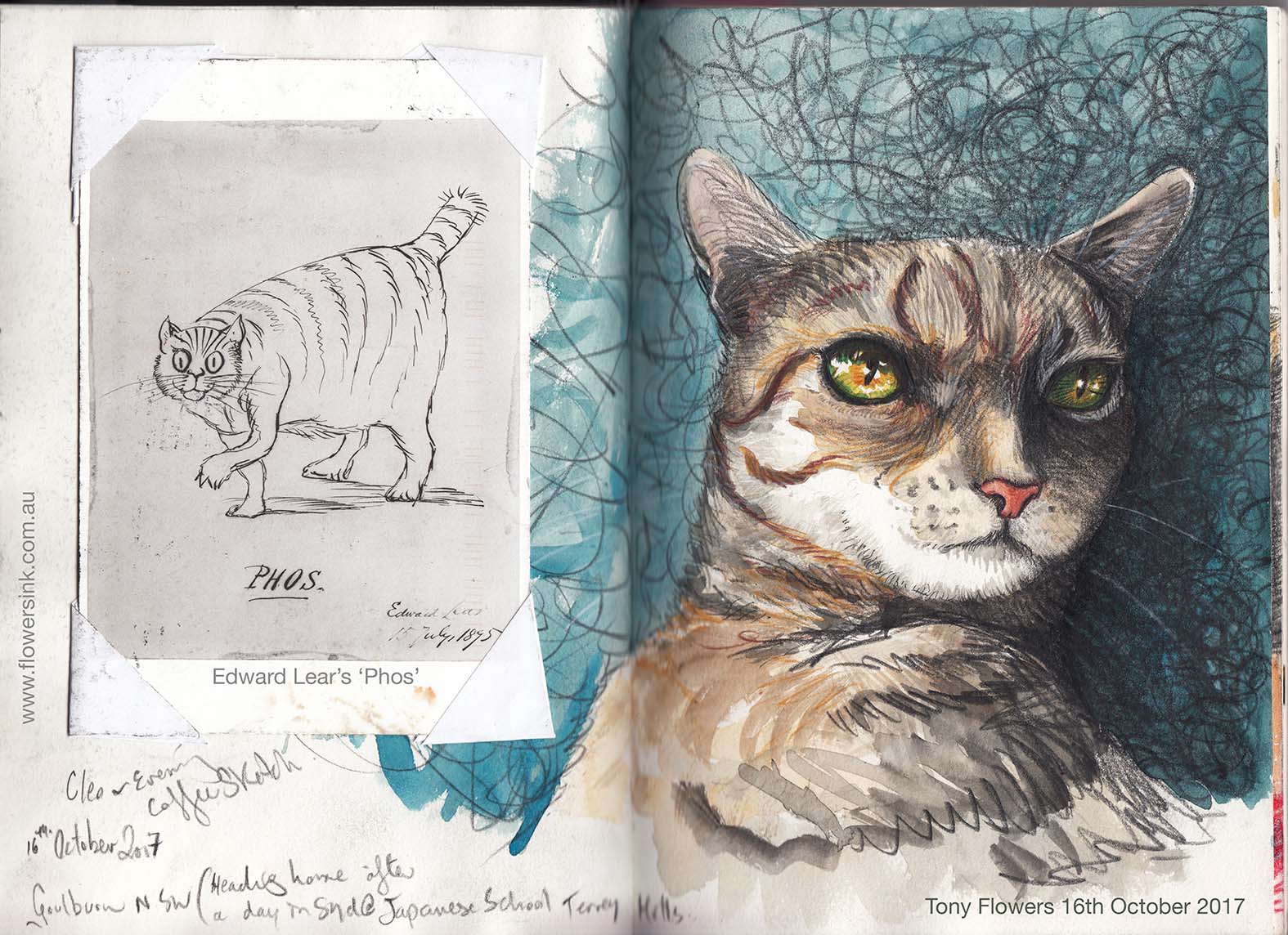
My first look at Cleopatra was done with my Edward Lear illustrators hat on looking at both his realistic and simplistic nonsense style, including a version of his ‘Phos’ drawing, which is an illustration of his own cat. Lear was such an avid cat lover and it is said that when Lear had a house built late in lif he had the floor plan exactly replicated from his last home as his cat ‘Phos’ was old and blind and he didn’t want his cat to feel lost.
While my attempts at realism are a mere shallow version of anything done by Lear himself, I am just happy about working through the basics of the process for the purpose of the exercise.
My next study looks at my young puppy Freya (a Belgium Shepherd) who was 9 weeks old at the time of the drawings. These were done primarily with my Tenniel hat on. Looking at how Tenniel’s drawings of the White rabbit could be adapted for Freya, I then looked at some of Lears drawing styles before finally drawing a sketch of my own character in my normal style (image on the far right).
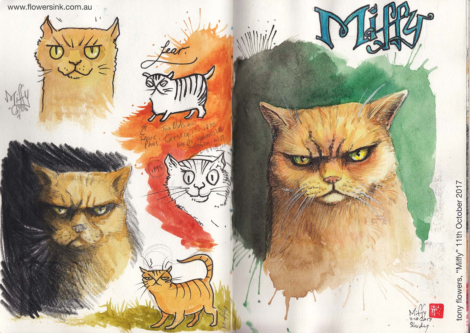
Next, I have tried to capture the picture book looks of my Myfanwy (aka Miffy). Most people think this threating looking cat is a work of pure imagination. She is not, she actually looks like this, and this is normal, even when she is purring. Miffy is a Britsh Shorthair. Interestingly enough, the rumoured cat breed that Tenniel based his Cheshire Cat on.
If you have read some of my older posts you will have seen some of my early illustrations of Miffy as a potenial book character.
The next image, above, is a Cleopatra again. In this image, I am just looking at Lear’s approach to realism, overlaid with Tenniel’s cross-hatching to describe volume. Note the ink work around the eyes and nose.
Above is another Cleopatra experiment. For anyone who is interested in mediums, these drawings are done with colour pencils, watercolour and ink. For pencils, I generally use a combination of Staedtler* Ergosoft and Faber-Castell Polychromos pencils. For watercolours I love AS, Art Spectrum watercolour tubes (http://artspectrum.com.au/product_type/watercolours/ ), their Australian Grey is the mid-perfect skin colour. I also use Windsor Newtons, both tube and block stock. And for ink, while I will occasionally bust out the old school nib and ink bottle, I generally use Staedtler pigment liners. (*Staedtler generously provide me with a large range of drawing pencils and pens)
This Freya image (she is now almost 12 weeks old) is more of natural history study to examine her markings and fur patterns (fur directions). The right-hand page is then an experiment with a simple illustration style, more like my normal style of drawing.
This does raise the question Why would I do this? Well as an illustrator I am always trying to improve my skills and look at things though other people’s eyes. It also lets me refine my own style. By doing these exercises and allowing myself to be influenced by them I can see small changes to my own style that I like.
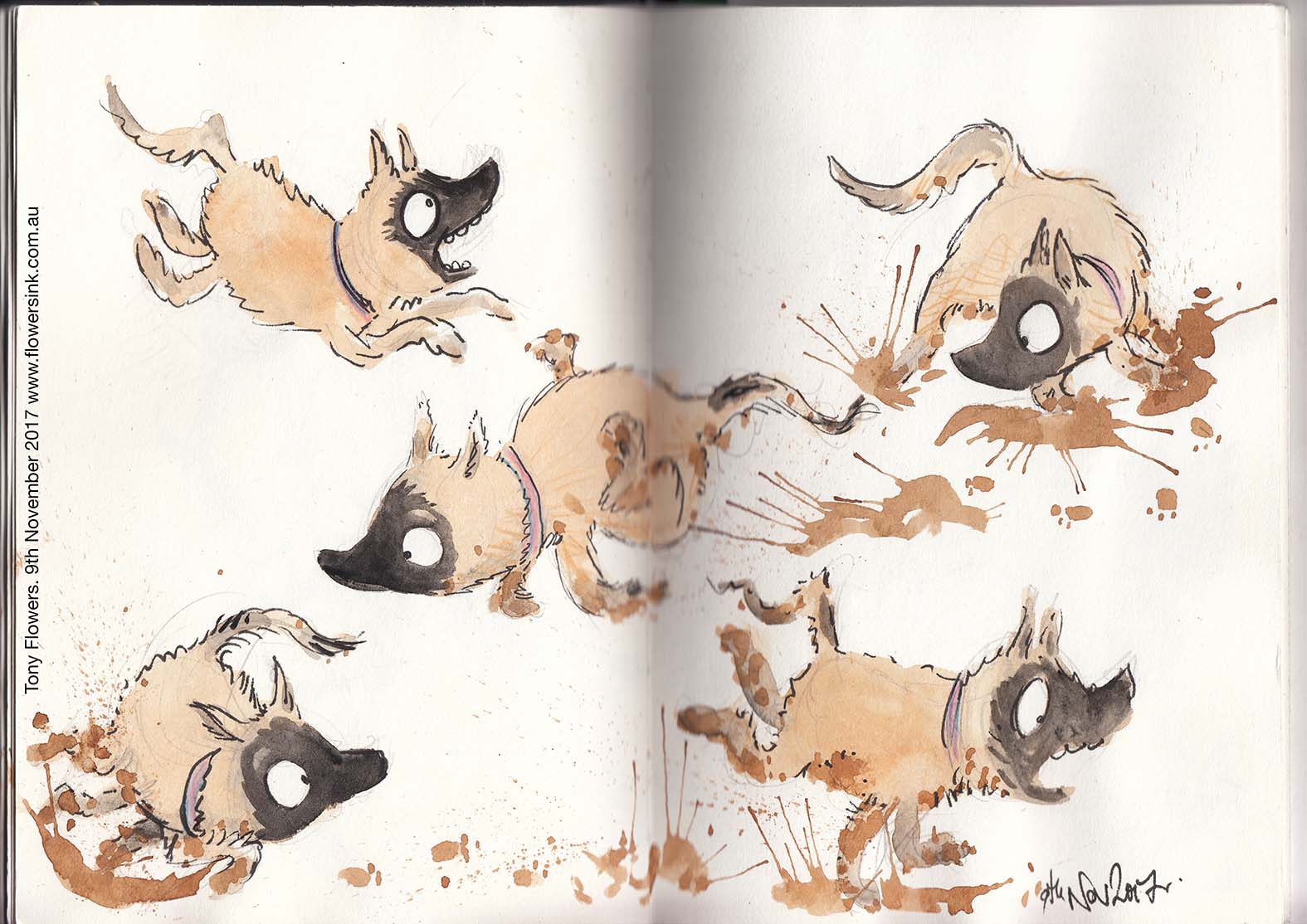
The final set drawings above are of Freya in my normal illustration style. While they do not resemble either the work of Tenniel or Lear I can see the influence of Tenniel in the shape and movement of her ears and the silhouette of her nose. I can see the simplicity of Lear’s lines in her outline, yet it feels as natural as my normal illustration work. This is probably due to the fact that while I am influenced by other illustrators, I am not a slave to replicating their work. Quite the opposite, after the initial study exercises, I don’t even think about technique when I draw. Rather, with the germ of an idea to draw Freya in my mind, I just let the pen find its own path across the paper. Through this dance between pen and paper, the marks left behind become Freya.
I should point out that while Tenniel and Lear were the main subjects that I focused on for these experiments, throughout the past few months I have also looked closely at the works of Arthur Rackham, Phil May, Charles Gir, the Aardman studios (exhibition at ACMI in Melbourne) and Dr Seuss.


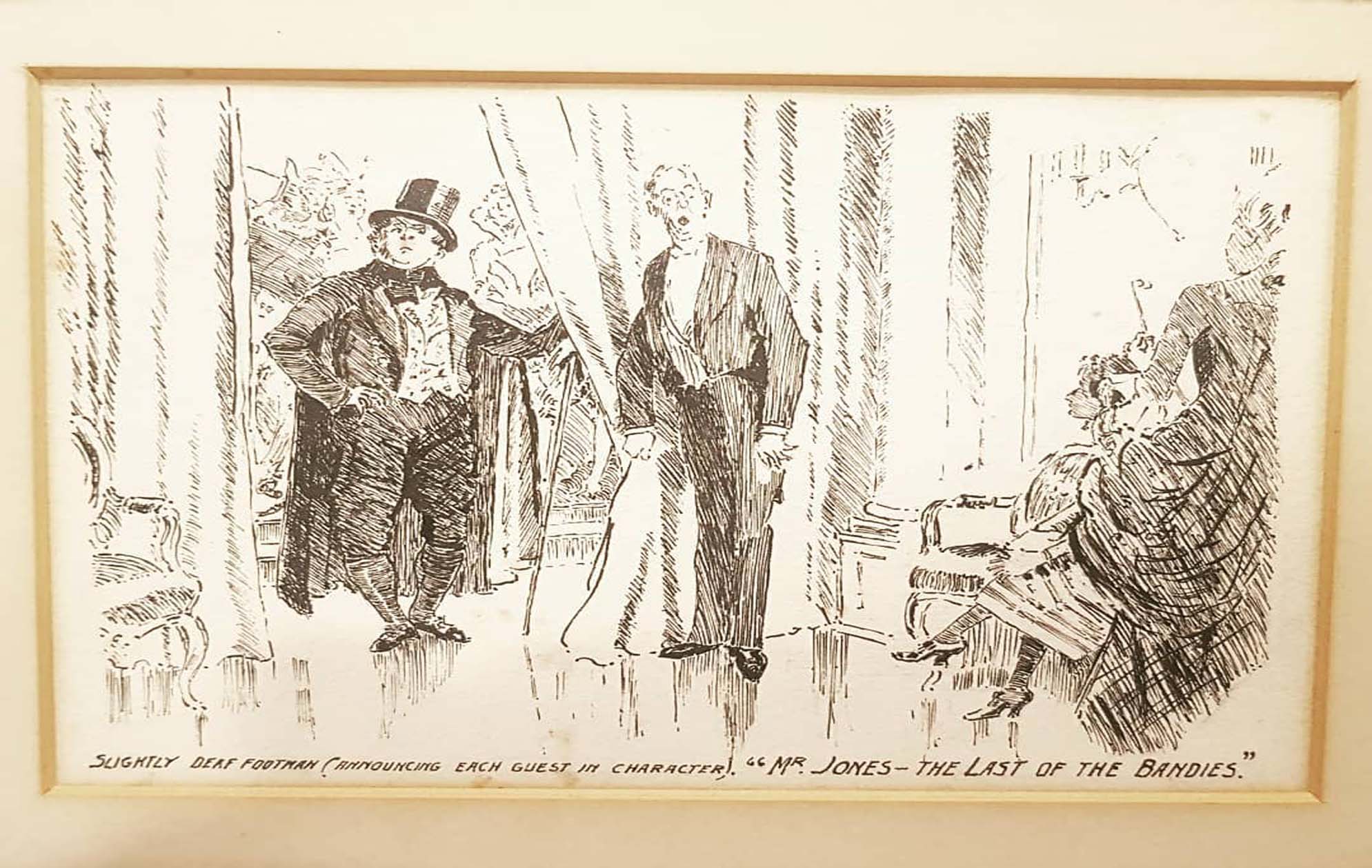 The slightly deaf footman (Reynolds, 1920)
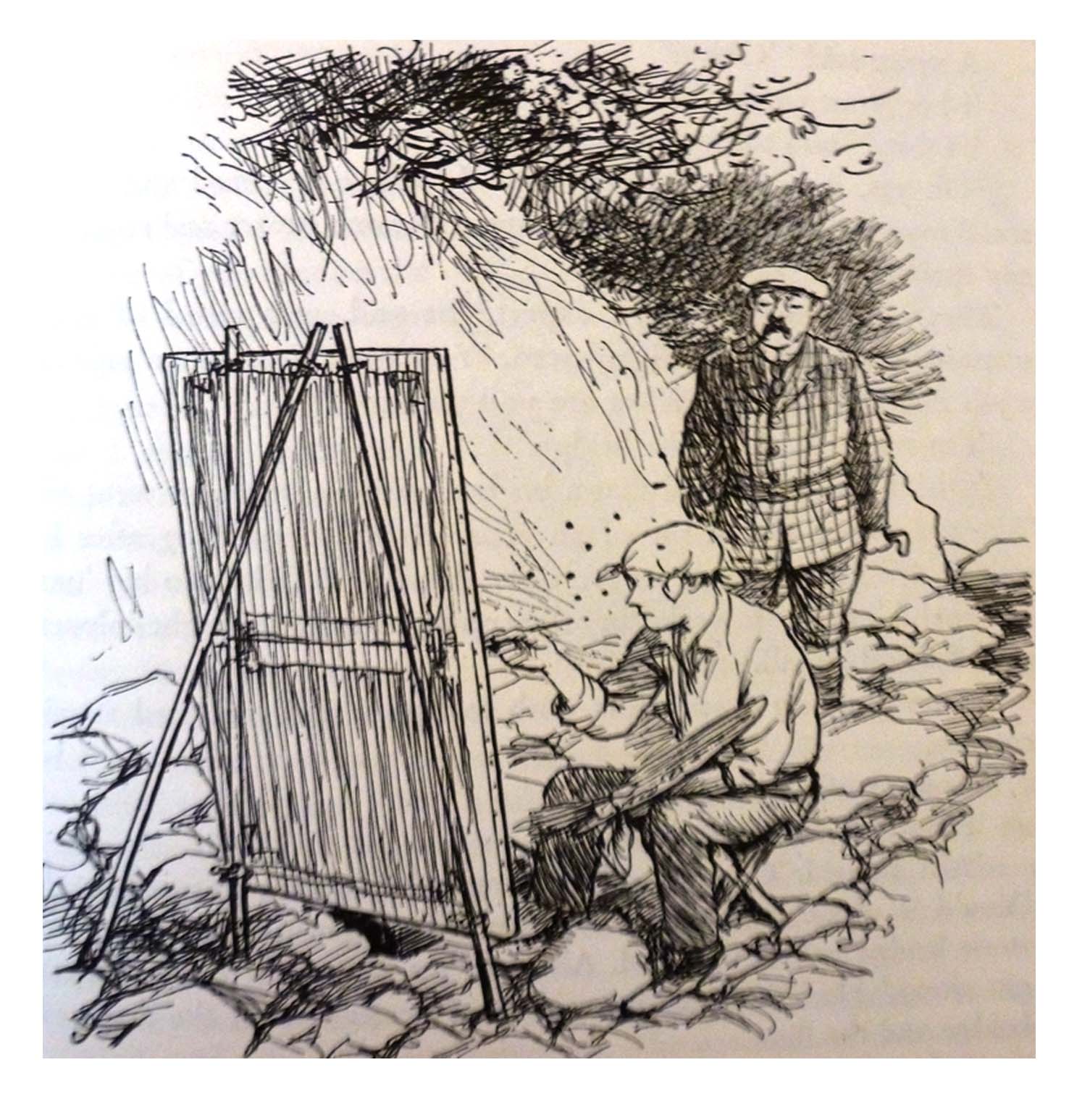
 Miffy the Samurai (ink, watercolour and pencil on paper), 2019
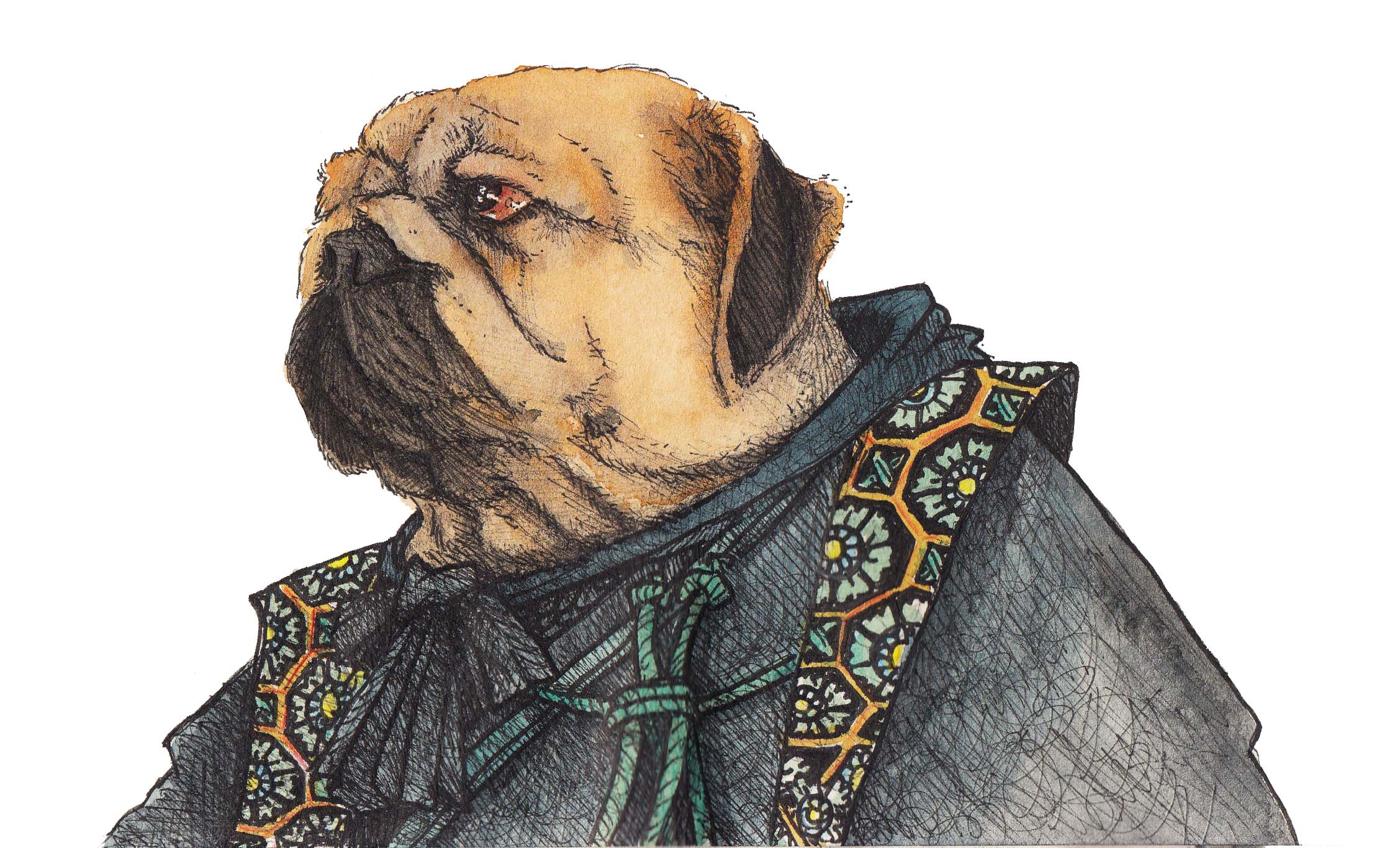 Shinobi Pug (ink, watercolour and pencil on paper), 2019
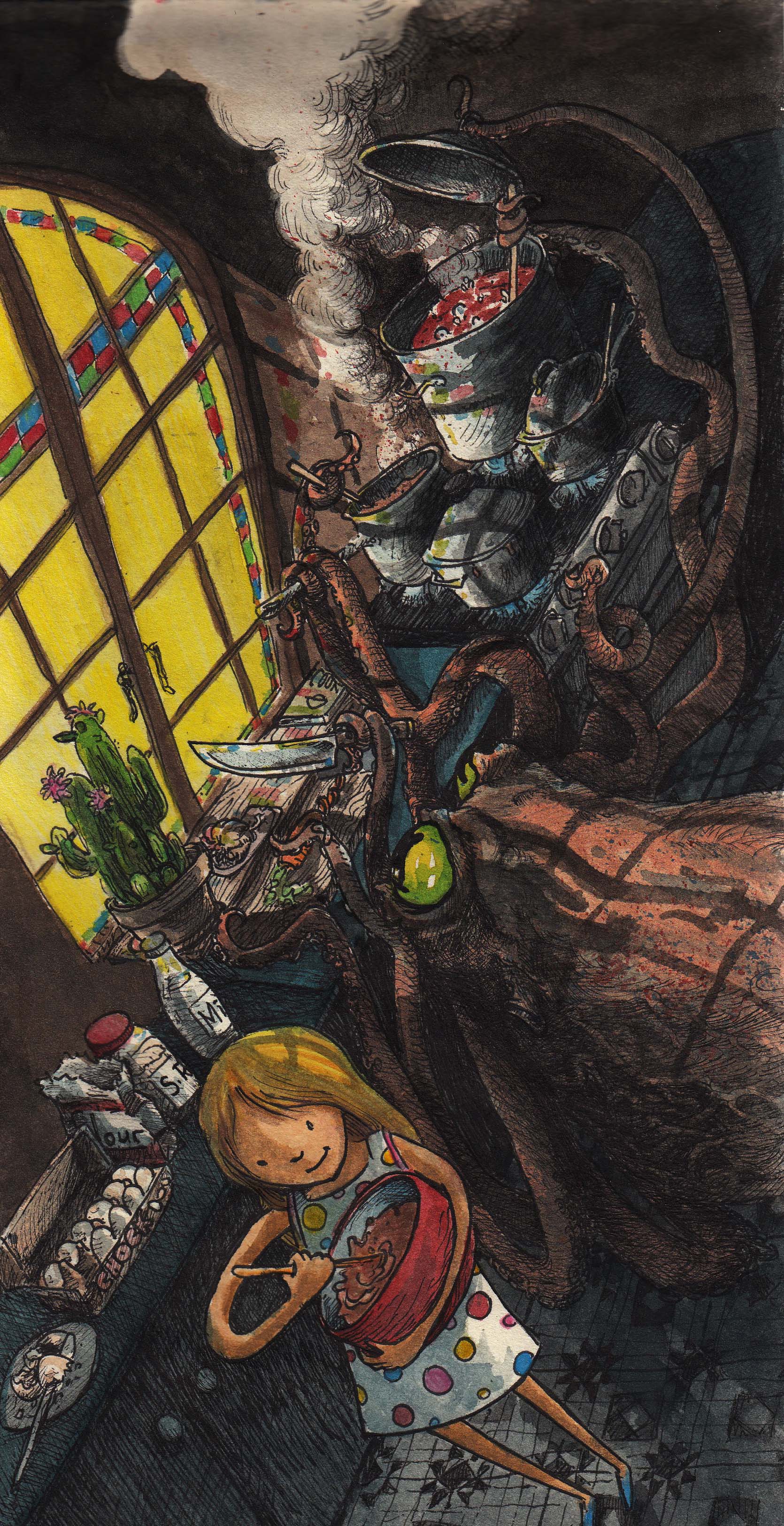 Cooking with an octopus (ink, watercolour and pencil on paper), 2019