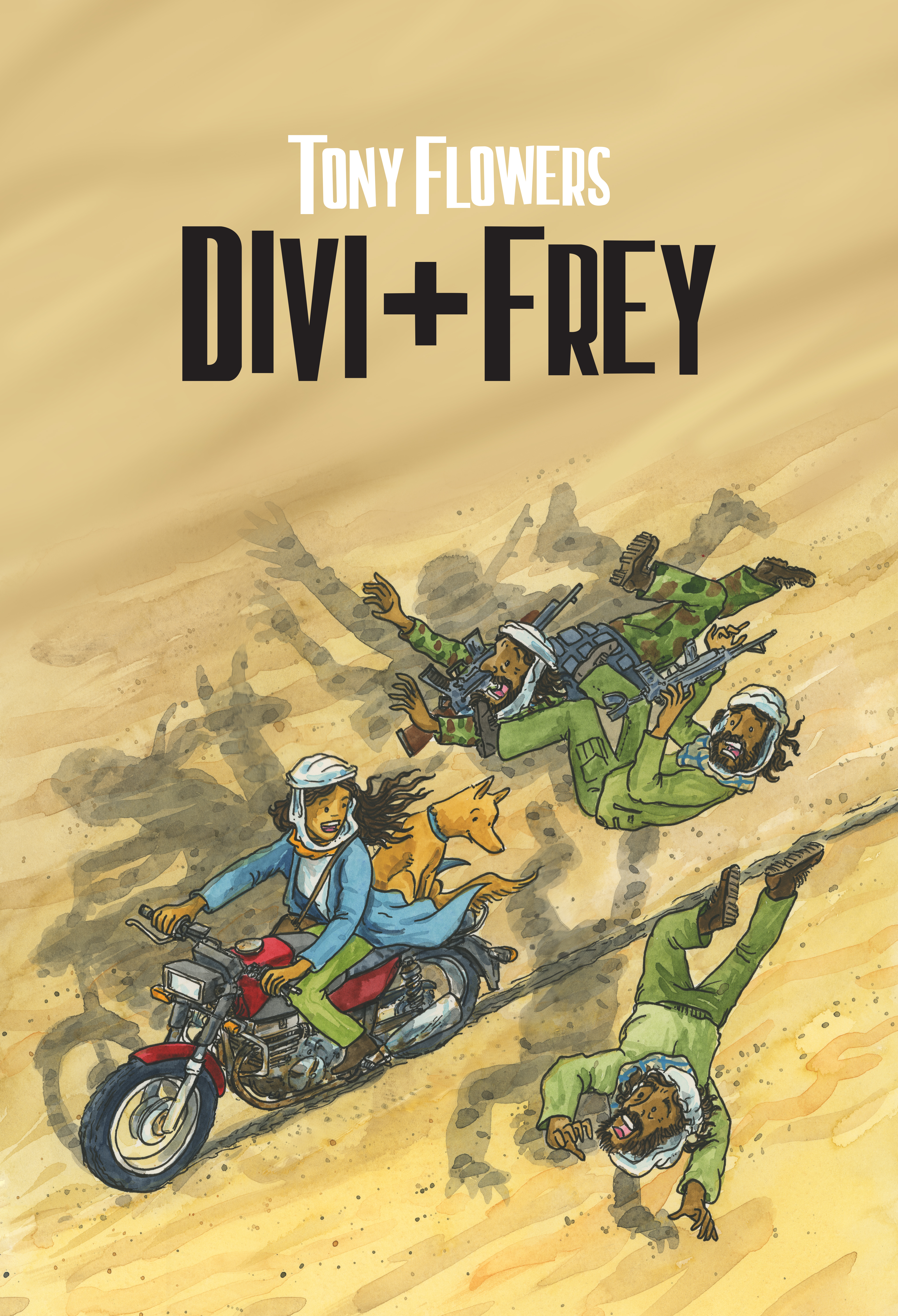
Divi & Frey promotional image (2025)
Watercolour is one of those magical mediums that everyone wants to try, but many people feel unsure about where to begin. My students often tell me they’re excited and terrified in equal measure. If that sounds familiar, you’re in the right place.
For illustrators, especially those of us who work traditionally, watercolour is one of the first tools we learn to master. It’s fluid, unpredictable, expressive, and endlessly surprising. Whether you’re just starting out or looking to expand your creative toolkit, understanding how watercolour behaves will transform your illustrations.
Here are some essentials to help you dive in with confidence.
Start With Quality Supplies
Good materials don’t make you a better artist, but they do make learning easier.
- Paints: A basic 12‑colour Staedtler tube set (around $20 at Officeworks) is a great starting point. As you grow, you can explore professional brands like Art Spectrum, Holbein, Winsor & Newton, Schmincke, and my sentimental favourite, Daler‑Rowney, the brand I first learned with.
- Brushes: Choose a few round brushes in small, medium, and large sizes.
- Paper: This one matters more than you think (more on that below).
The difference between student‑grade and artist‑grade materials can be huge. Better pigment = better results = less frustration.
Understanding Water
Watercolour isn’t painted onto the paper, it’s floated on the water you add or that is already sitting on the surface.
Experiment with water‑to‑paint ratios:
- More water = lighter, more transparent colour
- Less water = deeper, richer colour
Learning to control water is the heart of watercolour. Don’t rush it. Play. Watch how the pigment moves across the page. The more you paly and watch how it reacts, the more the medium teach you.
Layering: The Secret Ingredient
Watercolour rewards patience.
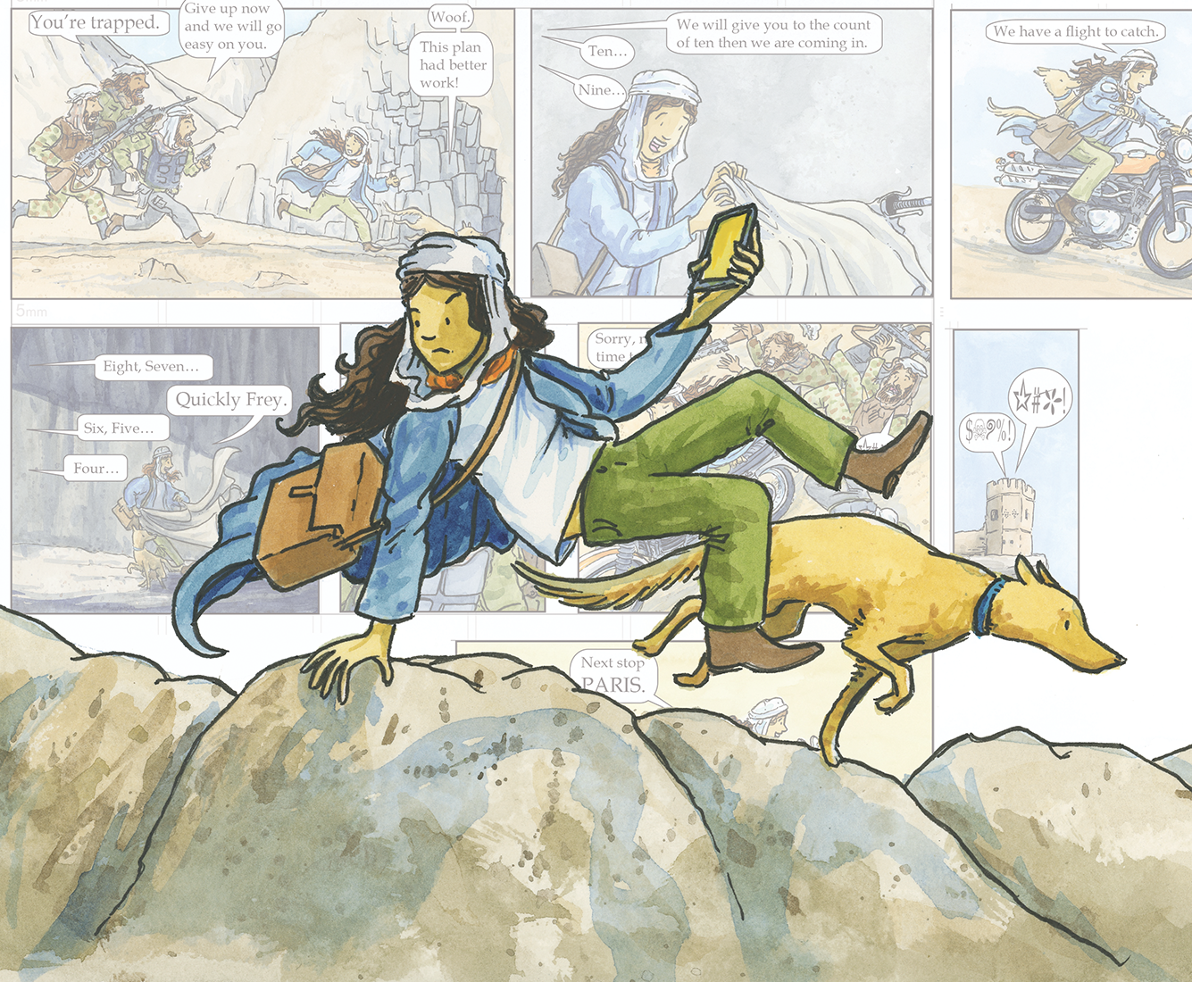
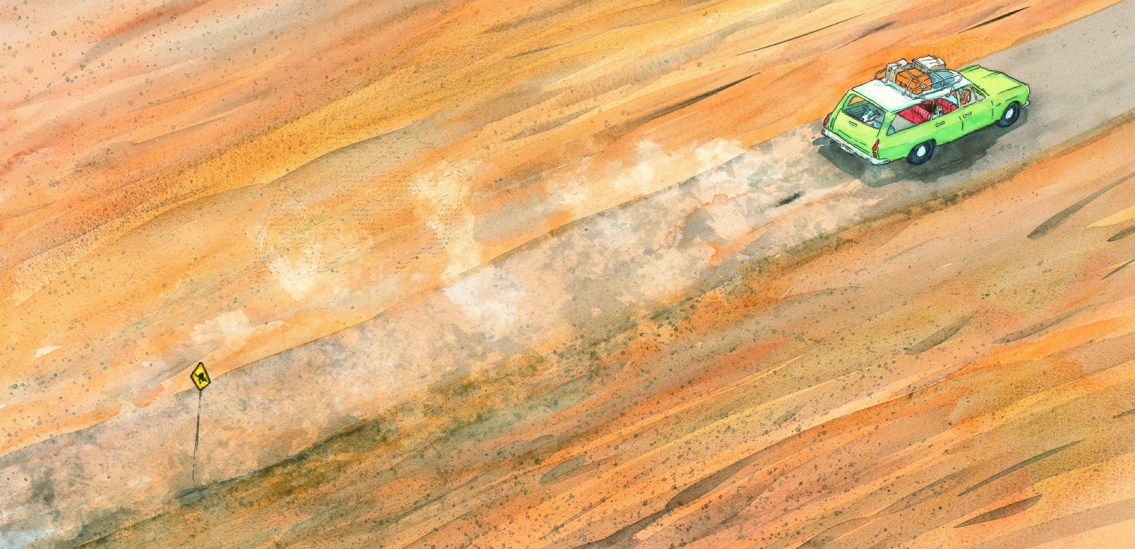
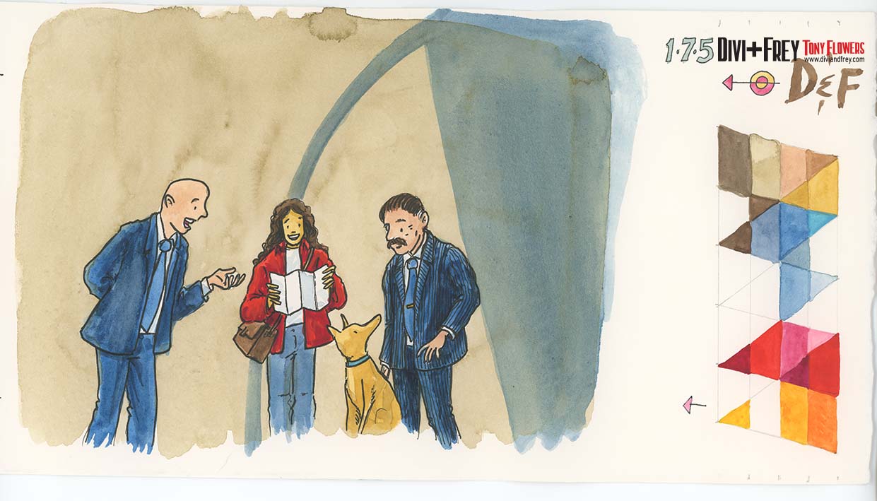
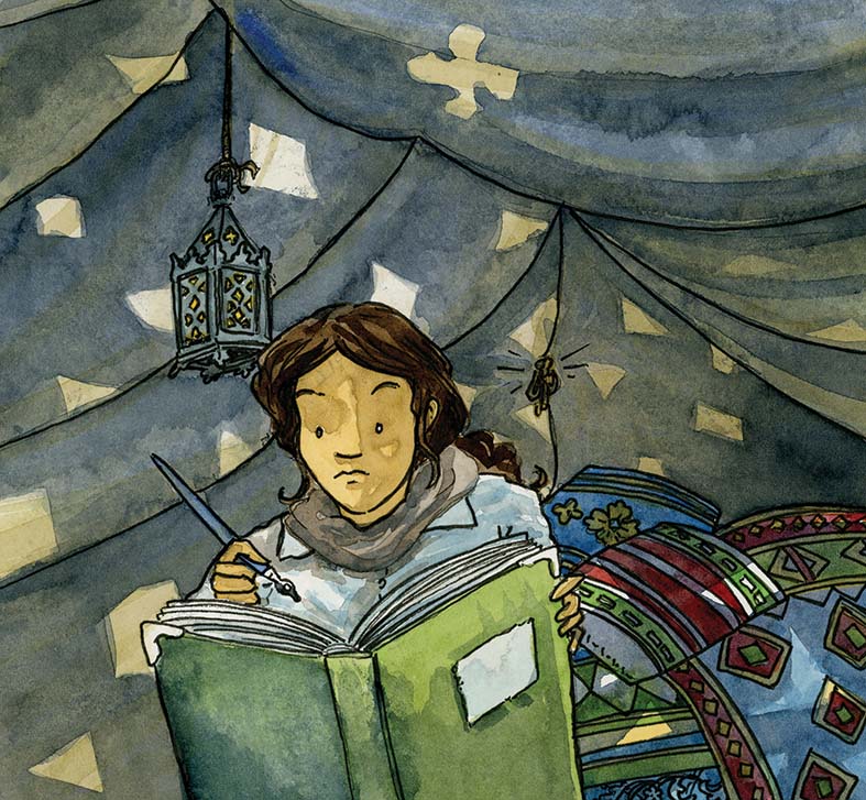
Start with light washes and slowly build up your tones. Many of my illustrations, including those in Divi & Frey are made from multiple layers of colour, each one adding depth, texture, and atmosphere.
Endpaper, Inside front cover for Advance Australia Fare
Colour Mixing & Swatching
Remember primary colours from primary school? This is where those lessons finally pay off.
- Mix colours on your palette to understand how pigments interact.
- Explore secondary and tertiary colours.
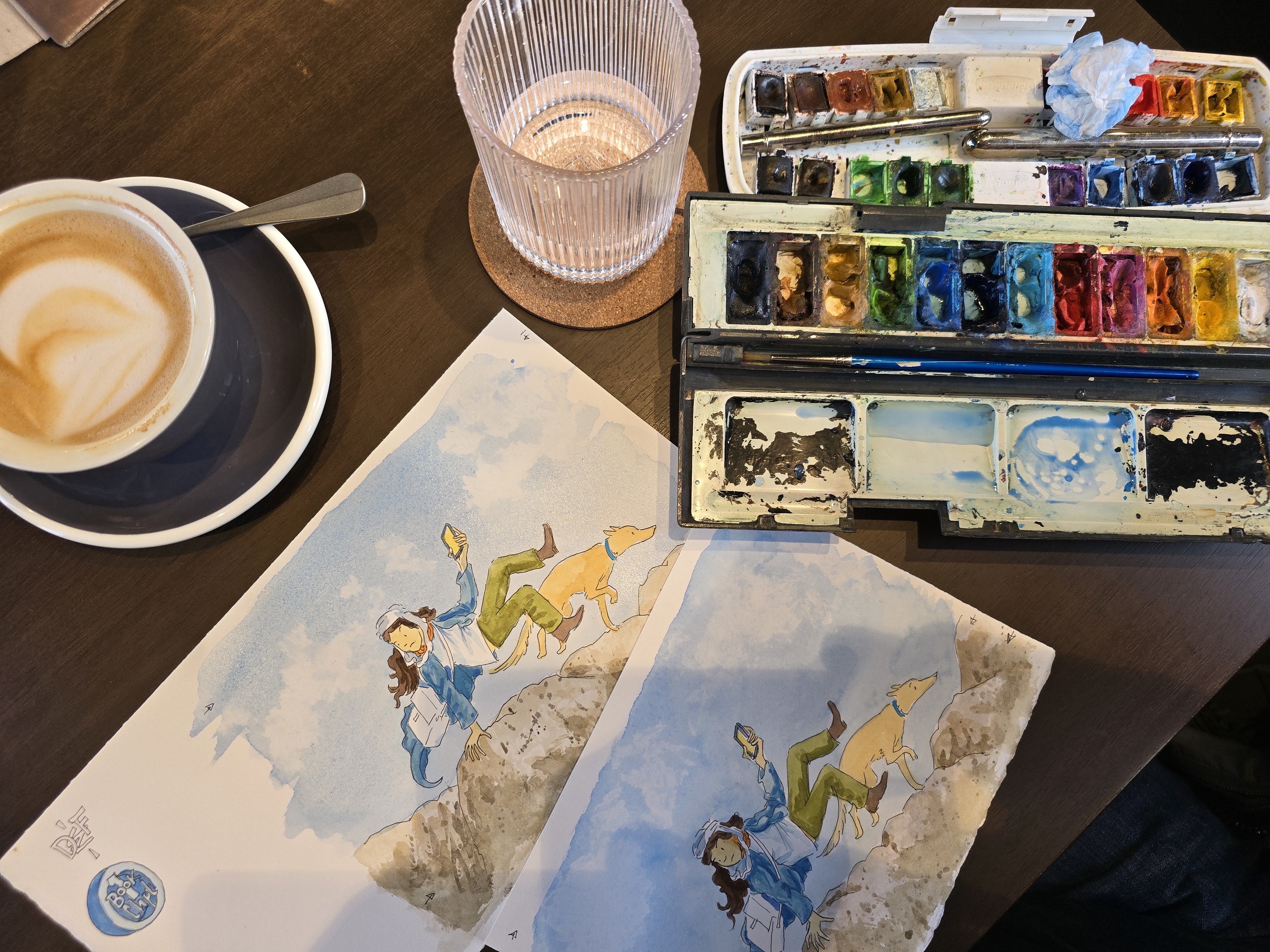
- Make test swatches, I do this constantly. You’ll often see them in the margins of my artwork
Swatches help you:
- Preview the colour before committing
- Track which colours you used
- Understand how layering changes the final look
Once a painting is finished, it can be surprisingly hard to reverse‑engineer the colours you used. Swatches save you from that mystery.
Techniques to Try
Get comfortable with the basics:
- Wet‑on‑wet: Soft, flowing blends
- Wet‑on‑dry: Sharper edges and more control
- Dry brushing: Texture and detail
The real magic happens when you start combining these techniques.
Choosing the Right Paper
Paper is one of the most important decisions you’ll make.
Weight
I choose to use a 300 gsm (140 lb) or heavier. Anything lighter will buckle under water. But you don’t need to go this heavy, especially if you are working to a smaller scale.
Texture
- Cold‑pressed: Slight texture, great for washes and detail
- Hot‑pressed: Smooth, perfect for fine line work (I use this for graphic novels)
- Rough: Strong texture for expressive strokes
Cotton Content
My preference is for a100% cotton patter, it absorbs water beautifully and gives a vibrant finish.
Acid‑Free
Essential for longevity. You don’t want your artwork yellowing over time.
Experiment
Buy small pads of different papers and see what suits your style.
My Own Workflow
Here’s how I use paper across a project:
- Rough sketches: Cheap photocopy paper, great for pencil and ink, terrible for watercolour (it buckles instantly).
- Project sketchbooks: Medium‑quality cartridge paper (around 180 gsm). Good for planning, not for final art.
- Final illustrations: Arches 300 gsm, 100% cotton.
- Cold‑pressed for picture books
- Hot‑pressed for graphic novels and fine line work
You don’t need to start with premium paper. Build your skills on affordable cartridge paper (180–250 gsm), then move to watercolour paper when you’re ready.
Brands I personally recommend: Art Spectrum, Arches, Canson, Fabriano.
Final Thoughts
Watercolour is a medium that rewards curiosity, patience, and play. Don’t wait for the “perfect” materials or the “right” moment. Start small, experiment often, and let the medium surprise you.
There a load of you tube tutorials that will teach you the basic and some of the more experimental approaches to using and playing with water colour.

Leave a comment